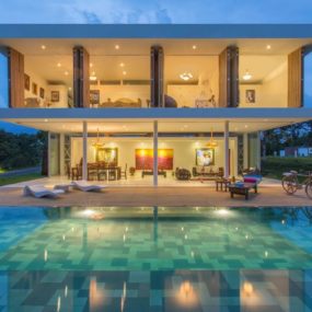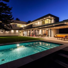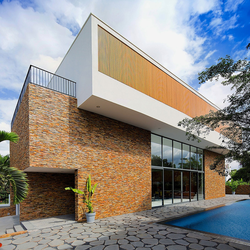
Located in Ho Chi Minh City, Vietnam, the Fuschia Villa is a 4467sqft residence designed by Vietnamese architectural firms MimA NY studio and Real Architecture to present a minimalist aesthetic within geometric volumes. The geometry of the façade is instantly apparent with its two interlocking cubes that represent the main and upper volumes. While the silhouette embodies clean lines and simple shapes, the textures within that silhouette are visceral and exciting. The lower volume is clad in stacked ledgstone with a void of window glazing and the upper cube is a clean white box punctuated by slatted bamboo shade screens. Finishing the vignettes is a large poolside terrace of angular pavers and pebble grout.
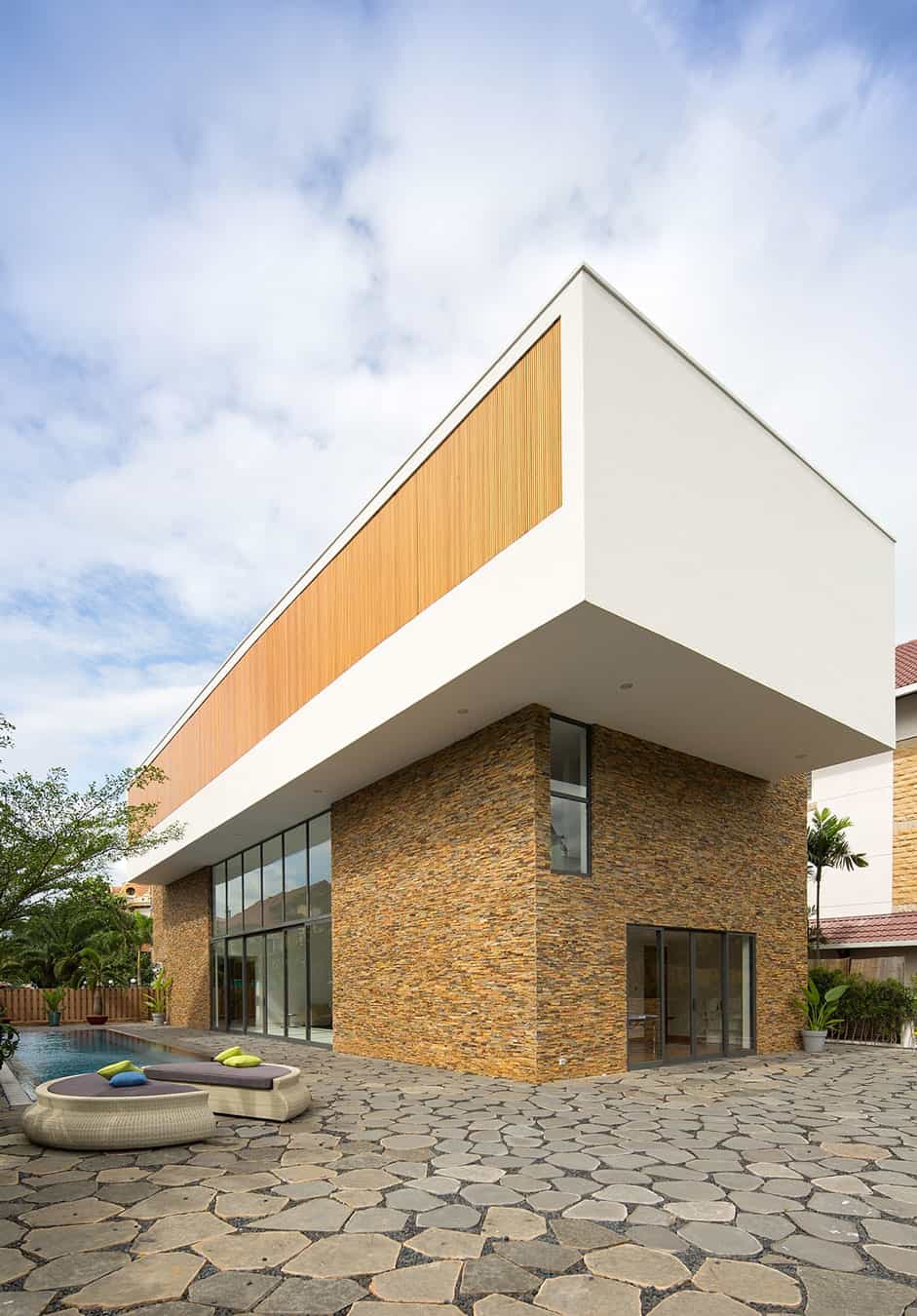
The backyard is accessed from the front yard via an entry gate that leads to the main entrance, by the glass panels within the lower level window glazings and via glass sliders in the office at the back of the home. Both sections of glass sliders are protected from the elements by the overhang of the upper volume.
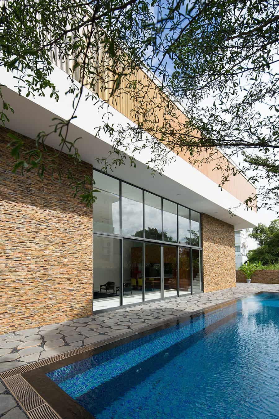
While the stone, bamboo, pavers and pool are definitely linear in design, the delicate leaves of the surrounding landscape both on the tree limbs and in the pool reflections soften the complete vignette.
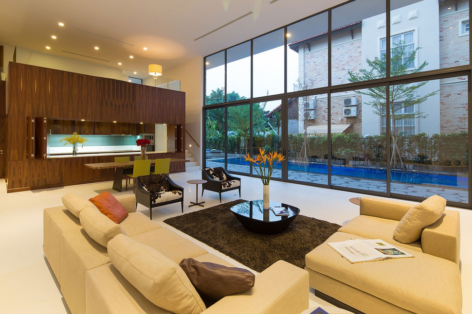
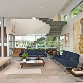
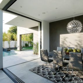
Just inside the home looking out to the pool are the living and dining zones. Large and spacious the furnishings stop from floating with the use of a dark area rug within the living area that visually ties into the dark wood dining table and the facing of the kitchen beyond. The kitchen is its own cube within the home with a passage on one side and a stairwell on the other. The stairwell leads to the family room above it and the passageway leads to the office behind it.
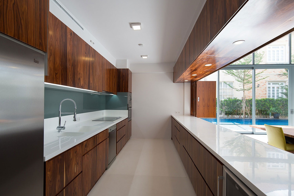
While the kitchen is contained within its own cube, the void to the dining area offers a clear view out towards the pool. When the chef wants privacy this void can be closed off via the stacked and folded panels. All the appliances are grouped along one wall of the kitchen keeping the opposite side clear for prep and serving. The white counters, walls, ceiling and floor balance the dark woodworking.
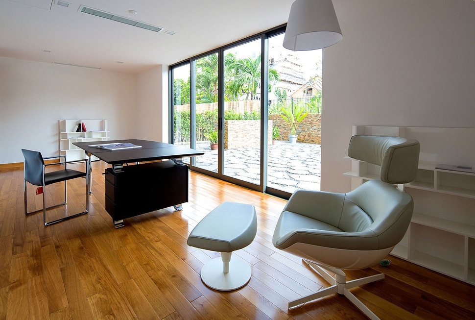
Behind the kitchen is the homeowner’s office. Privately situated away from the social zone, the homeowner is still just a few feet away from any and all acitivities whether through the hallway that connects it to the social zone or through the patio doors that lead around the corner to the pool.

The hallway to the office is narrow and discreet while the stairwell up to the family room is part of the overall geometry and aesthetic of the space. The shadows of the glazings mulleins create a repeat pattern that meets up with the stairwell and continues upward.
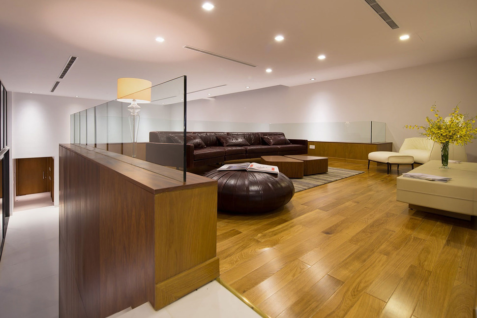
The family room leaves the white floors behind in favour of mid-tone wood planks. Glass panels line the pony walls for safety while still offering views down to the social zone and pool terrace below. The ceiling of the family room is continuous to the social zone continuing the minimalist aesthetic.
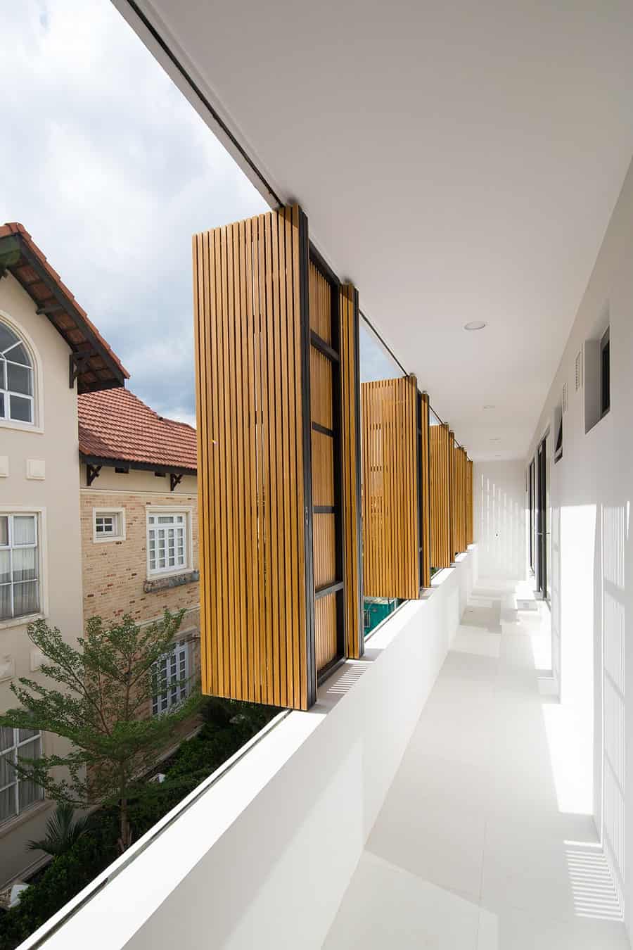
The second floor decks are all fitted with bamboo slats that can be opened wide or closed up tight. The slats keep the air flowing through the space while offering both privacy and shelter from the weather.
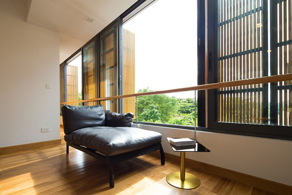
The bamboo slats continue past the deck along the windows of the Master Bedroom for a continuous – and functional – visual. While the Master Bedroom has a door that leads to the long and narrow deck, it retains privacy by otherwise being separate from it.
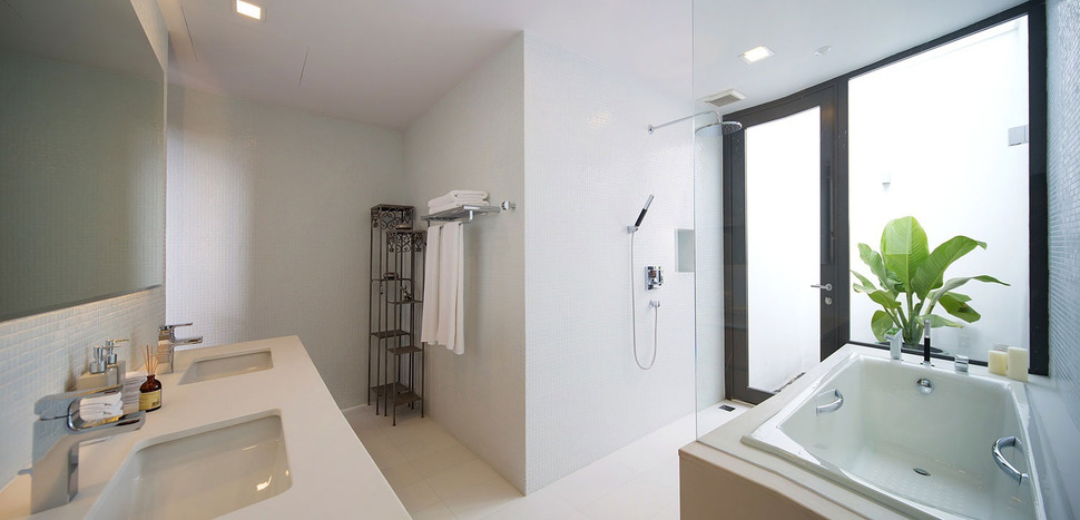
The ensuite to the Master Suite takes on an “L” shape with the tub and shower on one arm of the L and the double vanity on the other. The shower zone takes advantage of the floor area next to the tub and a doorway behind it leads to a private roof garden.
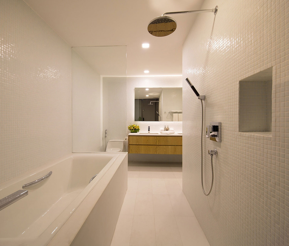
Although the ensuite is almost all white, the addition of white mosaics on the wall and white tiles on the floor keeps the space intriguing.
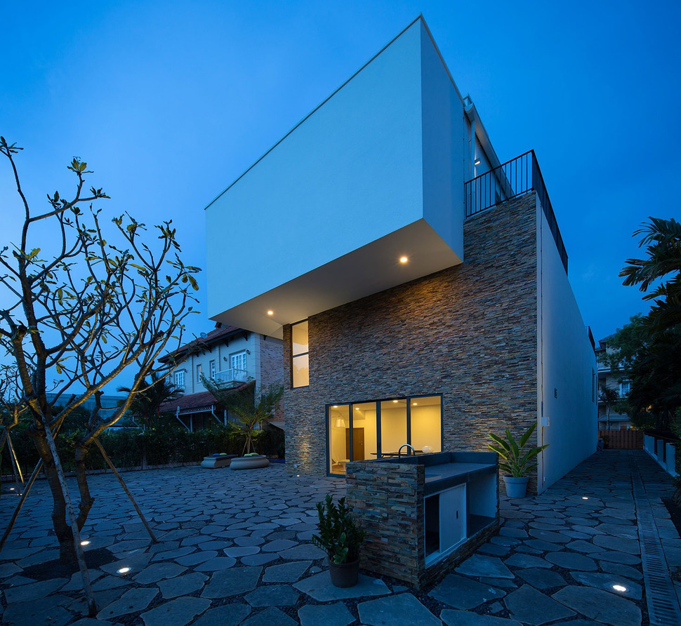
Although the Master Bedroom is separated from the long deck overlooking the pool, it does have its own private deck on the other side accessed through a hallway as well as a private enclosed garden just outside the ensuite. While the deck is visually part of the lower cube, the bedroom is definitely part of the upper cube. The barbeque station just outside the office represents a third cube.
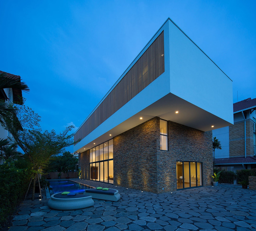
As an absolute contrast to all the linear lines used throughout the home, the architects chose a round seating unit cut in half to form two semi-circles. These fun loungers while curvy are also still geometric.
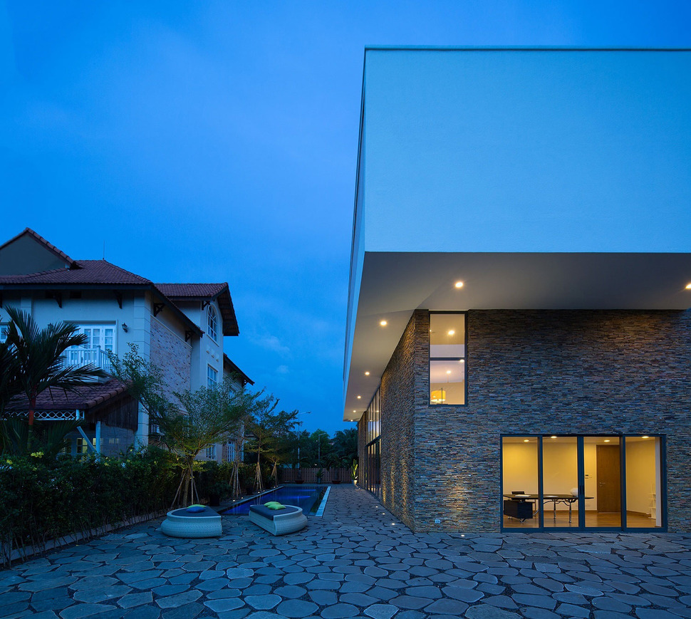
The concrete pavers used on the deck appear to be curvy as well but are actually made with straight lines that have curving in the corners only.
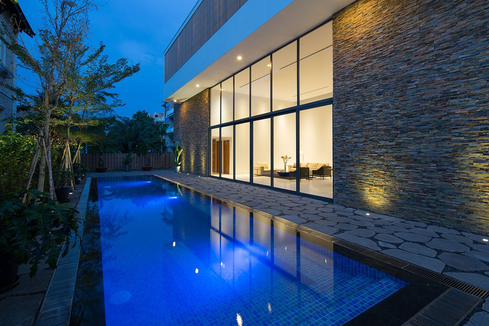
The pavers offer a large repeating pattern against the mini subways within the pool and the stacked ledgestone on the wall. While the paver pattern is big, the mullion pattern within the windows is still larger.
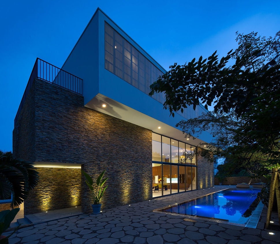
The multiple patterns incorporated into the choice of materials only enhances the rectangular shape of the pool and the two cubes of the building itself
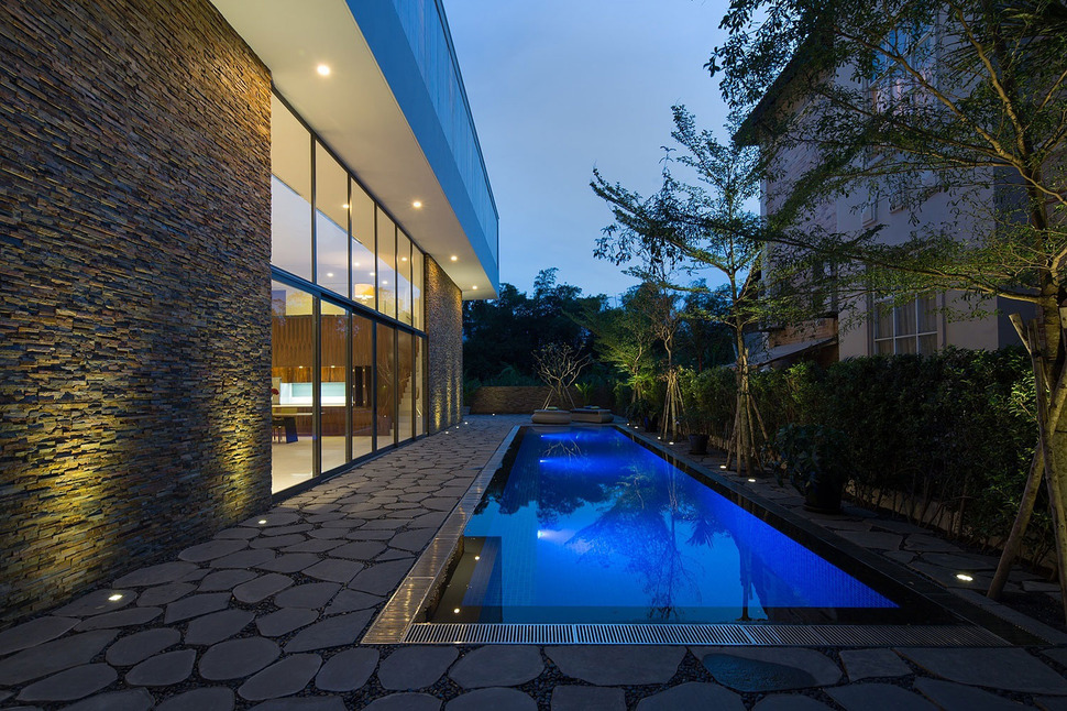
While the landscaping does not add to the geometry it does create its own repeating elements within the trees and the hedging while at the same time offering a buffer to the building next door.
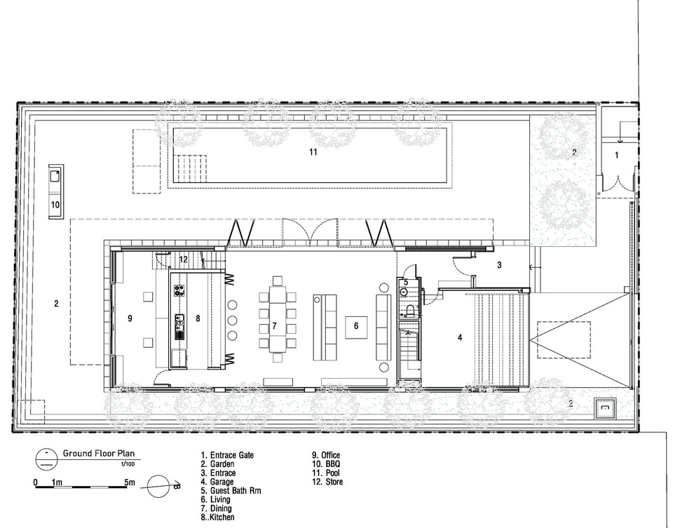
Entry to the ground floor is either through the garage or through a gate next to the garage. Both locations lead to the main entrance to the social zone or to a staircase that leads to the upper levels.
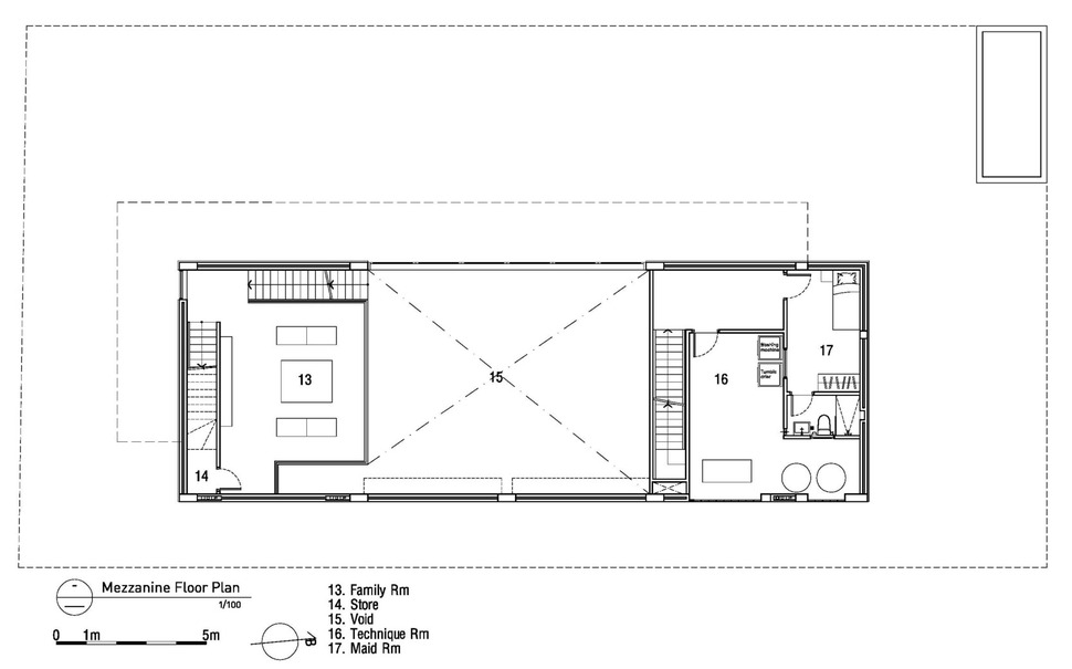
The stairs in the entryway lead up to a bonus space above the garage with its own bedroom, bathroom and study area. Next to it is the double volume social zone and next to that is the family room above the kitchen and office. The family room is accessed by the stairwell next to the kitchen and a second stairwell continues up to the upper floor of the home.
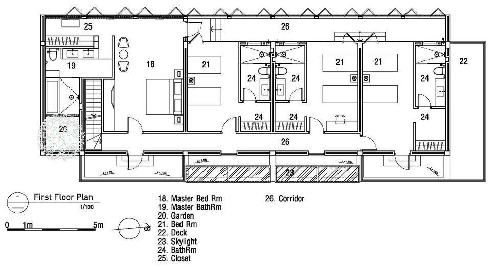
The upper floor features a Master Suite and three additional bedrooms all accessed via a long hallway running the length of the home starting from the family room stairwell and ending at the fourth bedroom. The fourth bedroom has its own private deck as does the Master Bedroom. All four bedrooms access the deck that overlooks the pool and each bedroom has its own bathroom.
MimA NYstudio
Real Architecture
Photography by Qa
