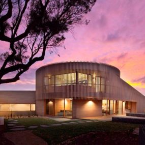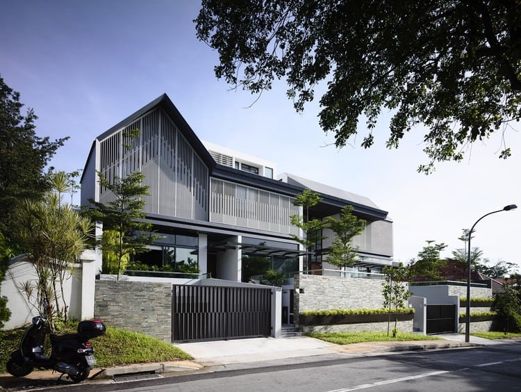
Built for a couple in Singapore, this sprawling house contains two different residences in one architectural package. Designed by A D Lab, the design features a tall master dwelling for the couple that owns the property, as well as a separate semi-detached wing for their grown son. The same piece of property once housed a more traditional family home which this new building replaced, and the residents wished for the design of their new home to reflect the general shape of the previous residence. To that end, a steeply angled suburban roofline soars over the living room of the double abode’s main wing, mimicking the shape of the house that came before it. Additionally, slatted vertical latticework takes the place of conventional siding while giving an artistic, warm touch to the home’s exterior.
The overall layout of the double house is designed with privacy in mind, since parents and child lead different lives now. While a central corridor and shared outdoor space allows the family to unite easily, their two places of living are kept completely structurally separate. Though it may appear from afar that the entire complex is a single building, the apartment on the right side is actually its own entirely separate house, joined only by decorative elements and a common design theme. Inside, each of the two sections has its own living room, kitchen, dining room, and private spaces. At the same time, however, the two dwellings are inexorably linked to one another, keeping the sense of family alive and allowing each of those living within to interact without truly “living” together. It’s a masterful modern design compromise which allows the homeowners’ son to pursue his own life as a young professional while keeping close to the heart of home.
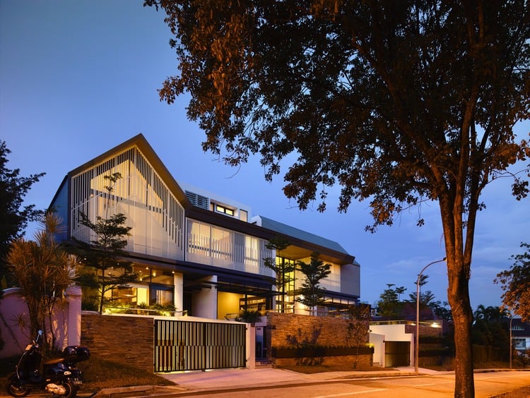
The impressive two-in-one house for parents and their grown son is inspired in part by the overall shape of an aging but much-loved suburban bungalow which once occupied the property and played host to the family’s growth over the years. The need for modern amenities and a separate space for the homeowners’ child, however, led to this striking clean-sheet design.
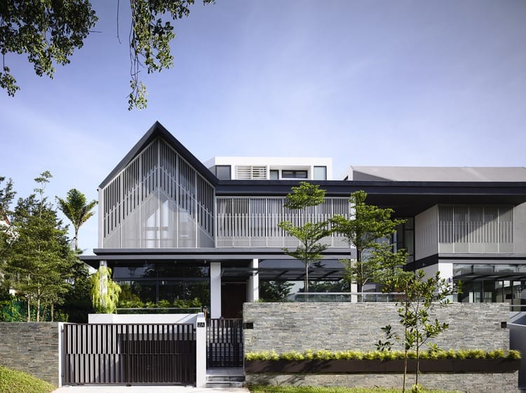
A commanding theme of the exterior finish of the dwelling, especially this left half, is the use of vertical patterns to create a sense of height, invoke visual interest, and to obscure the public’s view inward. Additionally, a double band of metal runs along the side of each wing of the house dividing their first and second levels.
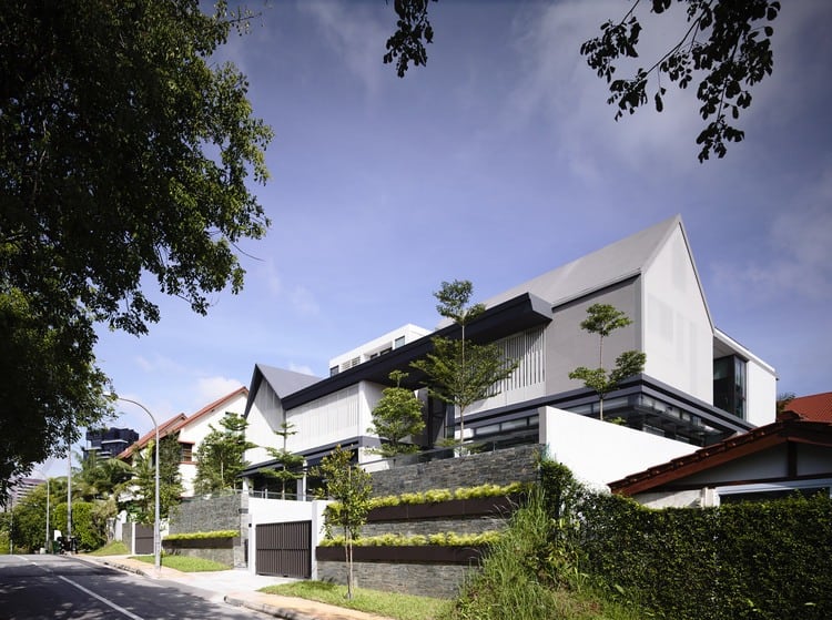
Though it appears almost gargantuan from certain angles, each room inside this dual home is packaged perfectly to preserve spatial integrity and intimacy while also emphasizing openness and contemporary cues. Taken alone, neither of the two houses within are actually as large as they might initially appear to be in combination.
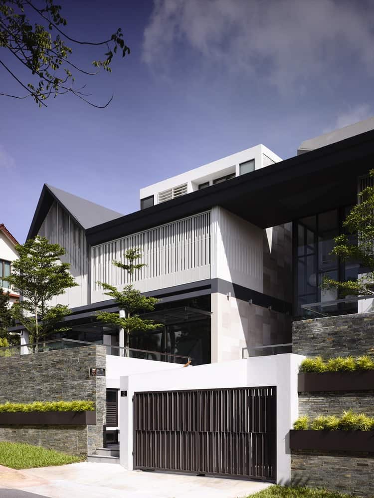
The two-story right side apartment has its own two-car garage and entry path, helping to enhance the autonomous nature of each portion of the residence.
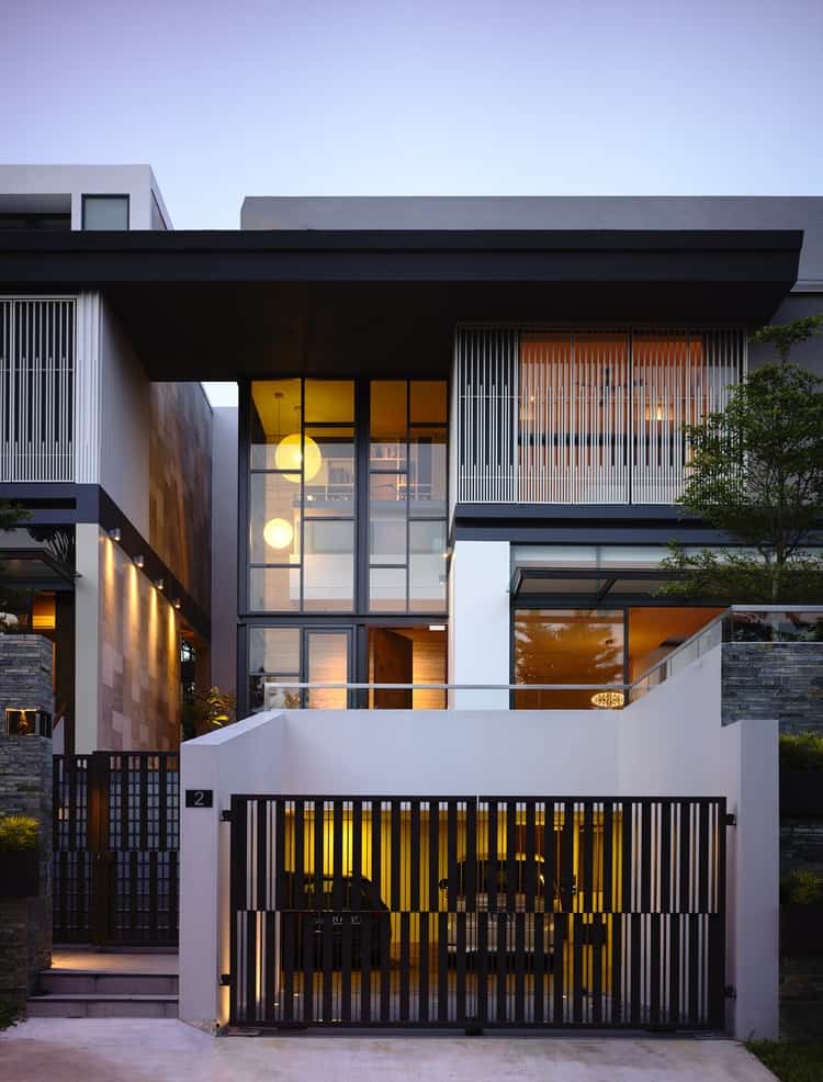
The apartment utilizes darker exterior tones in combination with more unhindered glass space on its upper floors to present a slightly different take on modern residential architecture, less inspired by the shape of a traditional bungalow than the other half of the complex.
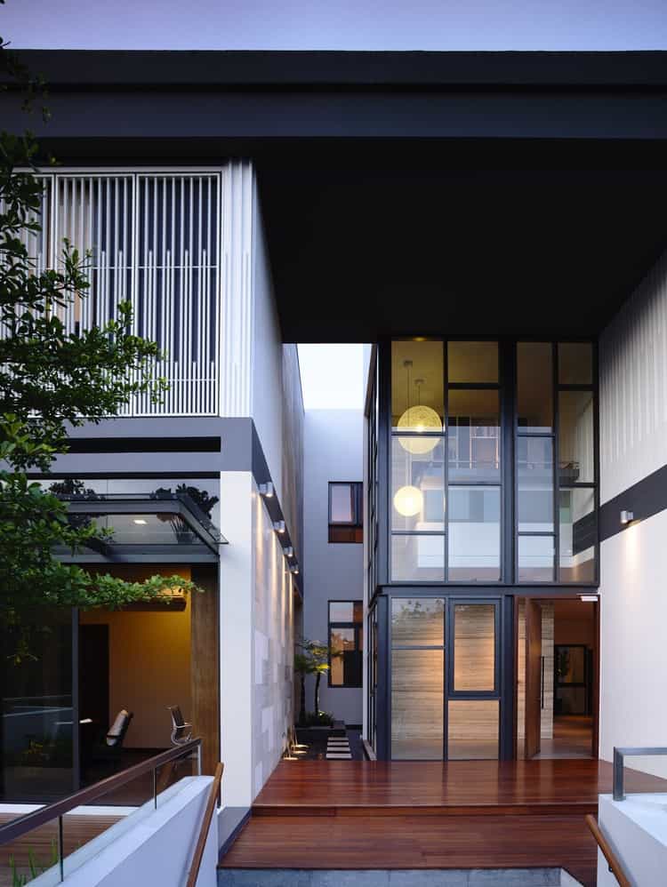
The parents’ and son’s homes are truly kept separate from one another even in such close quarters and within the same design, with a wood-plank pathway carved between the two and a break in the rooftop overhead. The wings are completely different structures, interlinked by a common style and various details of the design.
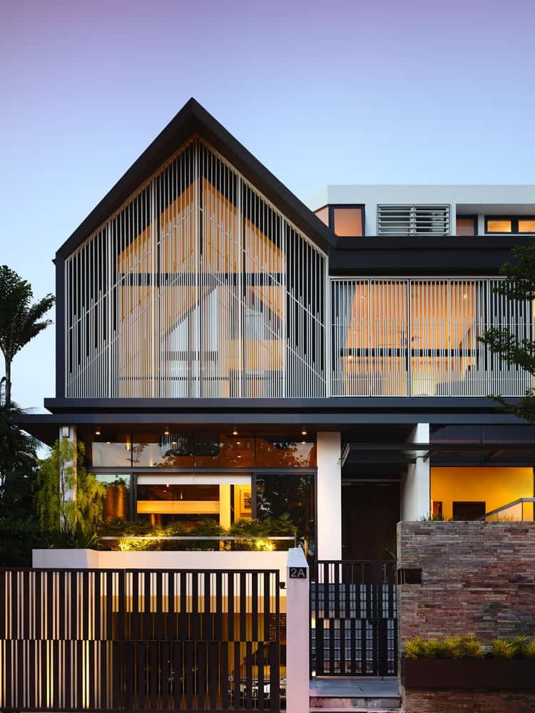
The peak of the roof and the patterns covering the windows of the preeminent portion of the home almost suggest the architecture of a church, echoing architectural traditions which are thousands of years old.
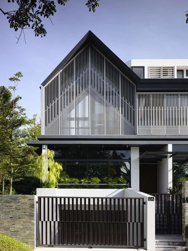
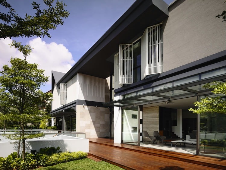
Elevated one level from the street, a short and wide front lawn is hidden from the view of passers-by. The greenery terminates at a deck which runs along the entire length of the home, giving the main house and the apartment their own separate lawns on either side of the entry staircase.
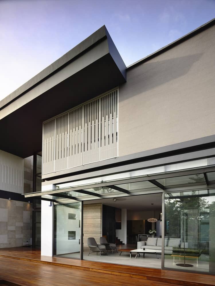
The roofline of the taller principal portion of the home continues across the divide to end partway through the profile of the son’s more compact residence, linking the two while making clear which portion is the most significant. The latticework from the windows of the main portion continue here in part as well.
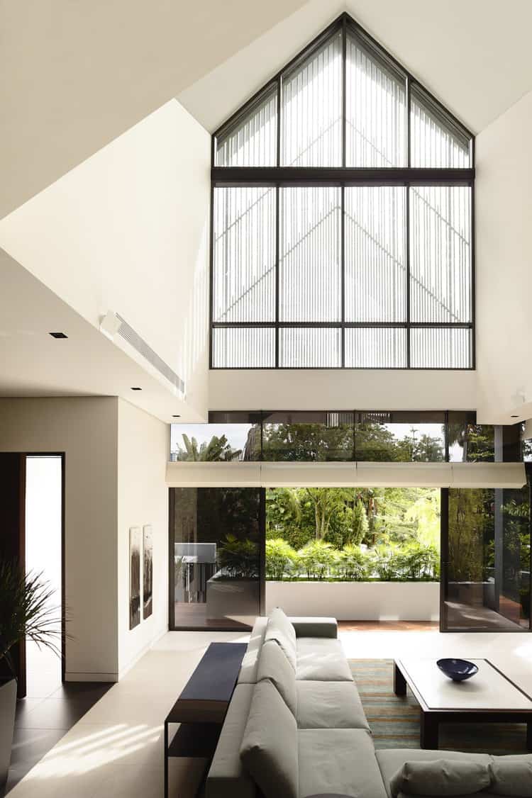
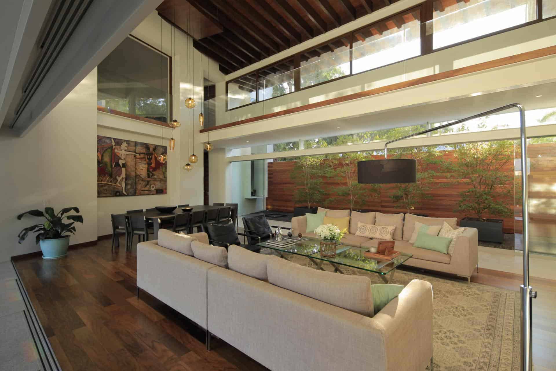
Inside the first and largest section of the house, which contains the major living spaces of its owners, the living room is the tallest room in the whole complex, reaching nearly three stories high. From inside, you can tell that the large window above this living space isn’t a single surface, but is constructed of twelve separate glass sections.
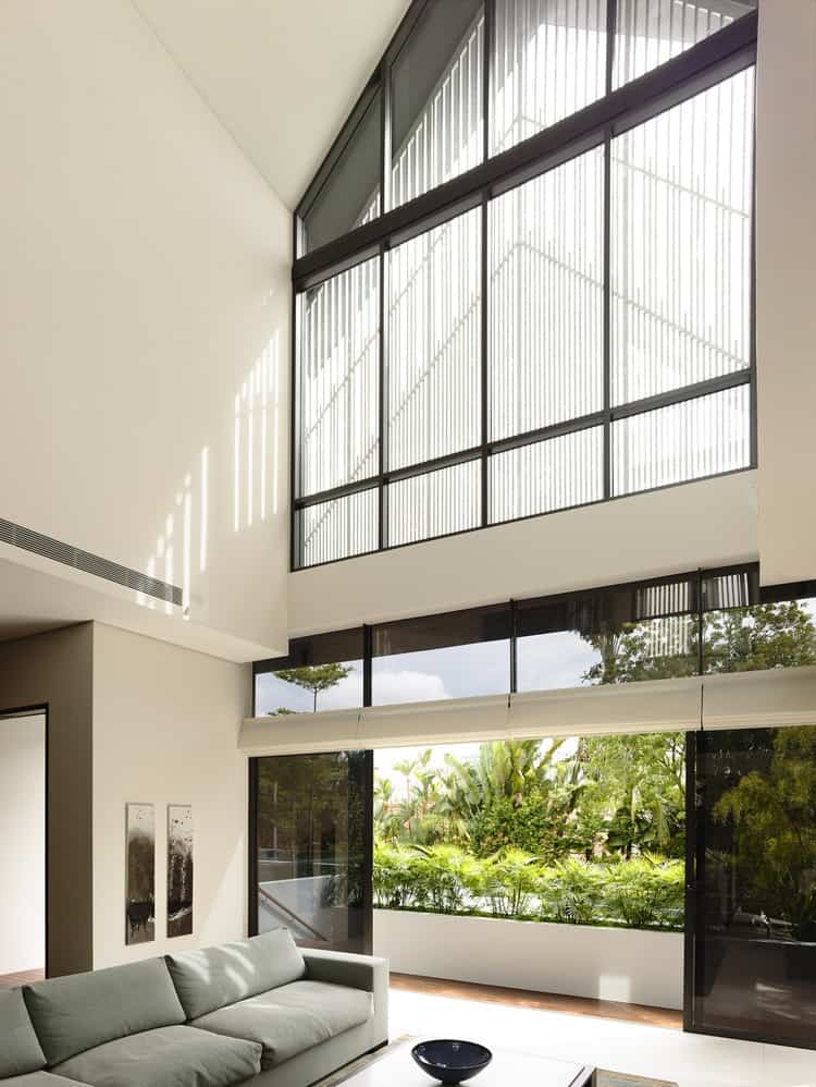
While the big cathedral-style windows above the room fill it with most of its natural light, their decorative panes keep those dwelling within from seeing what’s beyond. For that job, a set of sliding glass doors and windows on ground level let anyone in the living room survey the street.
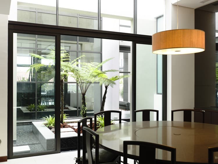
Near the split between the two interlocked residences, window walls provide a view between each section inside public rooms. Here, the master wing’s dining table looks across some ornamental plant life and into the kitchen of the homeowners’ son.
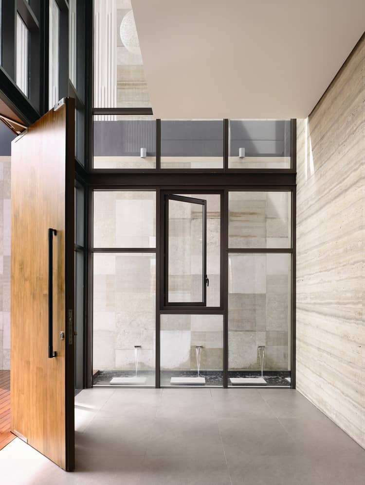
The second portion of the house makes great use of stone textures for accent walls on its two levels, with wood portions used to soften and warm the decor.
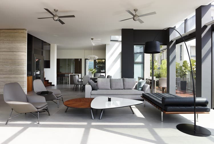
The bottom floor of the home’s second wing is fairly open in structure, but retains some wall boundaries at its center to help define the edges of each space within. Most of the furniture is made up of modernized pieces based on midcentury designs, finished mostly in greyscale with touches of wood for accent.
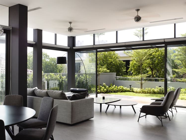
The apartment’s living room leads directly out onto the elevated, walled patio and grass at the front of the property, allowing for the expansion of social space into outside realms.
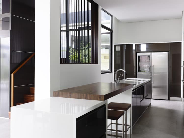
Most of the apartment’s decor is more sleek and glossy than its master home across the way, fitting for a young professional resident. The kitchen’s counter space is divided into three distinct sections, with an elevated wooden bar surface in its middle and storage along one edge.
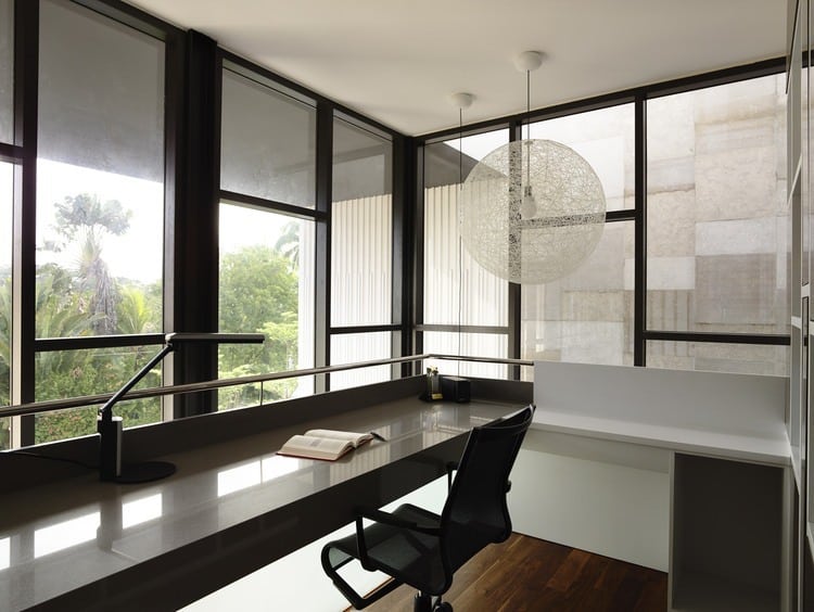
In the upper corner of the apartment wing under a formidable roof overhang, a minimal office space oversees the street below. The slatted window covers can be drawn aside here like shutters, allowing an unhindered view.
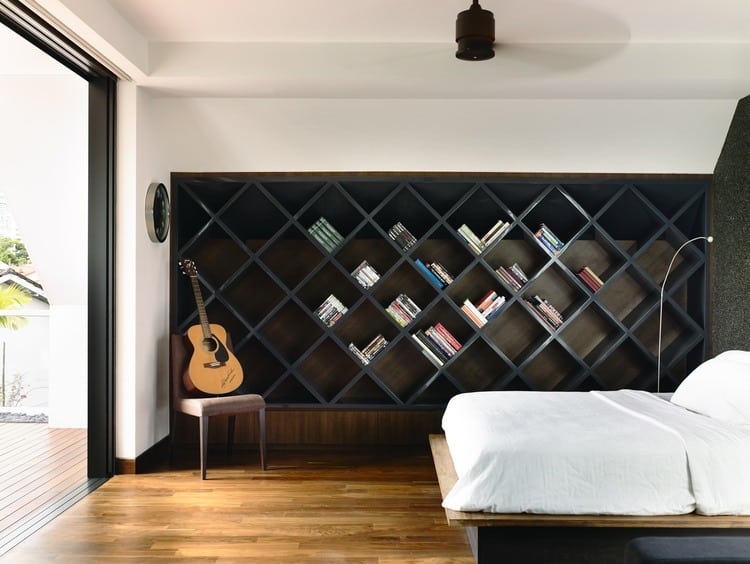
The master bedroom of this portion of the dual dwelling features a built-in bed frame, as well as diagonally organized shelving for books and other storage.
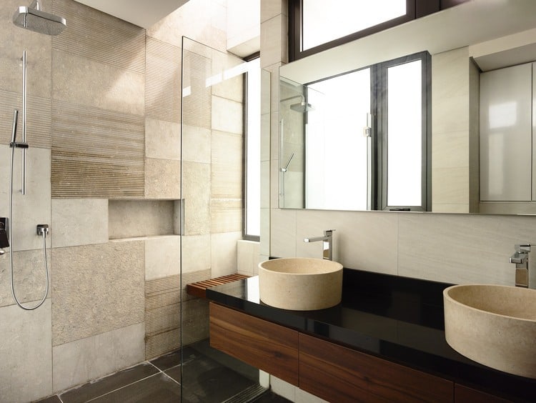
His and hers sinks spring up from the piano black bathroom countertop. The entire room is on the same floor elevation, its shower separated by panes of glass instead of being set apart by a step up or a change in tiling.
A D Lab
