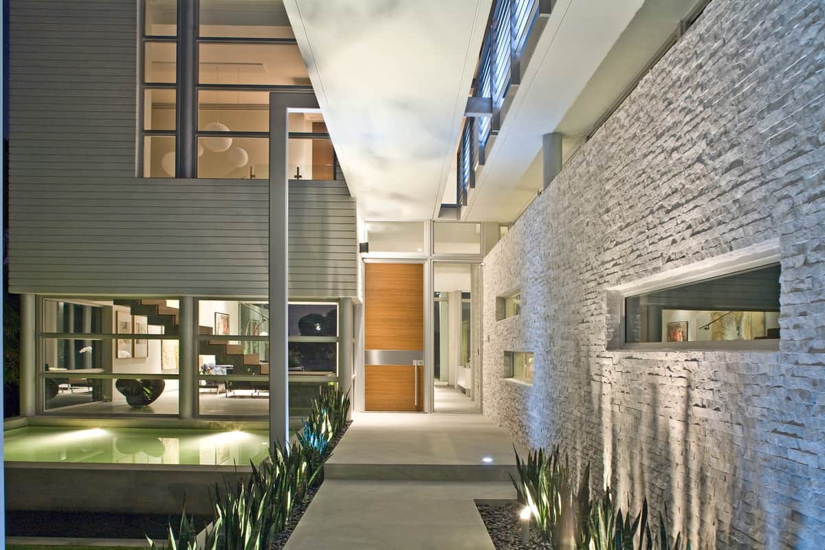
KZ Architecture specializes in modern, resort style private homes and their West Broadview home on the Bay Harbor Islands in Florida is no exception. As with most coastal homes, West Broadview Home focuses on the views of the water and an outdoor lifestyle. But it also features sophisticated architectural details that are as interesting to look at when the home is empty as it is when filled with furniture and accessories. This layering in of unique structural details starts with the front entry.
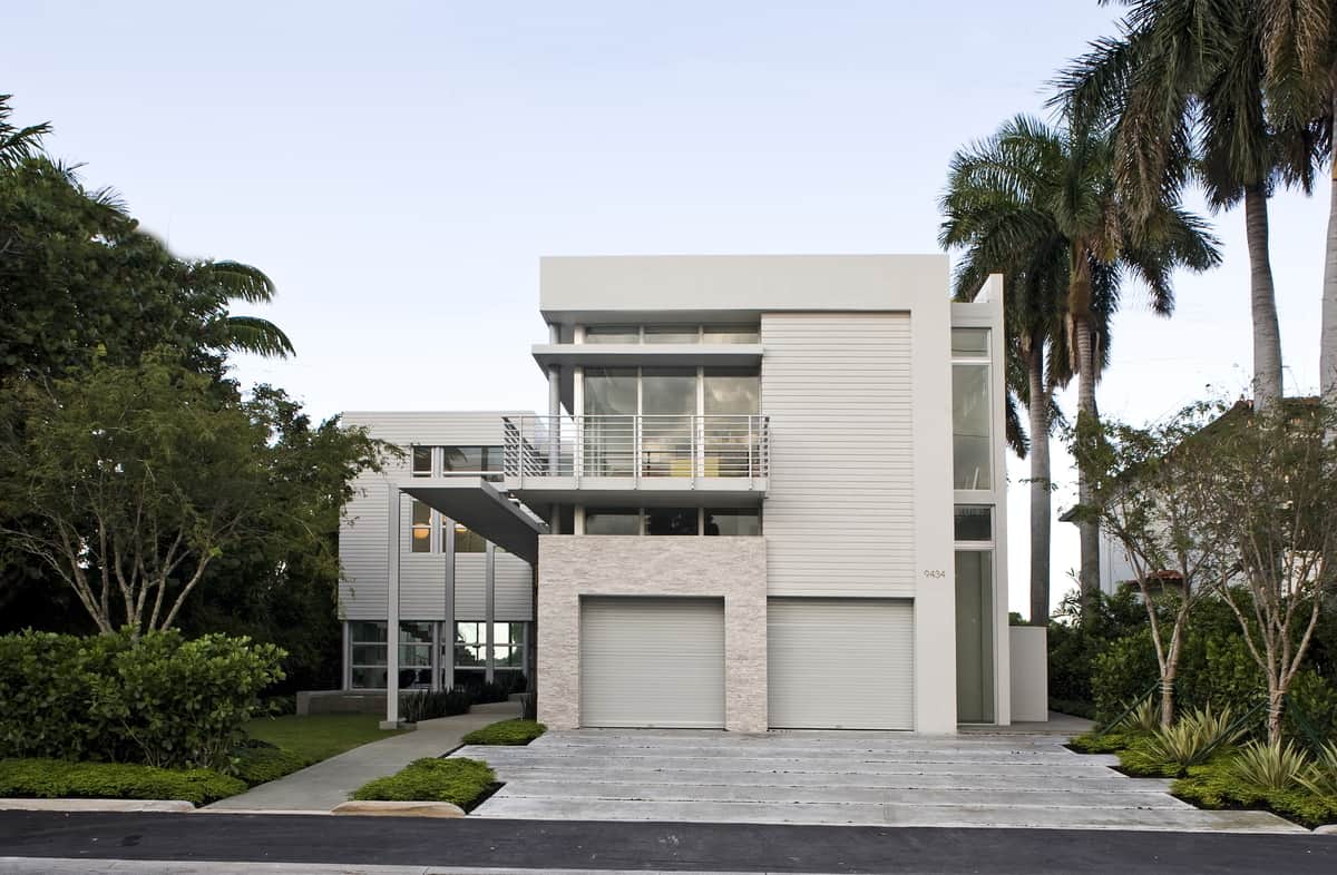
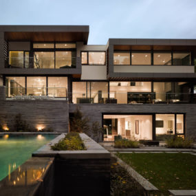
From the road the facade of the home is a geostyle composition of cubes that stagger in and out and side to side beginning with the first garage bay of the 2 car garage.
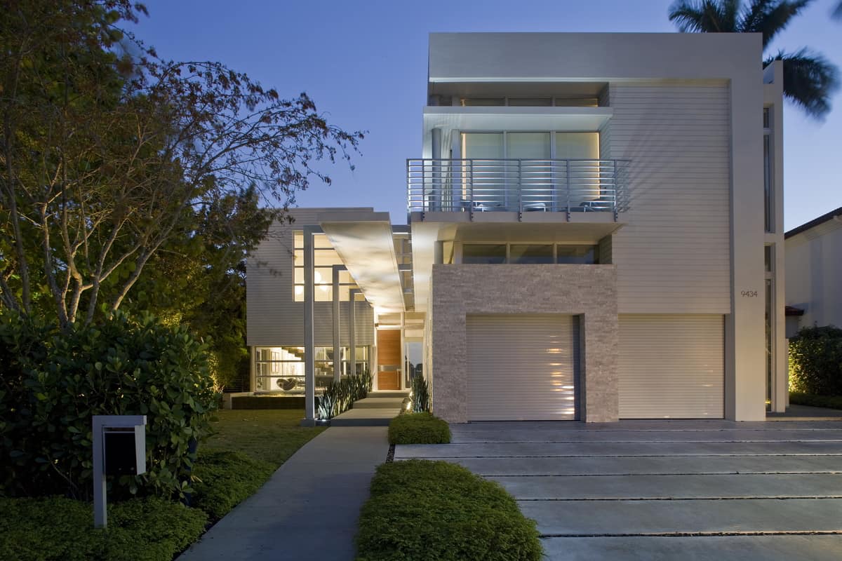
As you leave the street and get closer, the second layer of geometric details takes shape in the form of linear rectangles beginning with the grass grouts within the driveway and the long sidewalk beside it that is sheltered from the sky above by a concrete arbor supported by a row of posts that bend at right angles to merge with and join the two strips of arbor ceiling overhead.
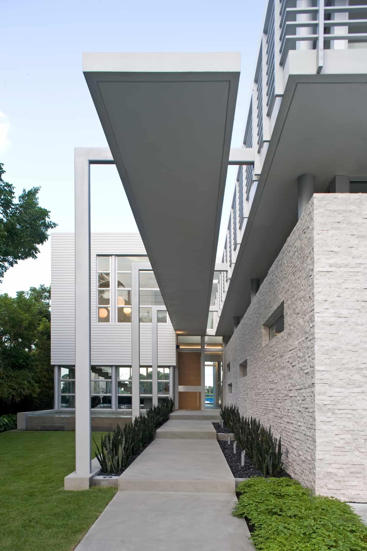
The detail continues to get ever more intricate by including the landscaping and outdoor lighting that flank the sidewalk.
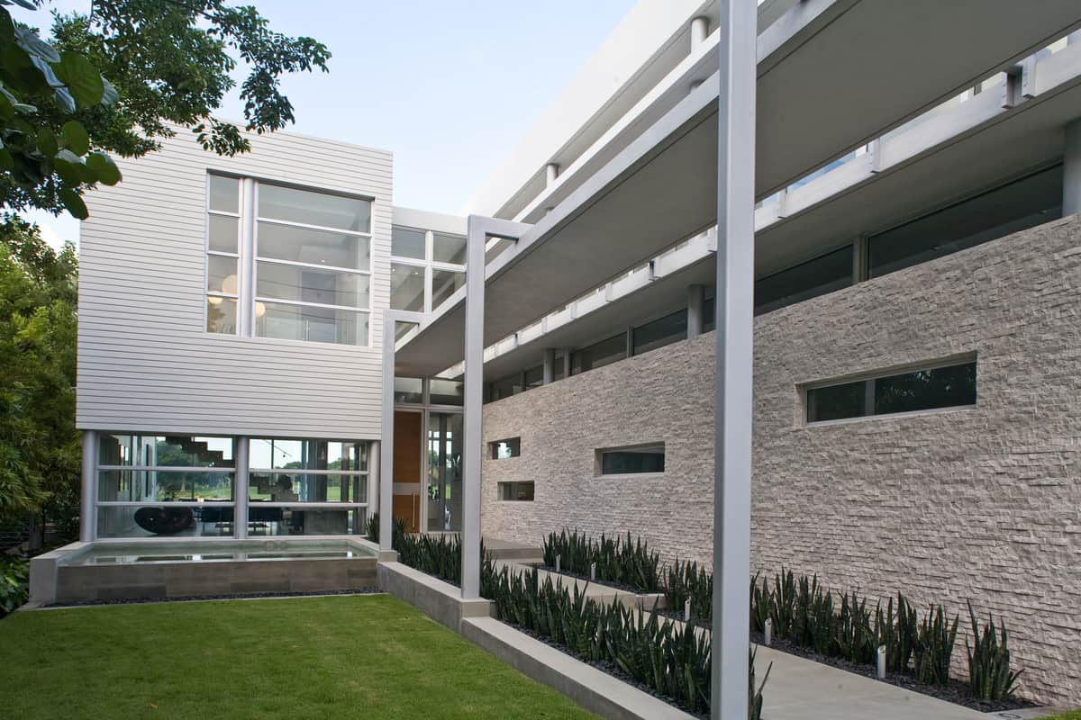
Staggered windows within the side of the carport and kitchen appear random but are purposely staggered ever higher to break up the rigid lines and give the geometry a sense of fluidity.
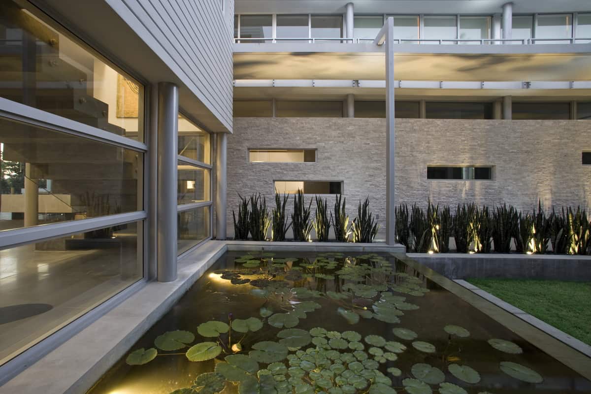
The fluidity turns to liquid within the water feature next to the front entry – how clever.
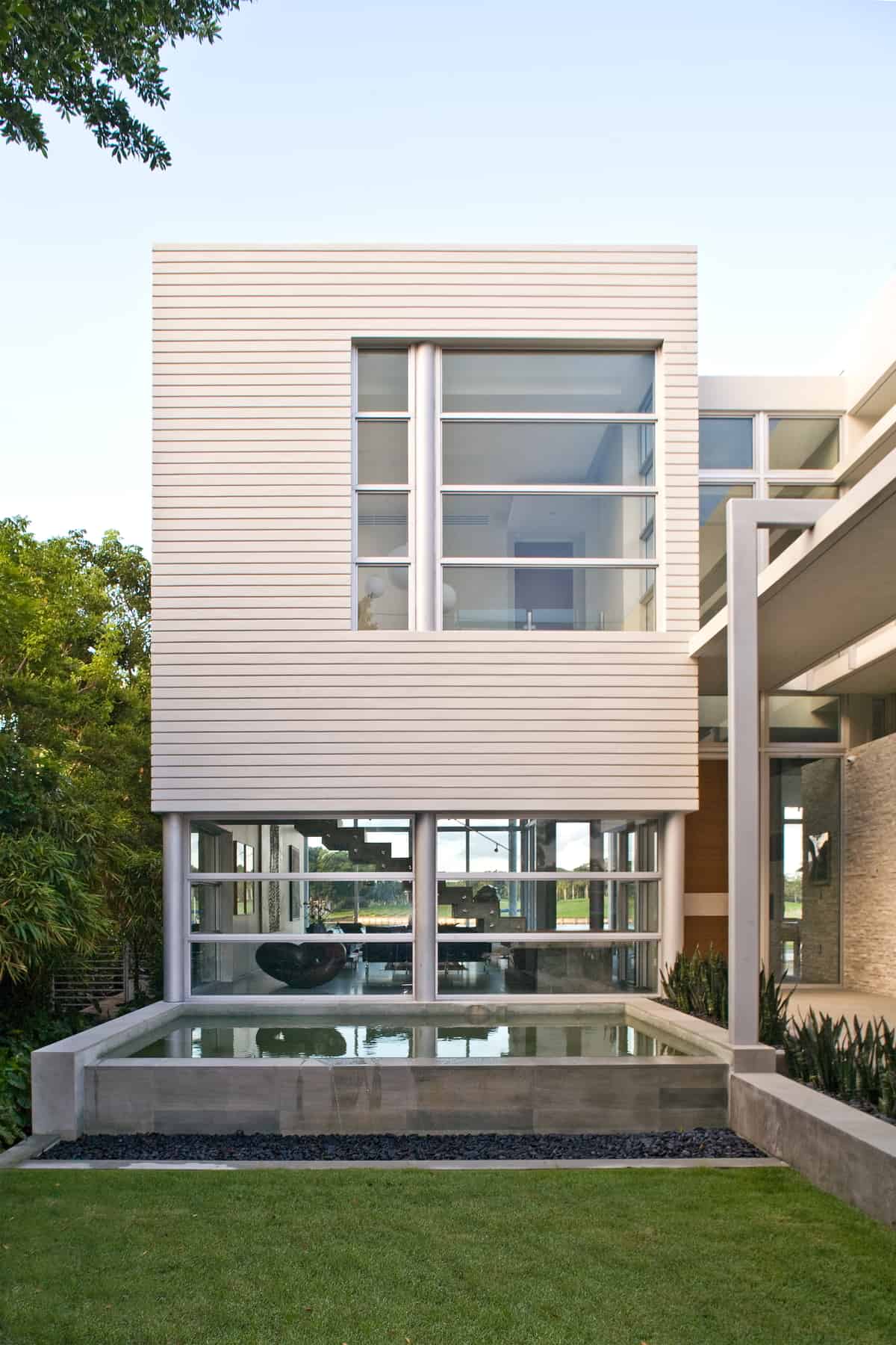
Looking through the home the water feature creates a direct connection with the swimming pool and the harbor on the other side.
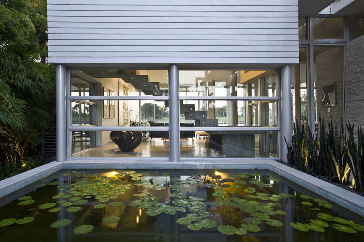
Looking into the water feature the Lilly Pads create a direct connection with the landscaping on either side of the sidewalk and the shrubbery beside it.
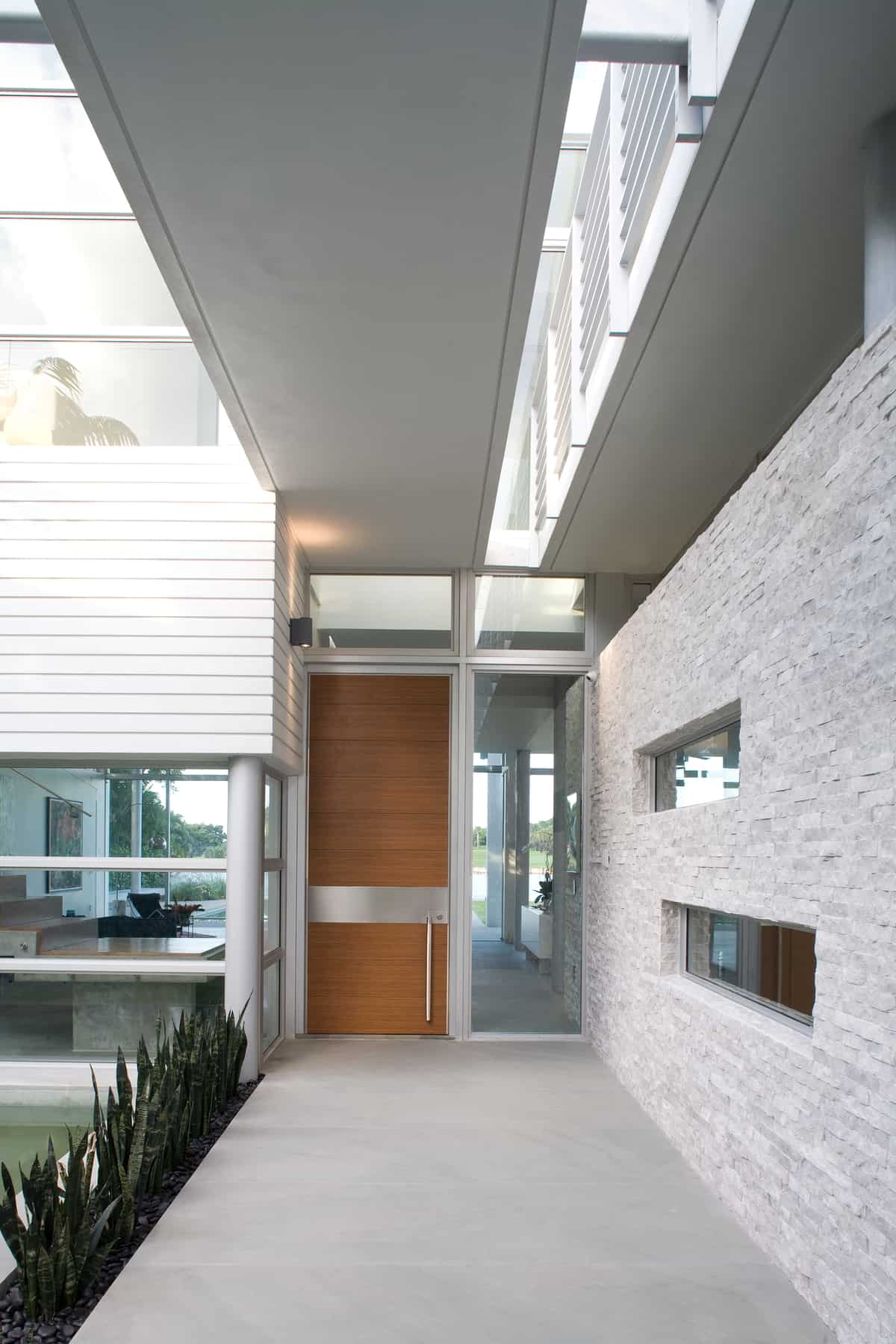
As visually intriguing as all the architectural features are, the focus still remains on the front door thanks to the material choice of warm wood.
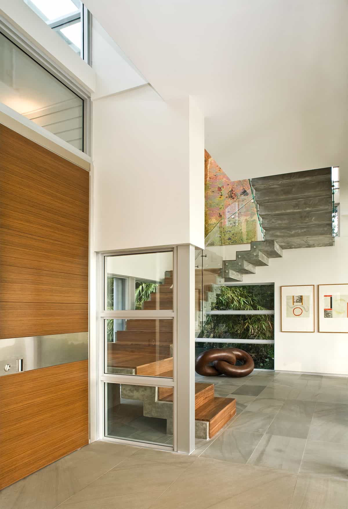
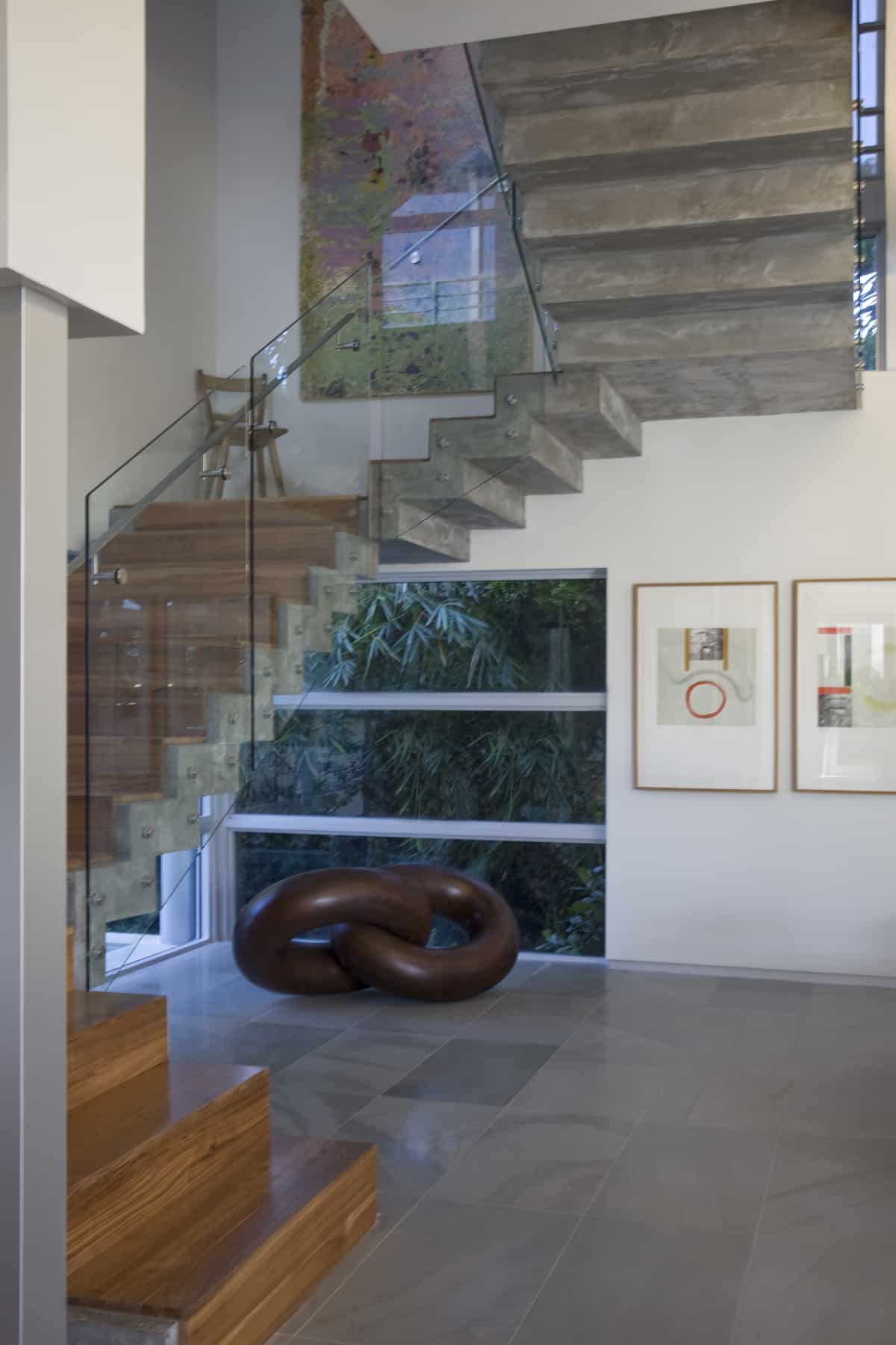
Inside the home the warm wood continues on the front side of the stairwell’s risers and treads. By cladding the stairwell in opposing materials front and back, the structure takes on a fluid form that would otherwise not be there had it been constructed of one material.
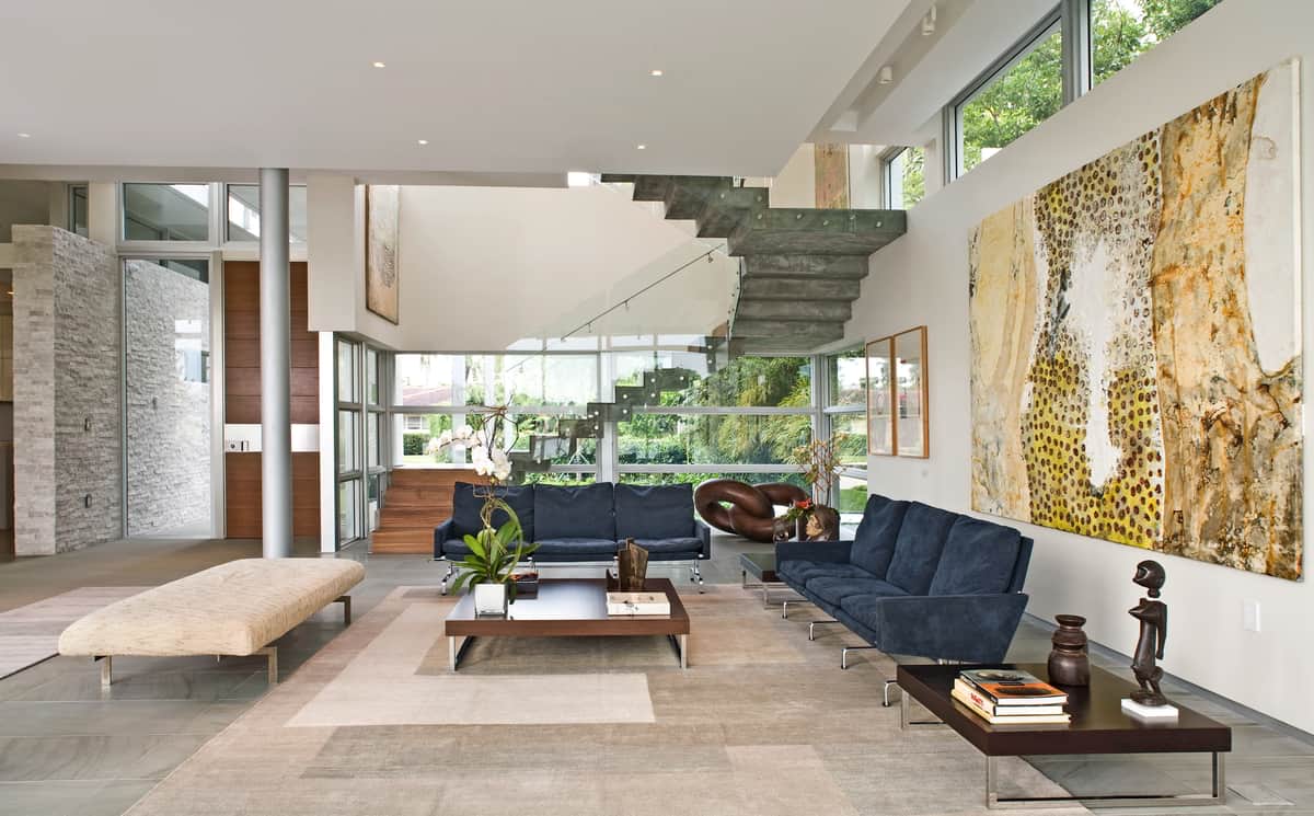
The two opposing materials in the stairwell create a sense of floatation to the top segments that is exaggerated by the clerestory windows running the length of the living room.
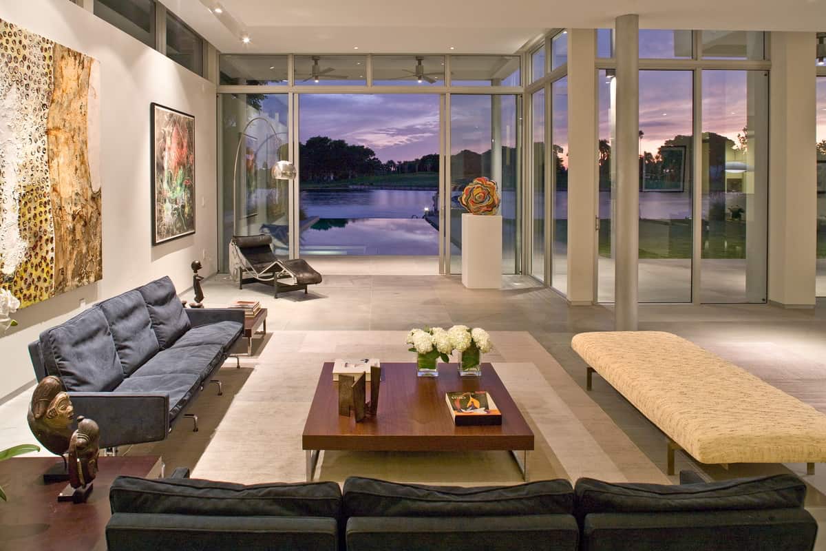
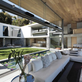
The clerestory windows continue around the back of the living room running over top of the wall of glazings as it zigs and zags to create a small lounge area directly in front of the swimming pool.
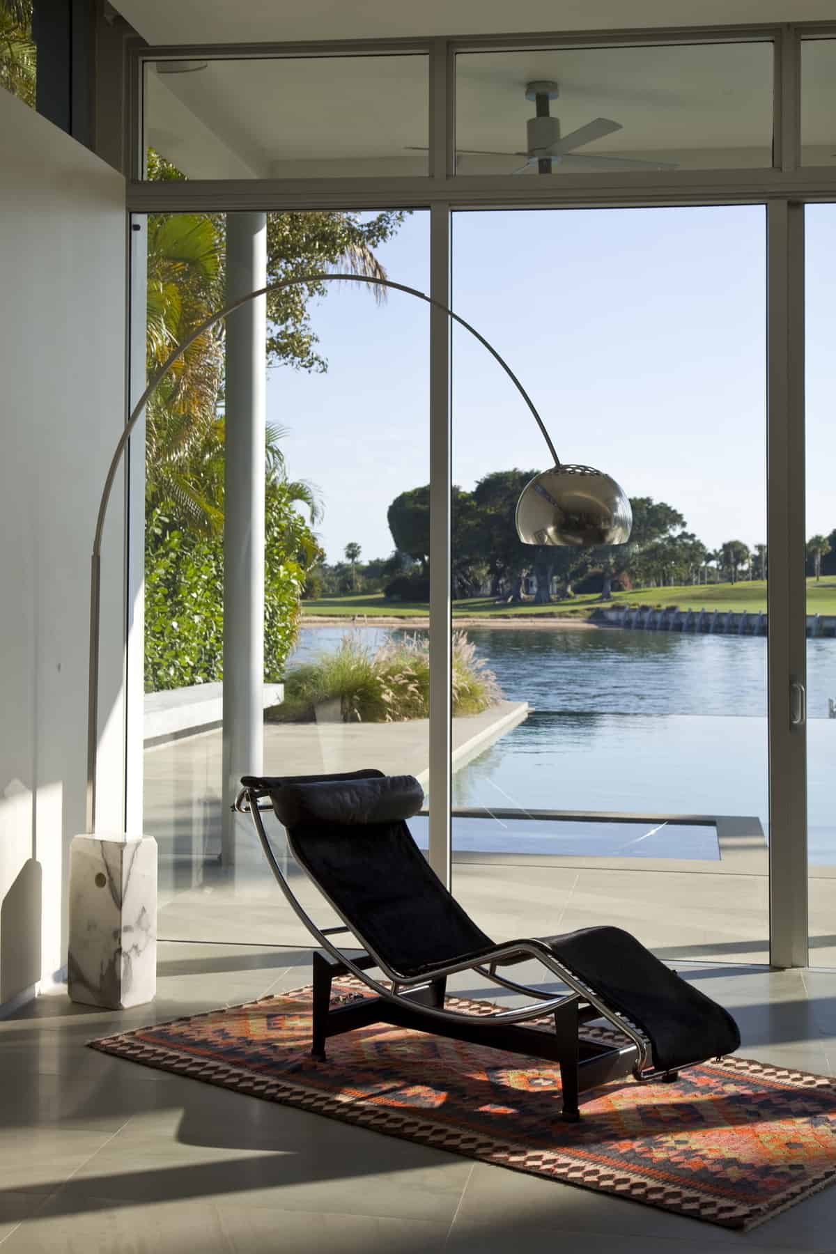
The lounge area features a LC4 Black Le Corbusier for the ultimate in relaxation.
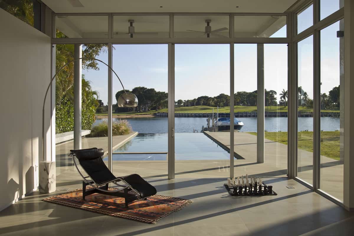
With a view like this one might never want to get up from the lounger.
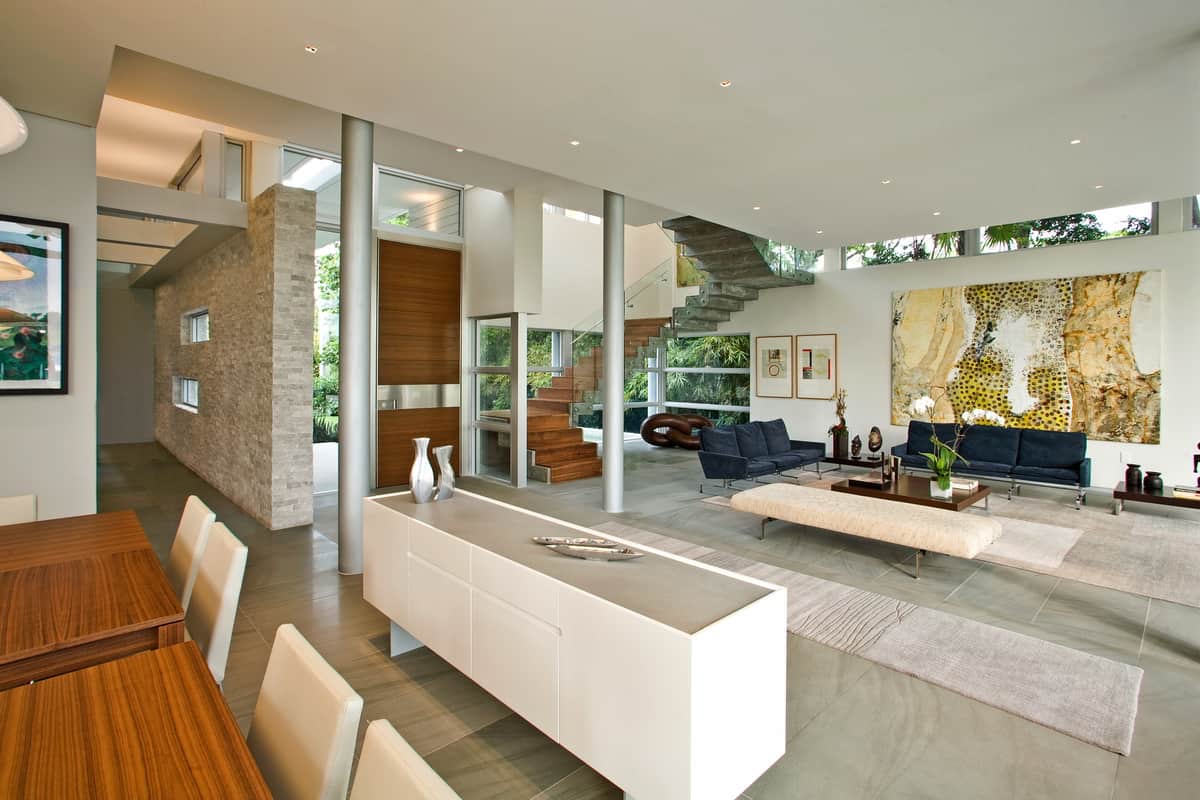
One thing that might get you out of the lounger is hunger and the dining room is right next to the living room with the kitchen in its own separate room behind it.
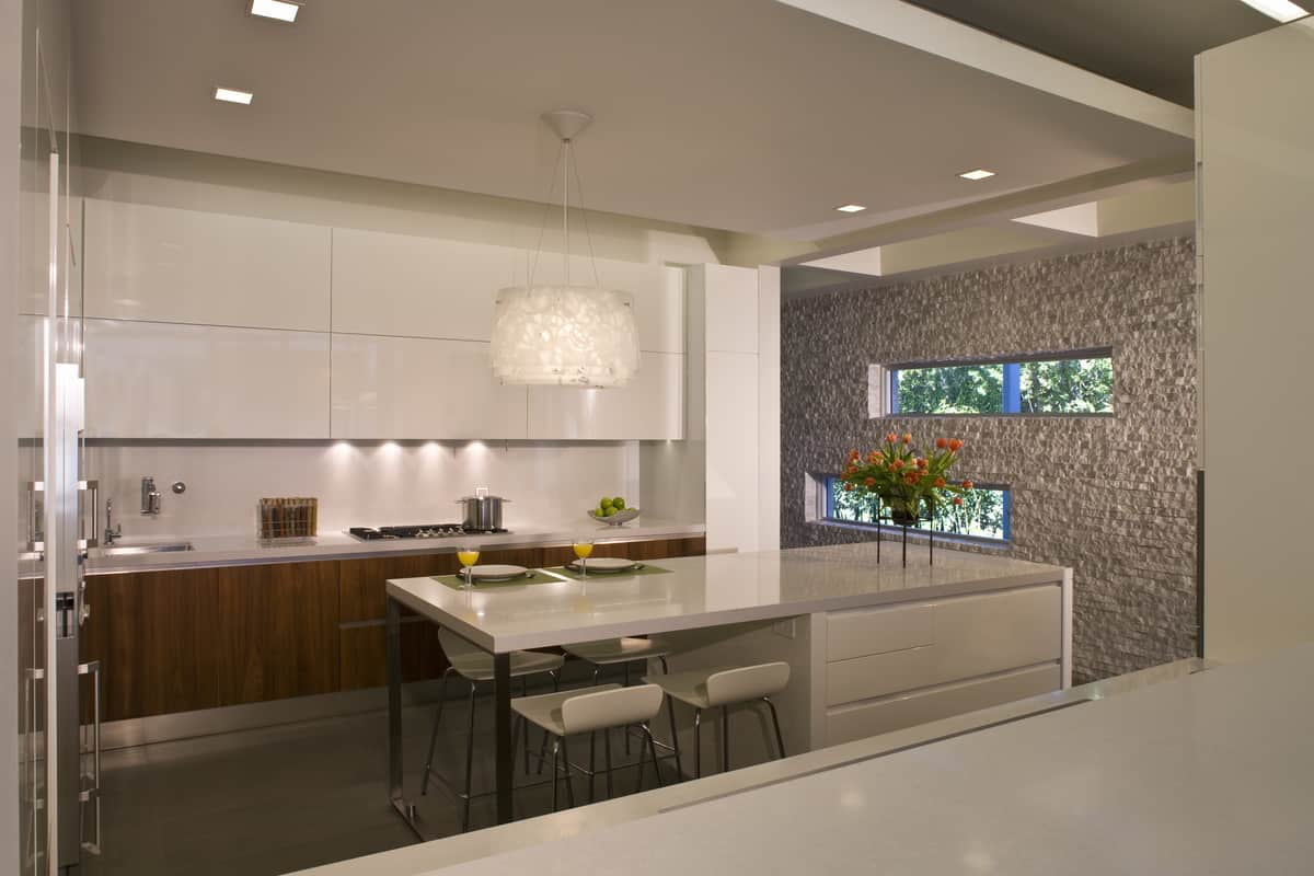
The kitchen showcases two of the long, linear windows that flank the entry sidewalk.
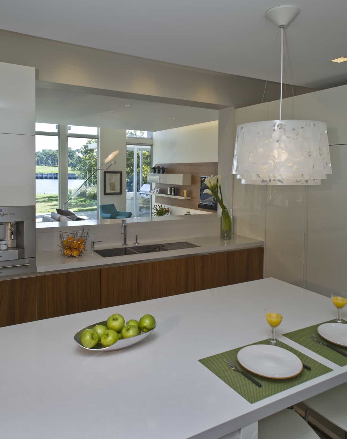
While the kitchen is in its own separate room, the views of the harbor are front and center through the wall void overlooking the dining and family room.
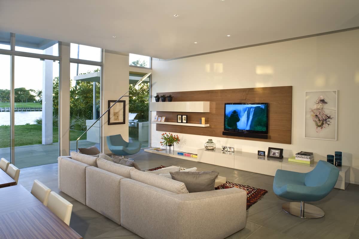
The family room is large and spacious and features a large media center of glossy white cabinetry against a backdrop of midtone wood. The duality of material balances out the steel/wood formation of the stairwell on the other side of the open plan social zone.
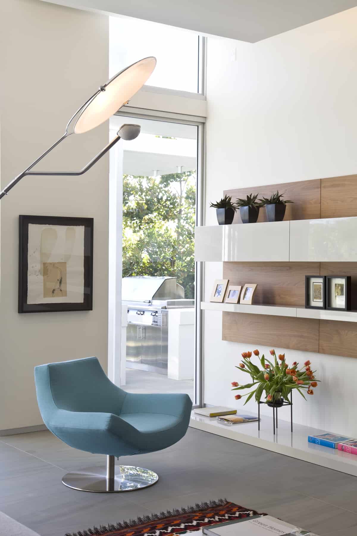
The closed door cabinetry in the media center doubles as open shelving for displaying family photos, small plants, books etc.

We just love the choice of pale blue for the accent chairs – and that floor lamp!

As beautiful as the interior architecture and furnishings are, the backyard really is the place to be.
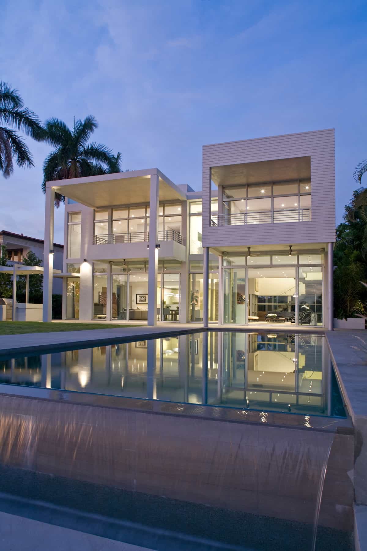
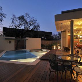
We love how the architects highlighted the asymmetry of the architecture by placing the swimming pool to one side rather then down the middle of the garden.
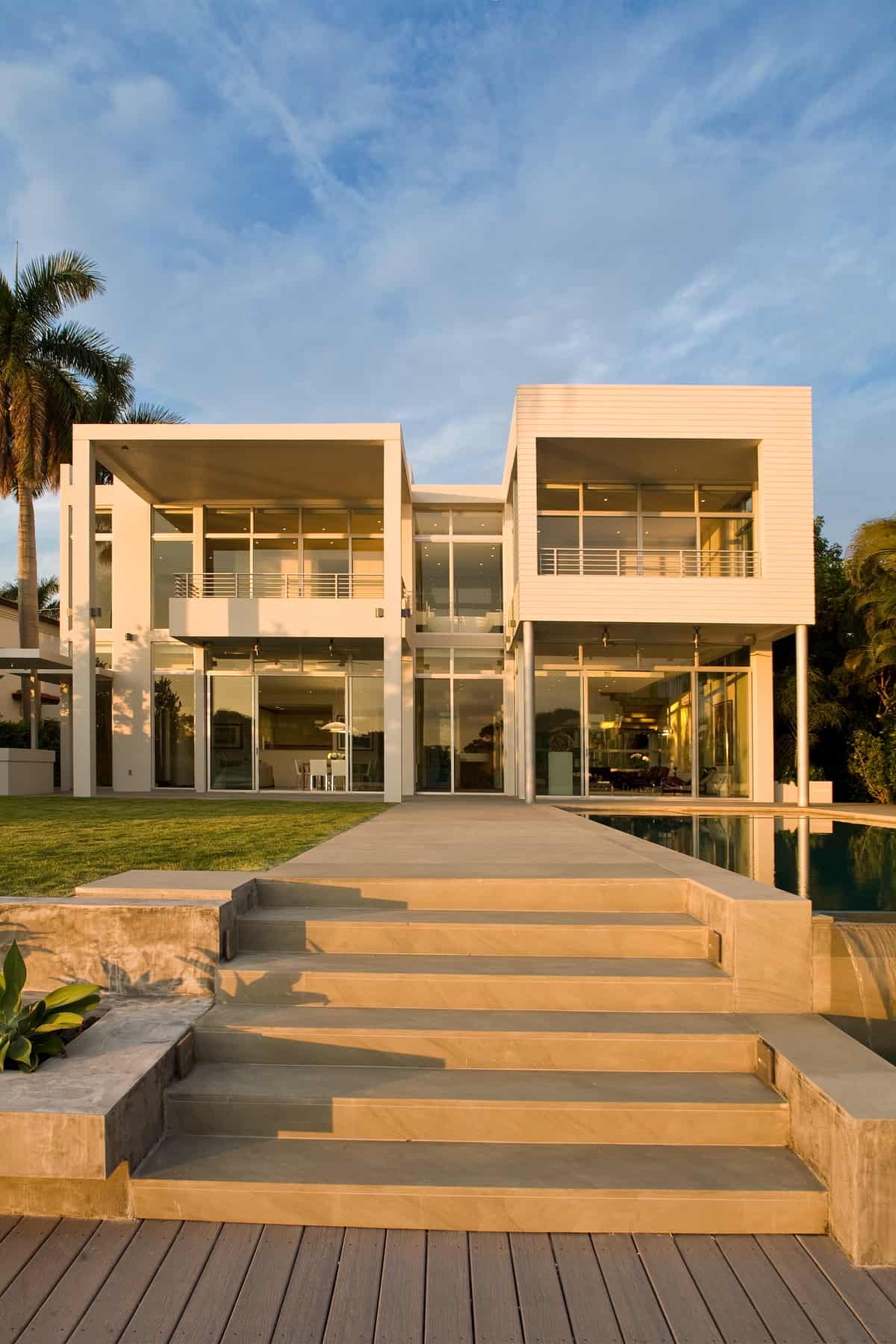
Even so they did do a down the middle detail in the form of a wide pathway that leads to the waters edge. The pathway lines up with the second storey division that separates the master bedroom from the master ensuite.
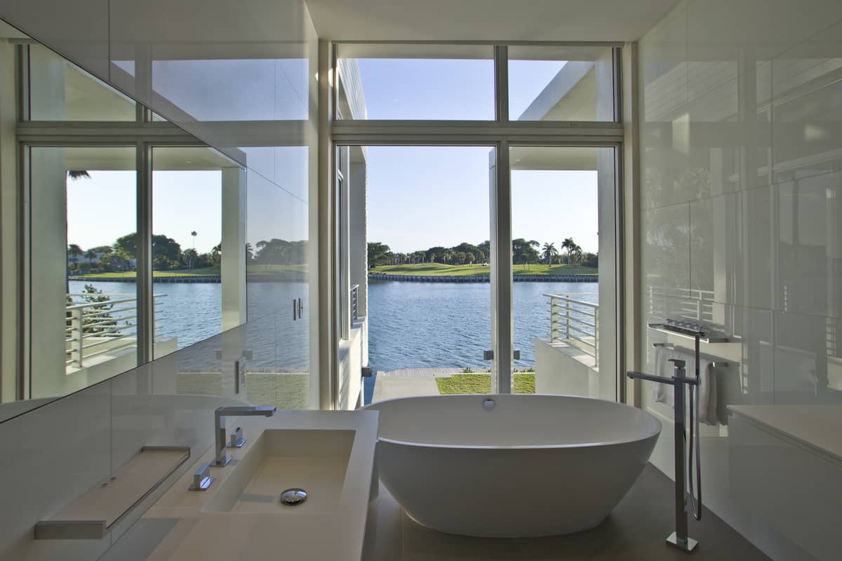
By placing the master suite on the 2nd floor the views can be completely enjoyed while the homeowners maintain their privacy.

This 2nd bathroom doesn’t have harbor views but it does have visual intrigue by way of the mini mosaics that cover the wall behind the vanity.
KZ Architecture
Photography Robin Hill
