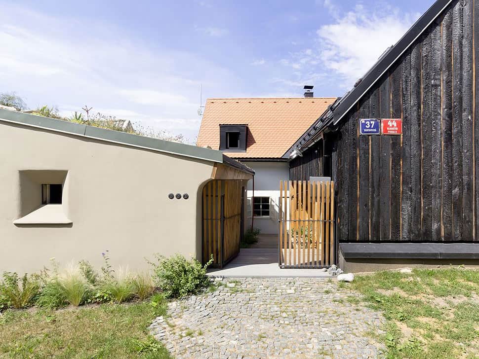
Boasting its original charm and “heart” which dates back 200 years, a village once called “Among Houses” today hosts this unique cottage home by A1 Architects, made by and for the architects, where old meets modern; where live meets work; where the materials and aesthetic of the home respect its differences and marry them in an oddly harmonious design. This microcosm of Prague has retained its distinctive rural character – it’s not even connected to the city’s main infrastructure – so you feel like you’re deep in the countryside while being just a short stroll from the city’s underground station. That’s a bit of a neighborhood tour, which is necessary to understand the home’s design. The original homes were characterized by their plaster walls, gabled roofs and thick stone and brick walls – features that A1 Architects wished to leave intact in their new design for living and working. Here’s how the layering of this historic-made-modern house came together.
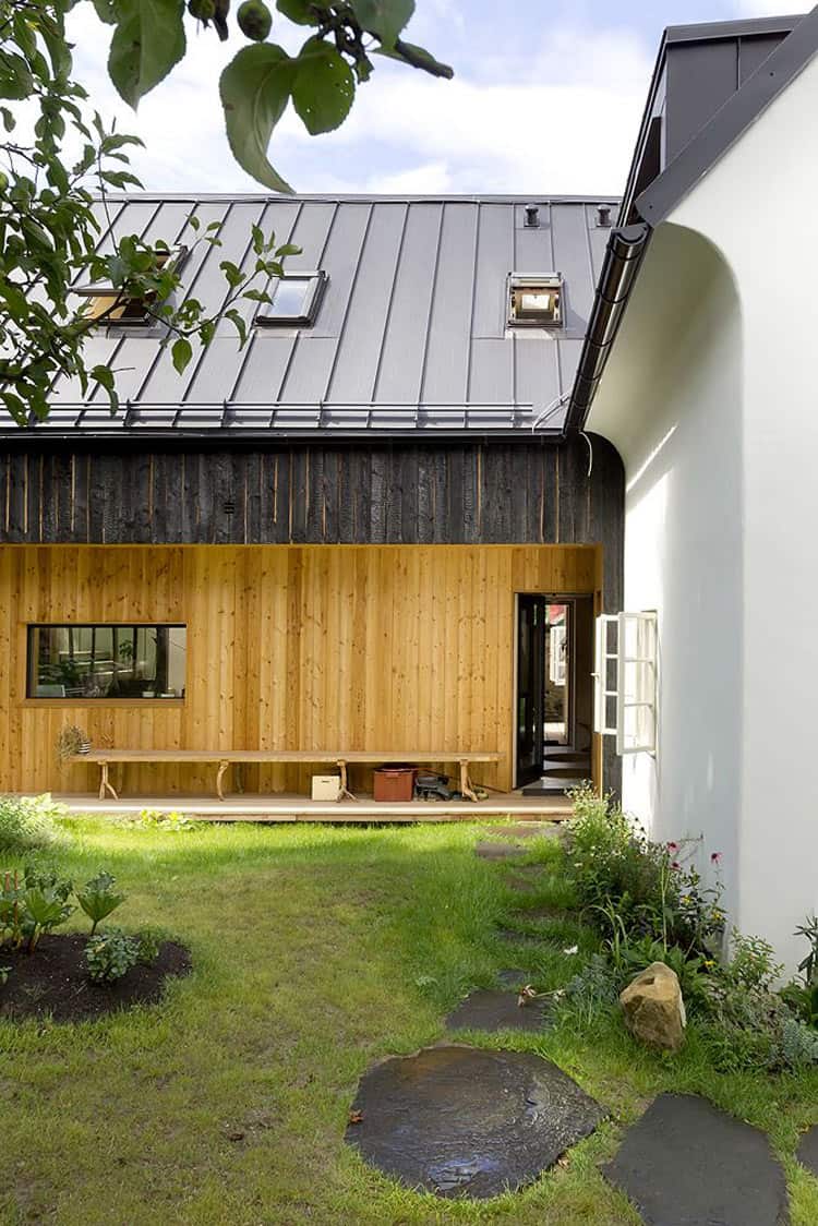
The historic stone and plaster home artfully meets the new, featuring a timber structure with a black charred facade, topped with a metal gabled roof.
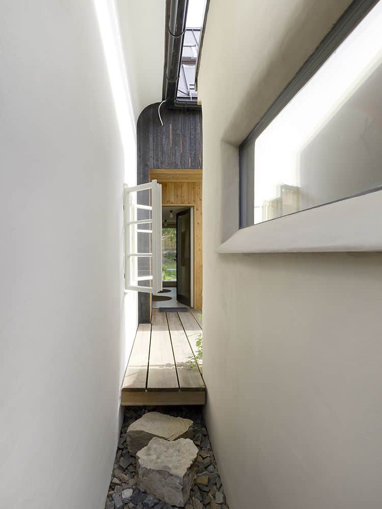
The architects explain, “The cross contra-position of both houses strengthen the local features of village-like urbanism with close and dense neighborhood.”
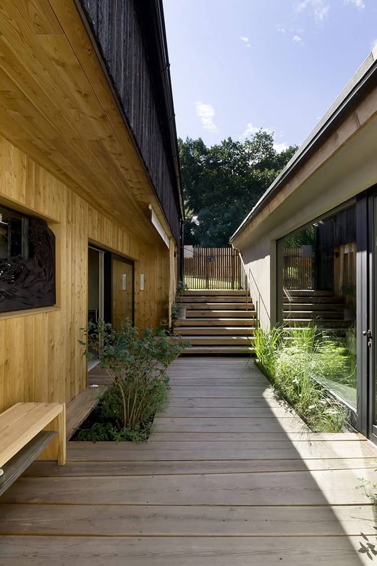
After almost a year of discussion and planning, the architects opted to intersect old and new, live and work by physically intersecting the existing structure with the new one. “The new addition coexists in certain contrast with the old house yet in harmony and respect to the site,” explain the architects.
When the house finally started to take shape – following two years of chasing permits to rebuild this historical site, and almost four years of construction – it became a learning experience for the architects, who uncovered some unexpected surprises along the way.
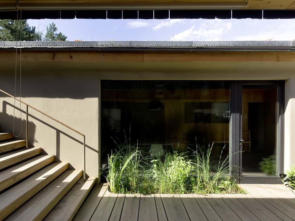
A set of outdoor wood steps leads down a wood walkway to the workspace, which is separated from the main living areas but easily accessible.
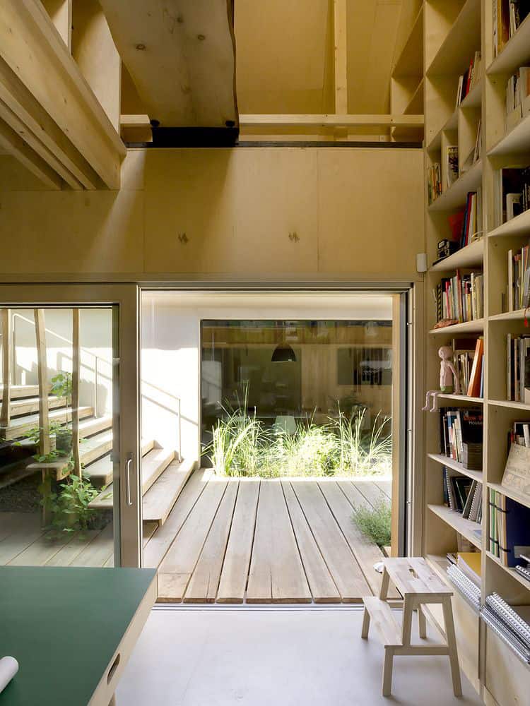
Being a live and work space, as much though went into the studio as the living spaces.

The office has a very clean, modern aesthetic that is surely the birthplace of many modern architecture designs.
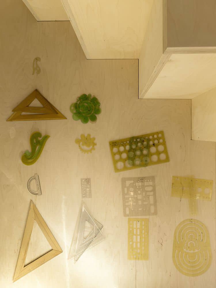
Tools of the trade…
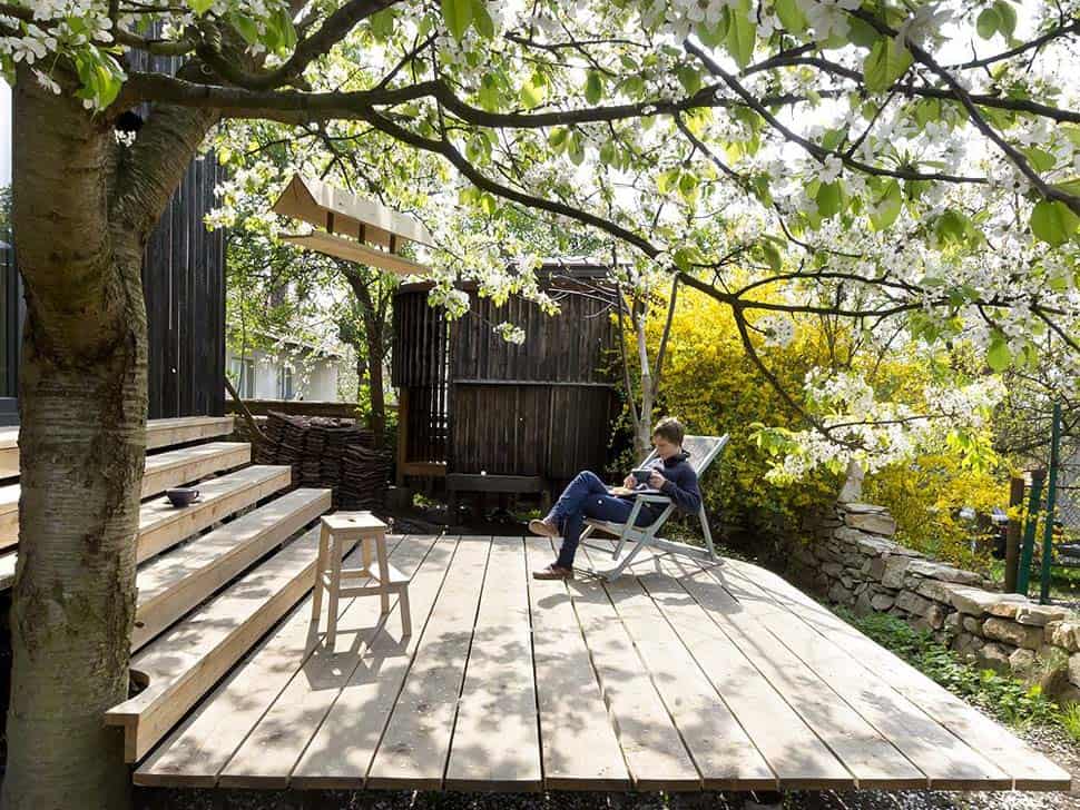
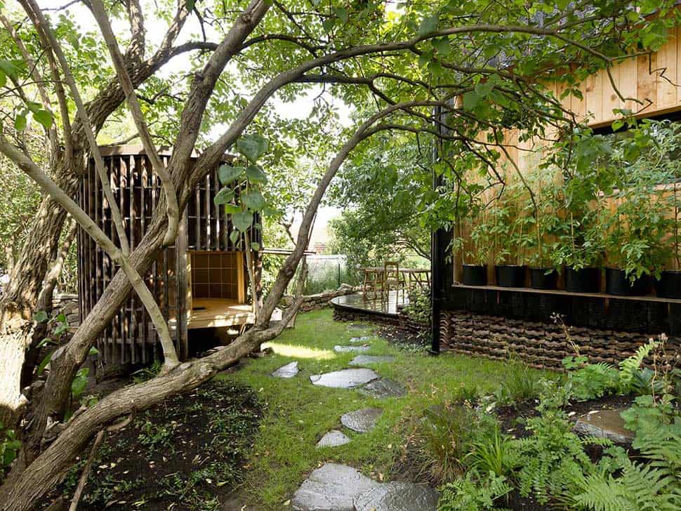
The outdoor lounging spaces are idyllic in their lush landscaping and far-away feel, matched by a prevailing (at first glance) rustic aesthetic.
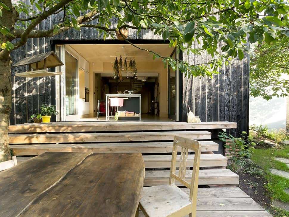
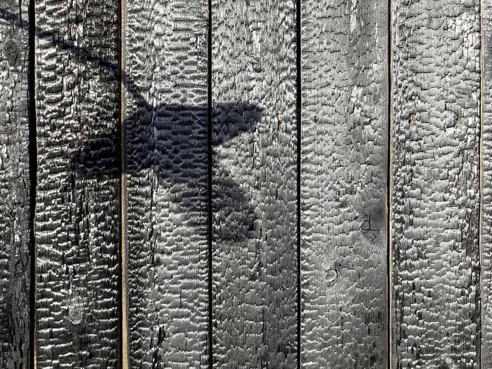
The charred black facade has a wonderfully worn, weathered look.= leading into the original structure.
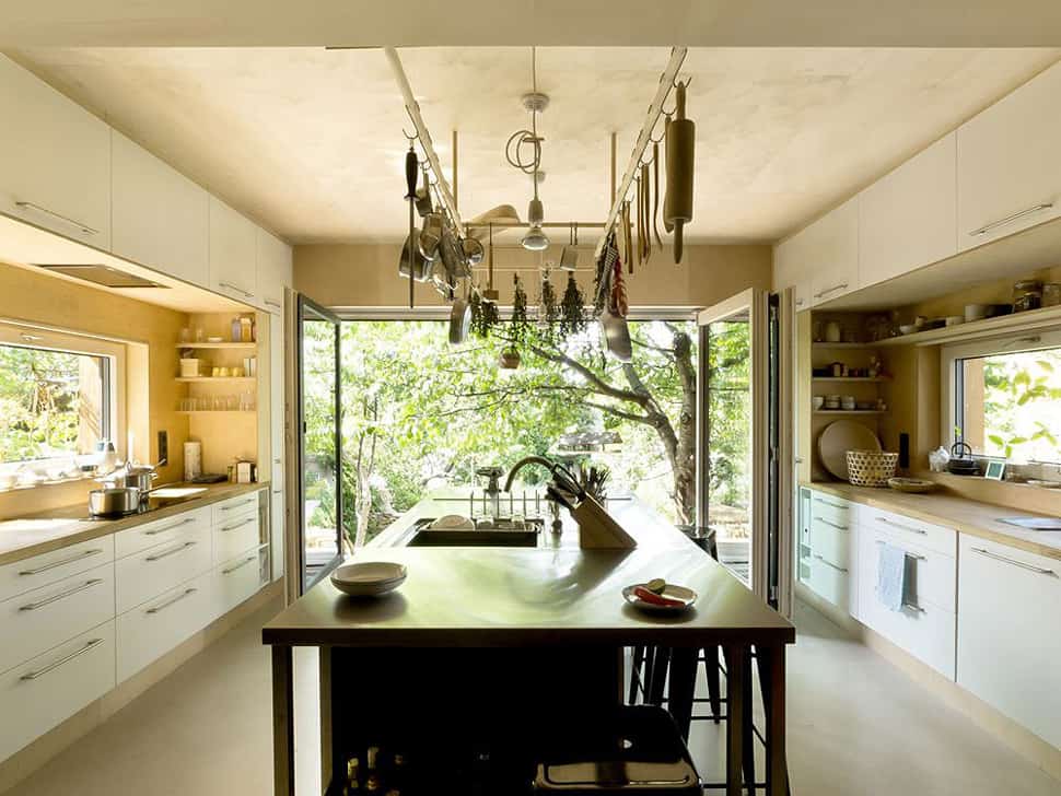
A large double-door opens to the kitchen, which is simple, bright and flavorful – like the foods probably prepared here!
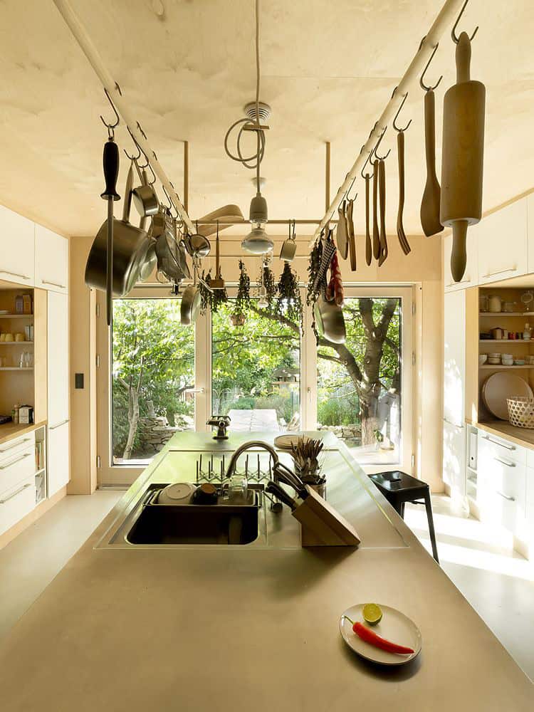
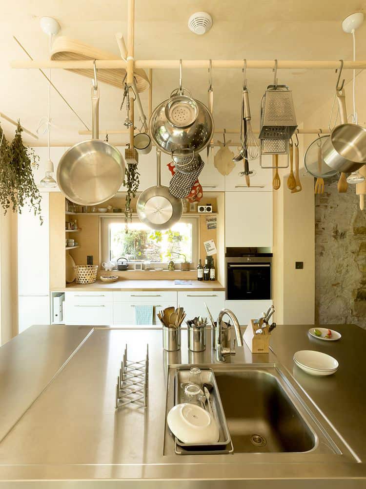
A central island is topped by a rack suspended from the ceiling, outfitted with the chef’s tools. A counter sits on each side, both overlooked by a window.
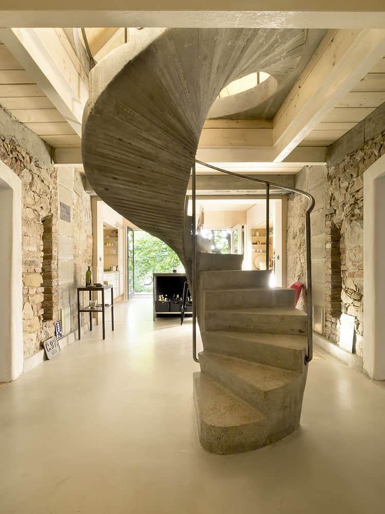
Past the kitchen, the home’s original stone walls are warm and cave-like, enclosing a stunning concrete spiral staircase rising up through the center.
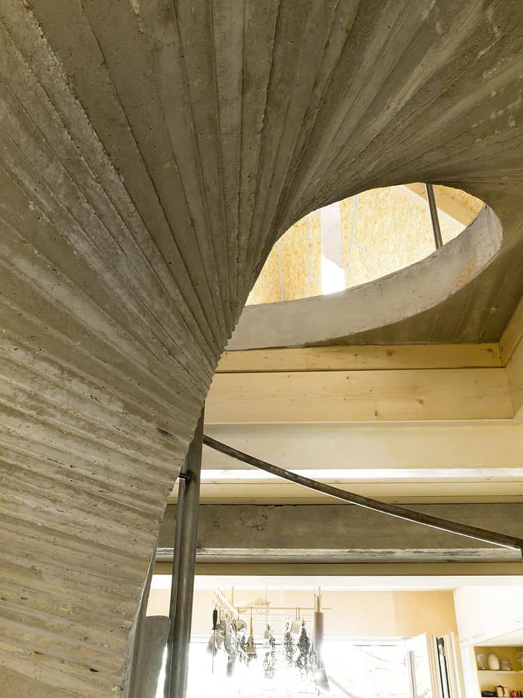
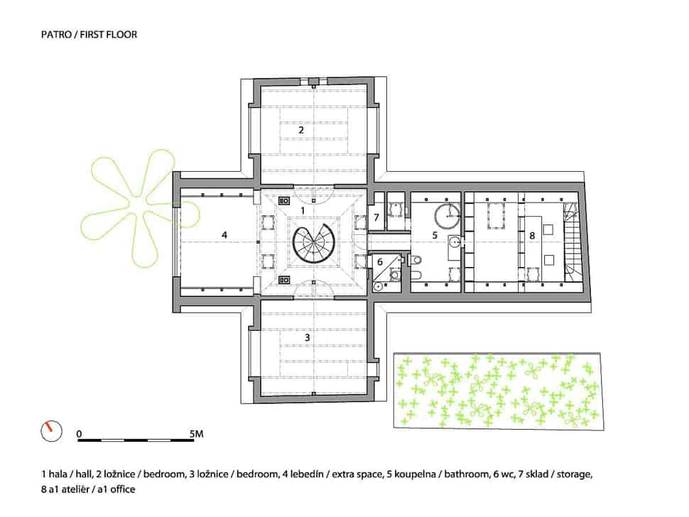
The staircase continues in the main central axis of the intersecting volumes, leading to the attic level housing three rooms and bathroom.
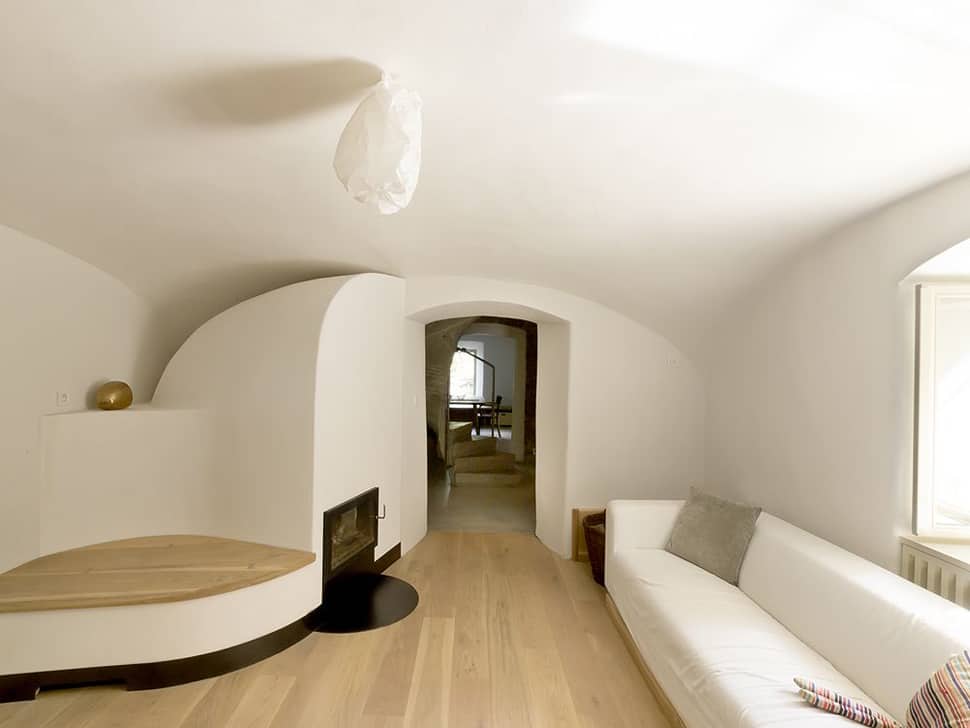
On either side of the kitchen and entrance hall, a pair of rooms are characterized by their authentic plaster walls with vaunted ceilings.
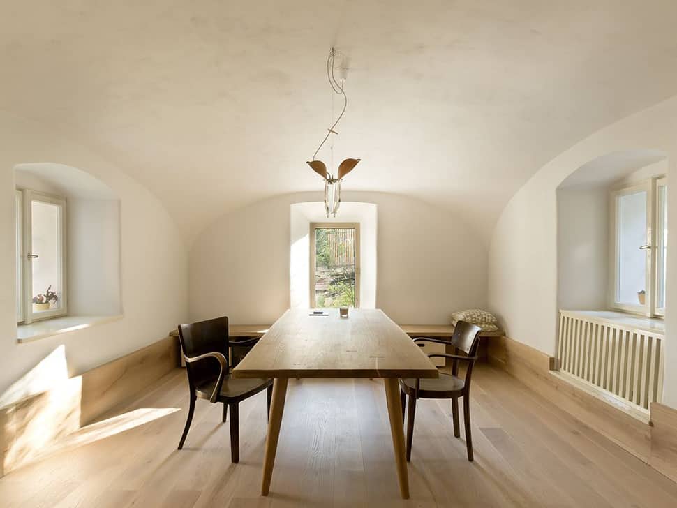
These bright white, imperfect plaster walls feature fluidity and curves which are cave-like in a totally different way.
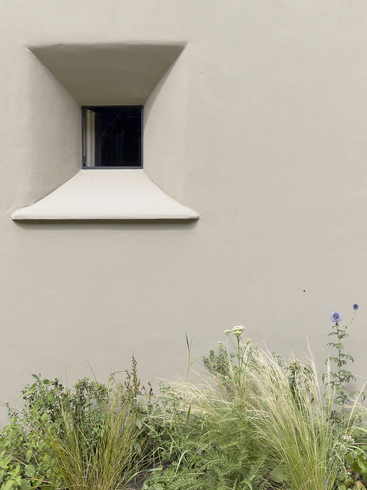
The original windows of the home are small and deep – while not exactly practical, they are a charming bit of history the architects wanted to showcase.
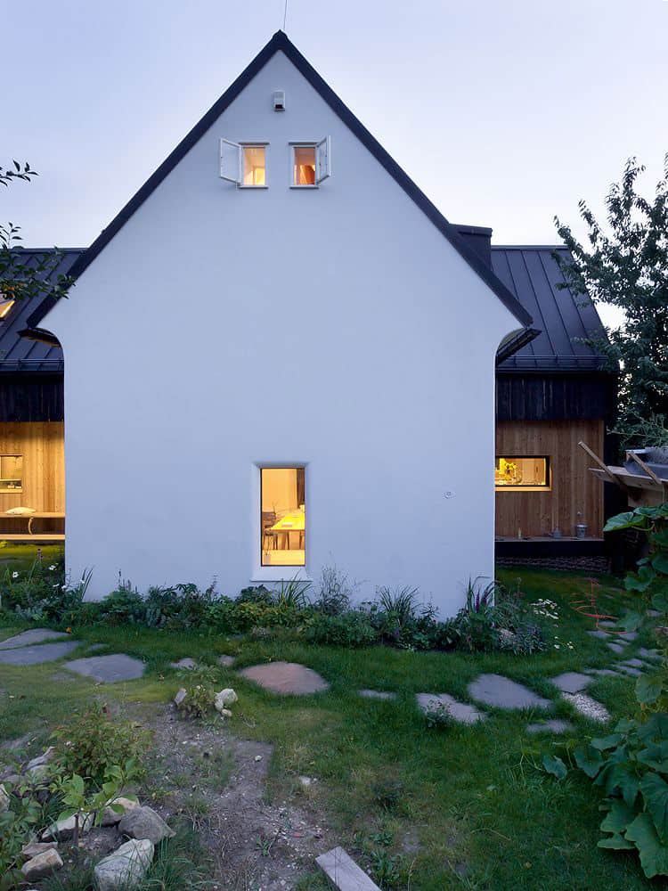
From A1 Architects, “The house itself seems very simple from the outside yet it is very layered in the interior and surprises one how big it could appear from the inside.”
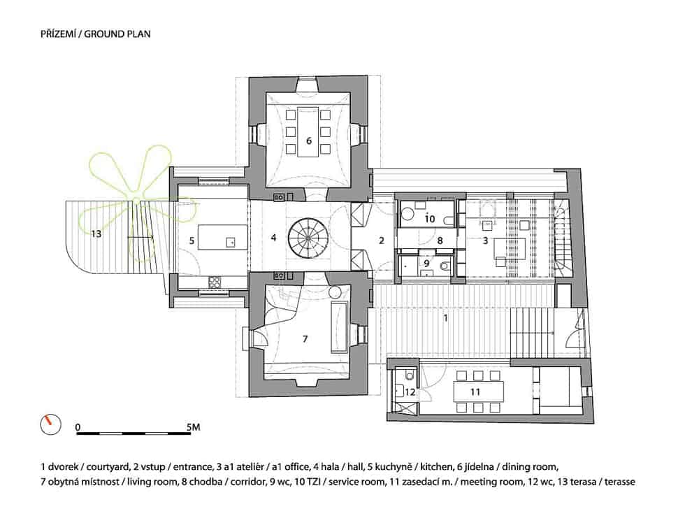
Floor plans:
A1 Architects</a
