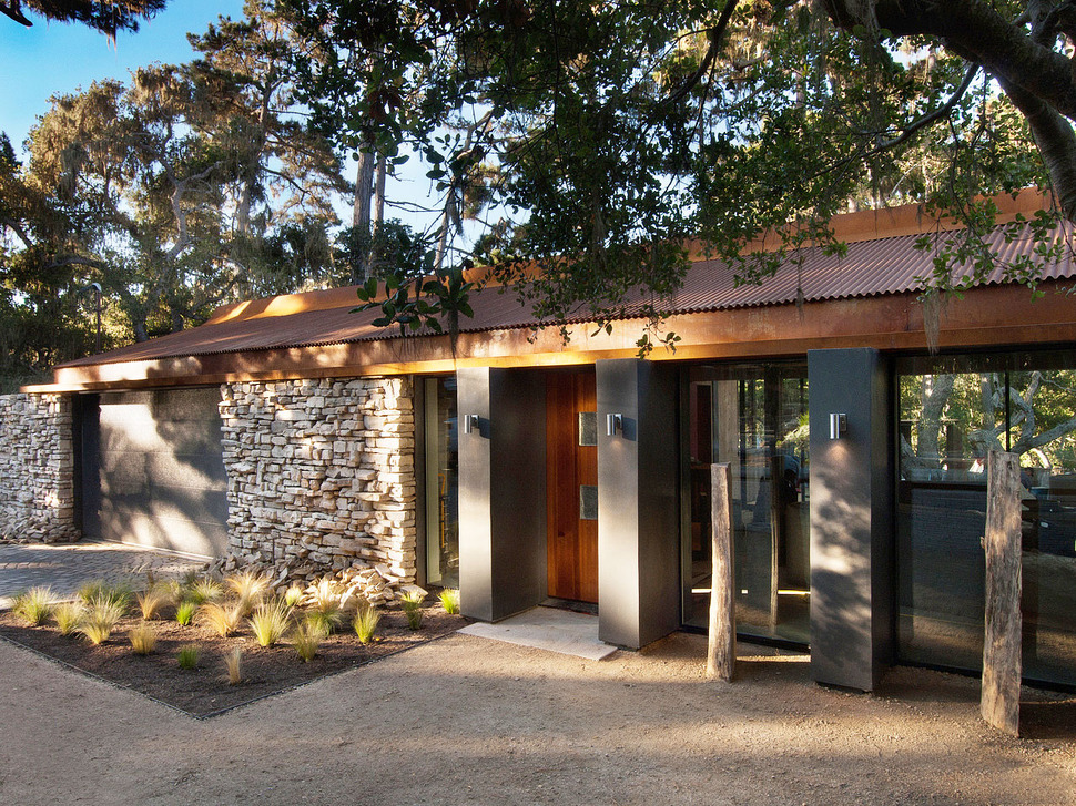
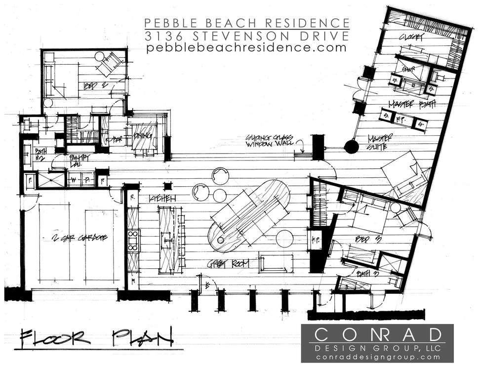
Conrad Design Group redesigned this speck home with all of the upgrades and amenities of a 21st century home. They stripped the home to its rafters and began the process of recreating the volumes into a stunning, modern residence with a central west coast contemporary design aesthetic. Featuring 3 bedrooms, each with their own bathroom, a central social zone and an private outdoor courtyard complete with fire pit, lounge area and outdoor kitchen.
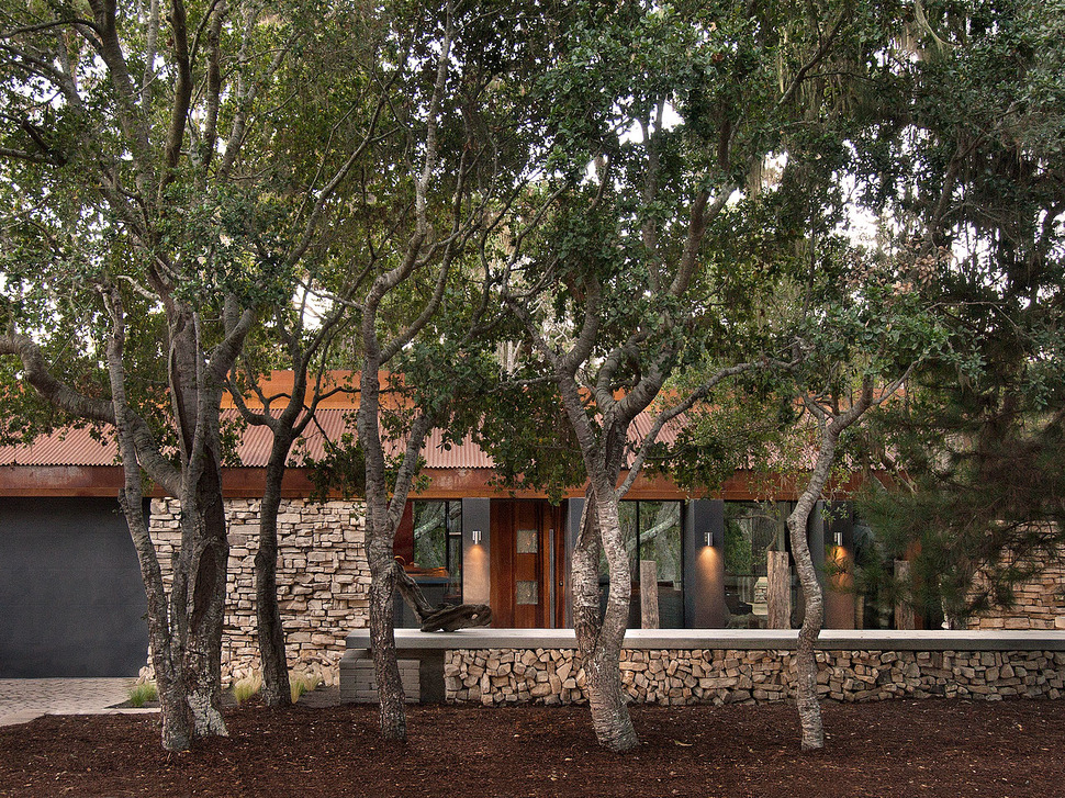
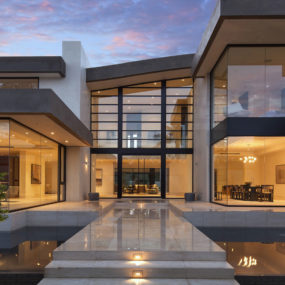
From the street the Pebble Beach Residence has a sense of privacy due in large part to the row of preexisting trees that run the length of the stone fence. The same stone used on the fence is repeated on the facade of the home in creating a continuation of the home to the landscape. Furthering the ability of the home to blend with its surroundings is the use of flat black on the garage doors and the four wall sections that slice through the glazings becoming both indoor and outdoor rectangular columns. These columns each support an outdoor light sconce.
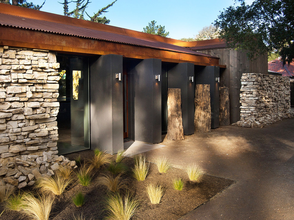
The entry to the home is a soft geometric pattern of repeating elements from the stone to the glazing to the columns and even the grasses within the landscape. This repetition of pattern is picked up on within the corrugated metal roof and the 3 tree stumps incorporated into the facade.
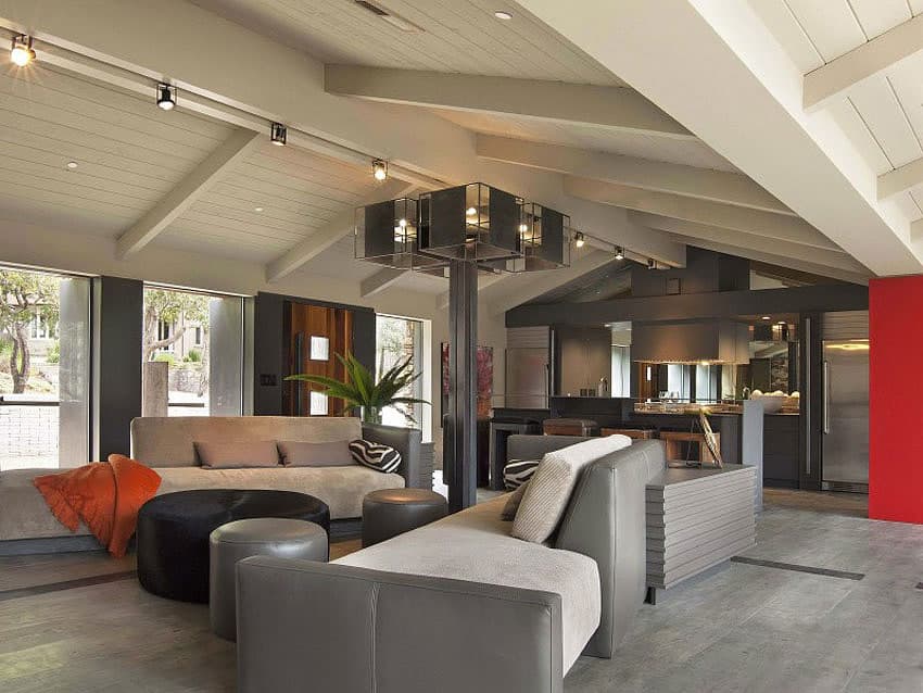
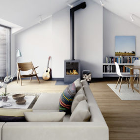
The entry opens up straight into the social zone featuring an open floorplan and a pitched ceiling. In the centre of the room a column of four 4x4s rises to the ceiling before fanning out into a Hollywood style light feature. Track lights stretch out from this feature, following the central beam to continue the light story. Pale wood flooring is balanced by the painted wood ceiling and this painted wood ceiling detail is a feature that is prominent within central west coast designs. Just past the social zone and within the open floor plan is the kitchen.

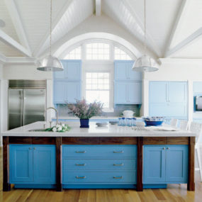
As with most modern day homes, the kitchen is separated from the social zone only by the island bar area. The island is long enough to seat 5 on a raised bar that hides the prep station complete with sink, only the gooseneck faucet gives away the sinks location.
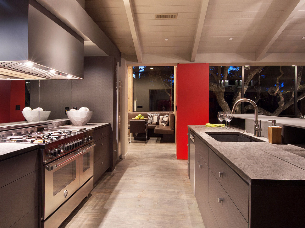
While there is seating at the bar, there is also seating at a small kitchen nook tucked away in its own private corner overlooking the private courtyard, unlike the kitchen itself which is wide open to be admired by all visit. Love the black granite undermount sink and the dark charcoal cabinetry, and of course that stove and hood – what chef wouldn’t want to cook in this kitchen.
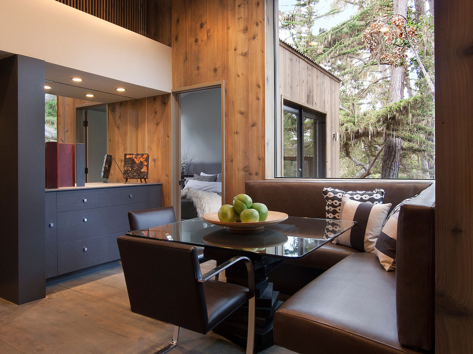
The kitchen eating area features a banquette for four with two additional chairs pulled up on the open sides of the table. A built in buffet for storage separates the banquette from the kitchen and creates a buffer from the guest bedroom just off of the area.
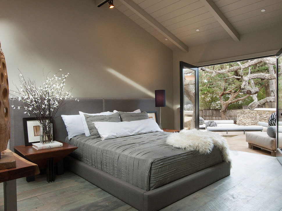
The guest bedroom is a study of greys with the walls, plank flooring, linens and headboard. The 3 panels that comprise the headboard give a real hotel atmosphere to the room as does the attached ensuite and the access to the courtyard.
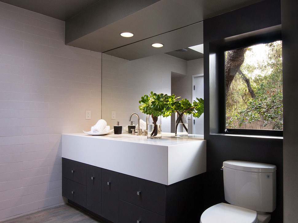
The ensuite to the guest bedroom continues the grey theme with the same dark charcoal cabinetry used in the kitchen, but here white is much more of a feature then in the bedroom with that stunning detail on the vanity of continuing the counter material down the cabinetry for a depth of one foot – gorgeous.
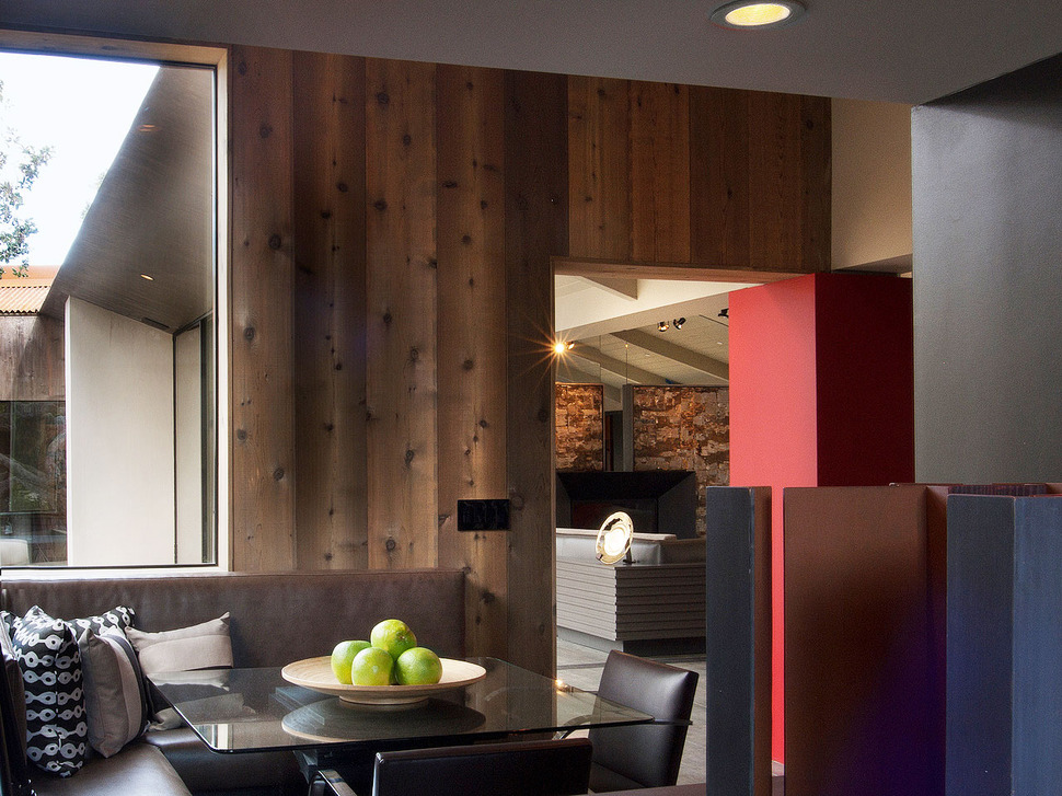
With the kitchen nook so close to the guest bedroom, a stay in this home truly feels luxurious and while the guest bedroom is open and completely exposed to the courtyard, the bump out of the kitchen nook offers it the sense of privacy. When its time for guests to join in the daily activities, the social zone is just a few feet away.
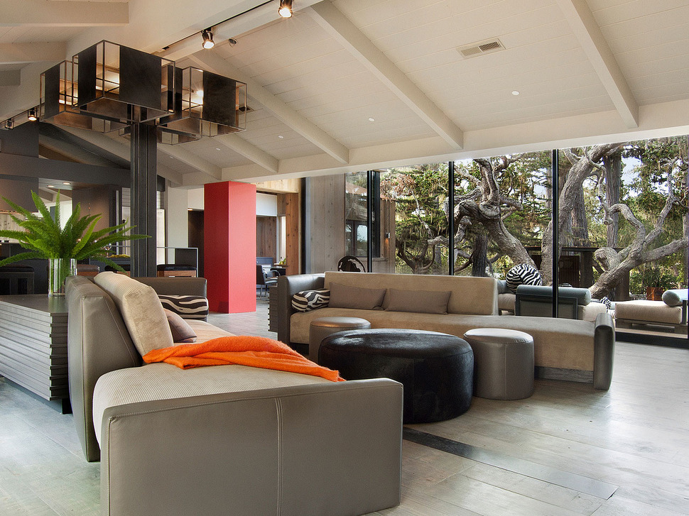
The social zone is centrally located within the home and looks out over the courtyard via the wall of glazings, however window treatments are not necessary thanks to the large, wide tree that shades the home from the intensity of the summer sun. Although the inner volumes are neutral in palette the smart choice of the orange column is just enough of a “pop” to bring life to the home, the addition of the tangerine throw is an awesome nod to the column.
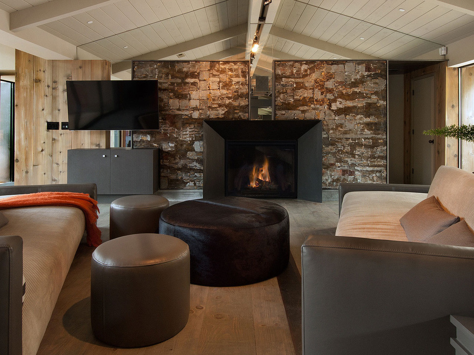
While one end of the open floor holds the kitchen, the other showcases a stone wall complete with a contemporary fireplace. While centrally located within the pitched ceiling line the room continues past the lowest line of the pitch to rise up again in a zigzag pattern. To compensate for this asymmetry to the end wall, the architects created a second wall of vertical wood planking, separated from the stonework by a narrow void. This void is where the TV and console are centred on. On the other side of the stonework is where the entrance to a second bedroom is located.
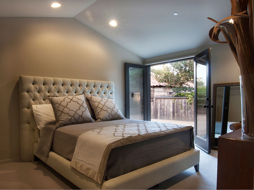
This bedroom also has its own ensuite and outdoor access, however the outdoor access is to the side of the home and not to the courtyard. Here the colour story is all about sand. Sandy walls, and detailing within the linens combined with a pale linen shade on the tufted headboard.
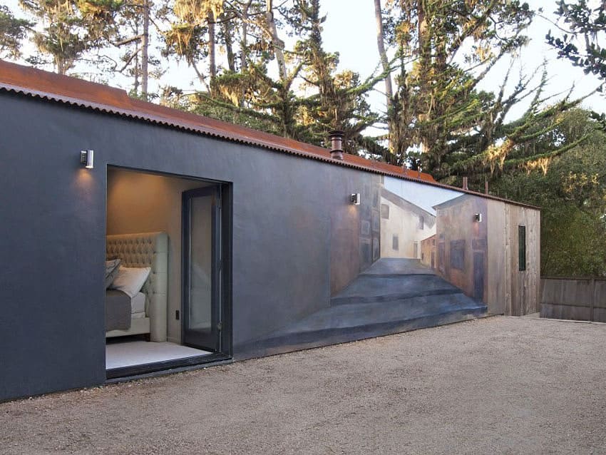
While this bedroom might not open up to the courtyard, it does open up to a pretty cool wall mural on the side of the building.
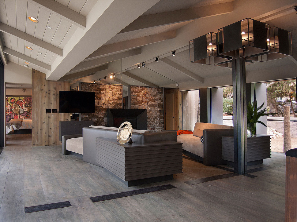
The third bedroom is the Master Bedroom and it is accessed from the other side of the social zone, next to the TV and below the zag in the ceiling. When the door is left open a view to a large modern painting creates a colourful statement as it picks up on the orange and tangerine moments in the living area.
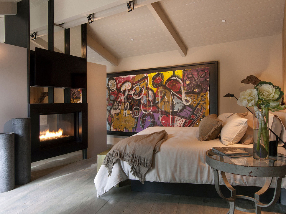
The abstract painting is huge and connects the bedroom to the ensuite on the other side of the double-sided fireplace.
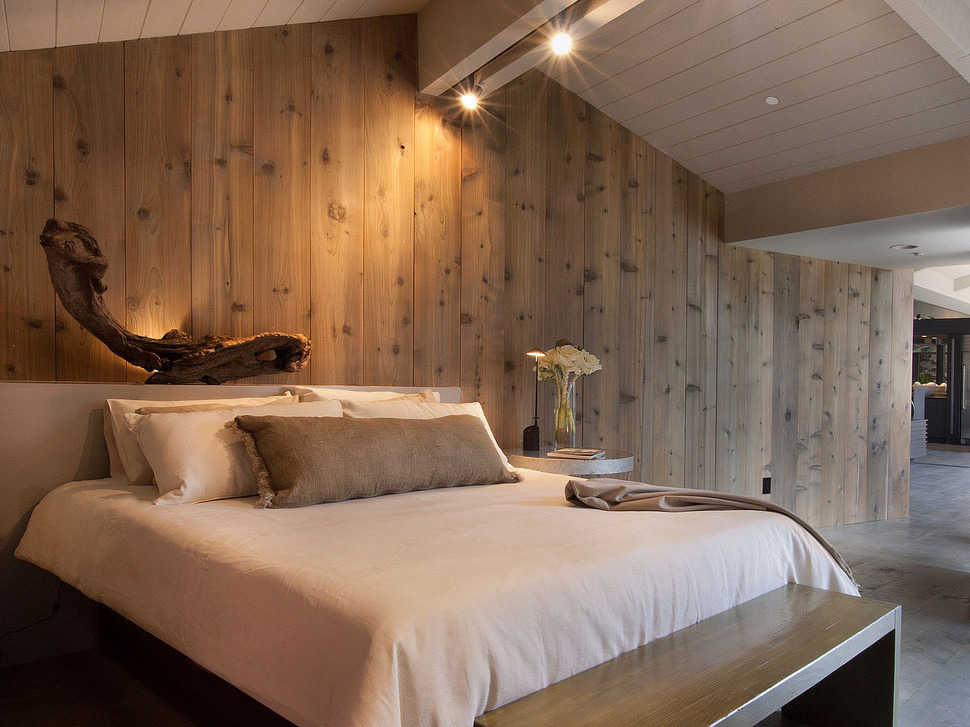
Unlike the other two bedrooms, this room features a wall of vertical knotty planking for a Zen atmosphere that is accentuated by the sculptural wood formation displayed on the headboard.
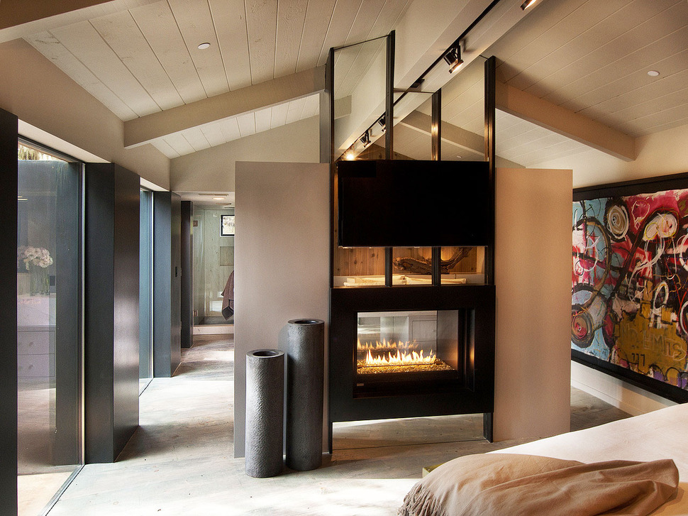
While the Master Bedroom has a Zen atmosphere, the large abstract stops the room from feeling too subdued.
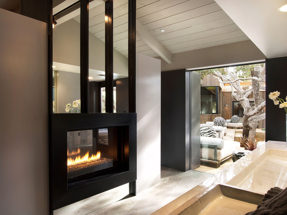
The other side of the fireplace is where the ensuite is situated, galley style with one end of it overlooking the courtyard.
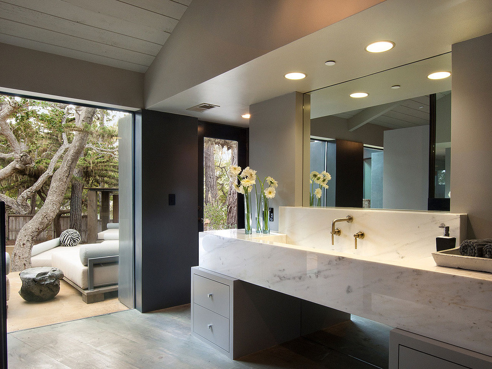
The vanity within the ensuite is a large Carrera marble masterpiece with brass wall mounted faucet and taps showcased against the marble slab backsplash and two grey cabinets creating the “stands” for the marble. Behind this exposed section of the bathroom is the private shower and bathing zone.
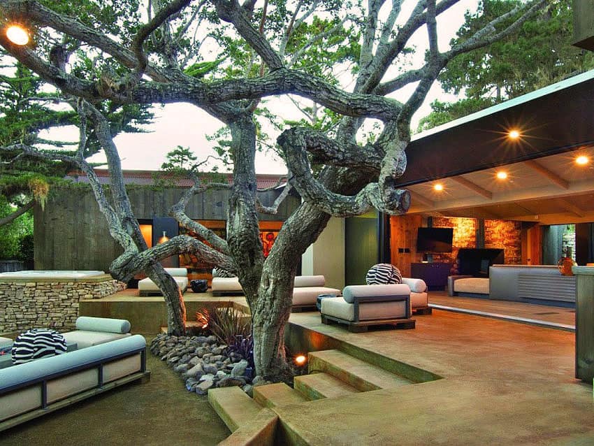
From the courtyard the colourful abstract within the Master bedroom and ensuite is clearly visible, but the bathing area is completely hidden behind a solid section of the facade.
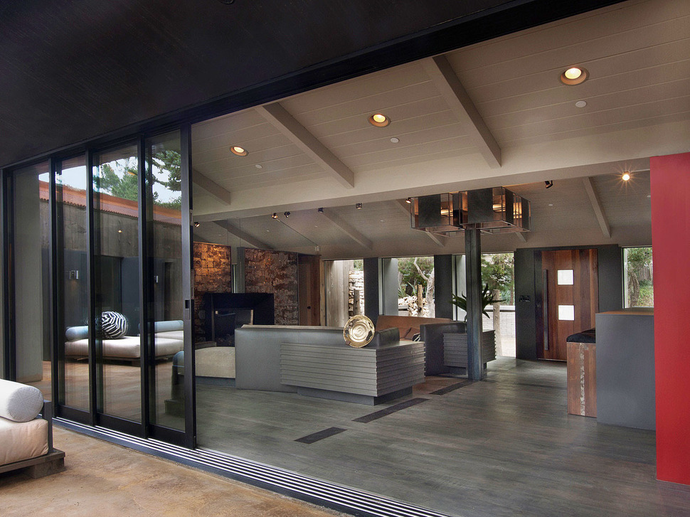
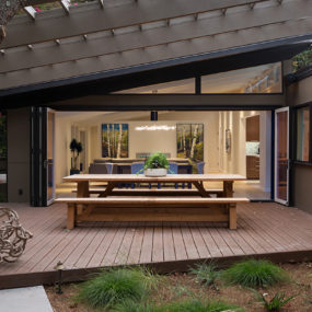
The courtyard is accessed through the multiple sliding and stacking glass doors off of the social zone.
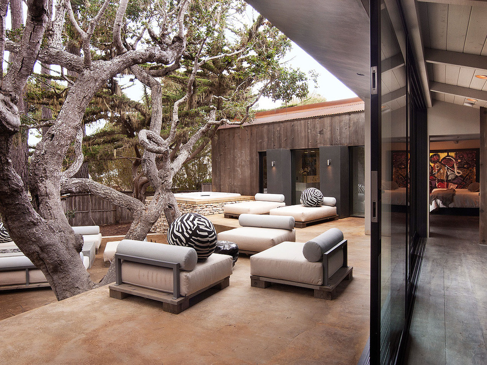
The courtyard is divided into two levels, an upper and a lower. The upper section features a lounge area for three and a pair of chaises just outside the Master Bedroom. While completely exposed to the elements, the large specimen tree offers plenty of shade.
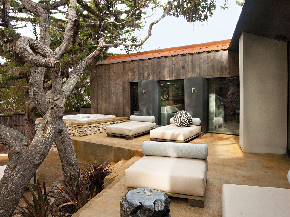
Next to the two chaises and sitting on the lower level, spa is surrounded by a stone facade. Sitting on the lower level, next to the upper zone, the spa does not take up much visual space, but rather blends seamlessly with the architecture.
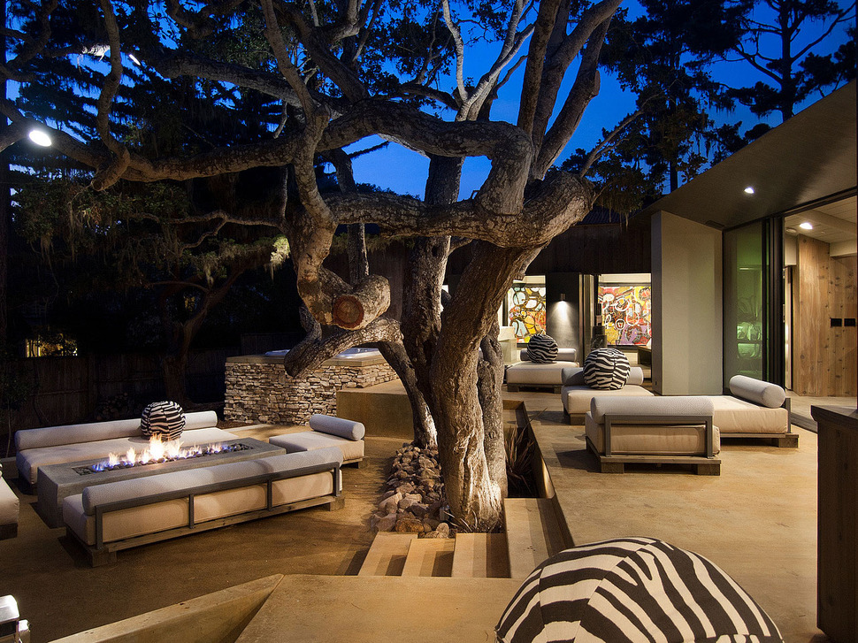
Access to the lower level is via 5 steps. The lounge area on this level is wrapped around a large firepit.
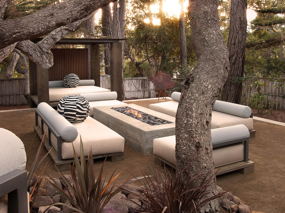
The firepit is centred within a large rectangular coffee table with deep enough edges for drinks and food. The seating is deep enough to sink back, put your feet up on the firepit and stare up at the stars as night falls.
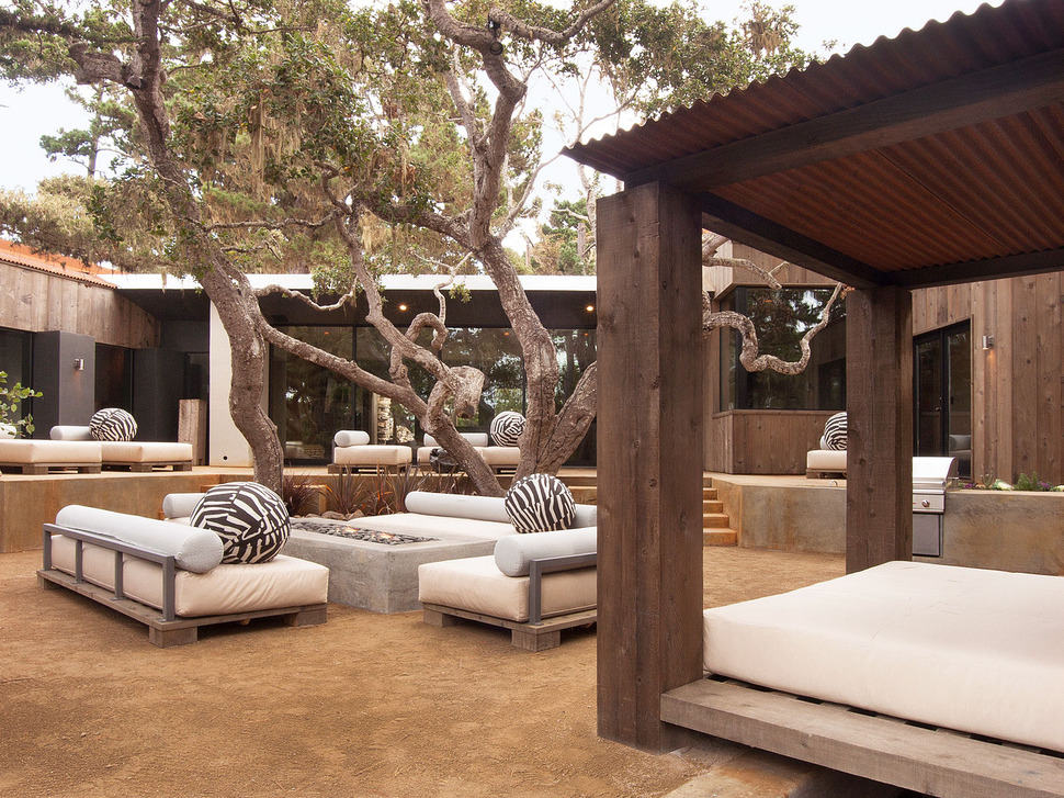
There is even an outdoor covered bed just next to the lounge area.
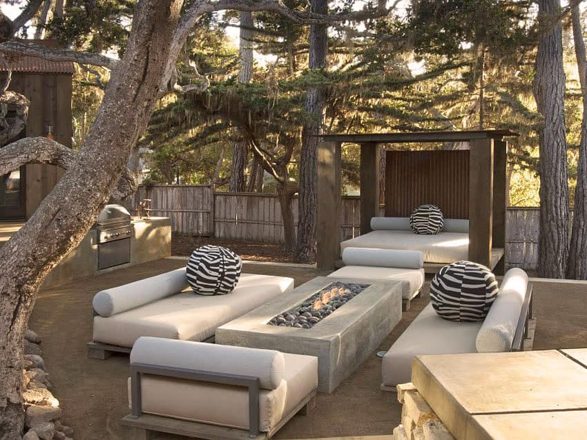
and tucked up against the upper level is the outdoor kitchen.
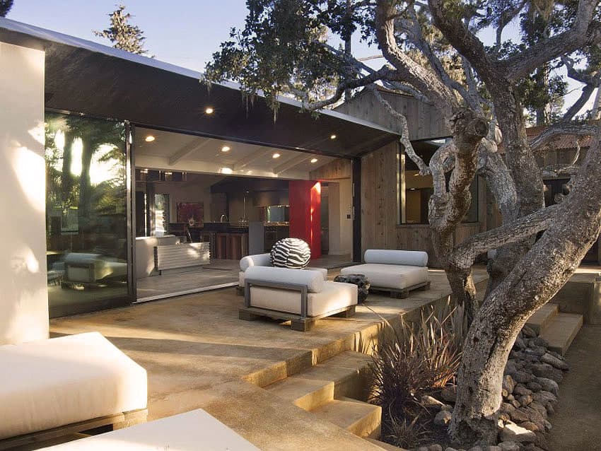
For more complex meals, the indoor kitchen is not much further away.
Conrad Design Group
Photography by Steve Ravano
