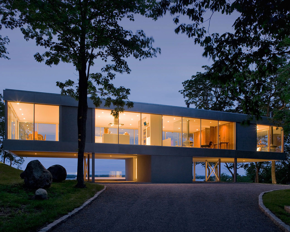
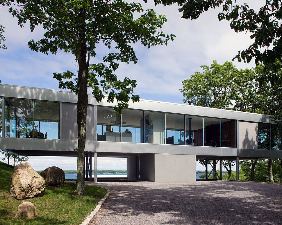
Positioned on the peak of a hill and approached by a long curving access road, Clearhouse has been designed by Michael P. Johnson in collaboration with Stuart Parr Design to take advantage of the panoramic views on all four sides of the home. Located on Shelter Island, NY, USA, Clearhouse is surrounded on three sides by a lush forest and on the fourth by the Atlantic Ocean. An integral part of the design was to keep the parking area of the home exposed to allow the views to travel through to the front yard, this opening up of the carport creates an impression of a vertical T as the home cantilevers out on both sides of a central access column.
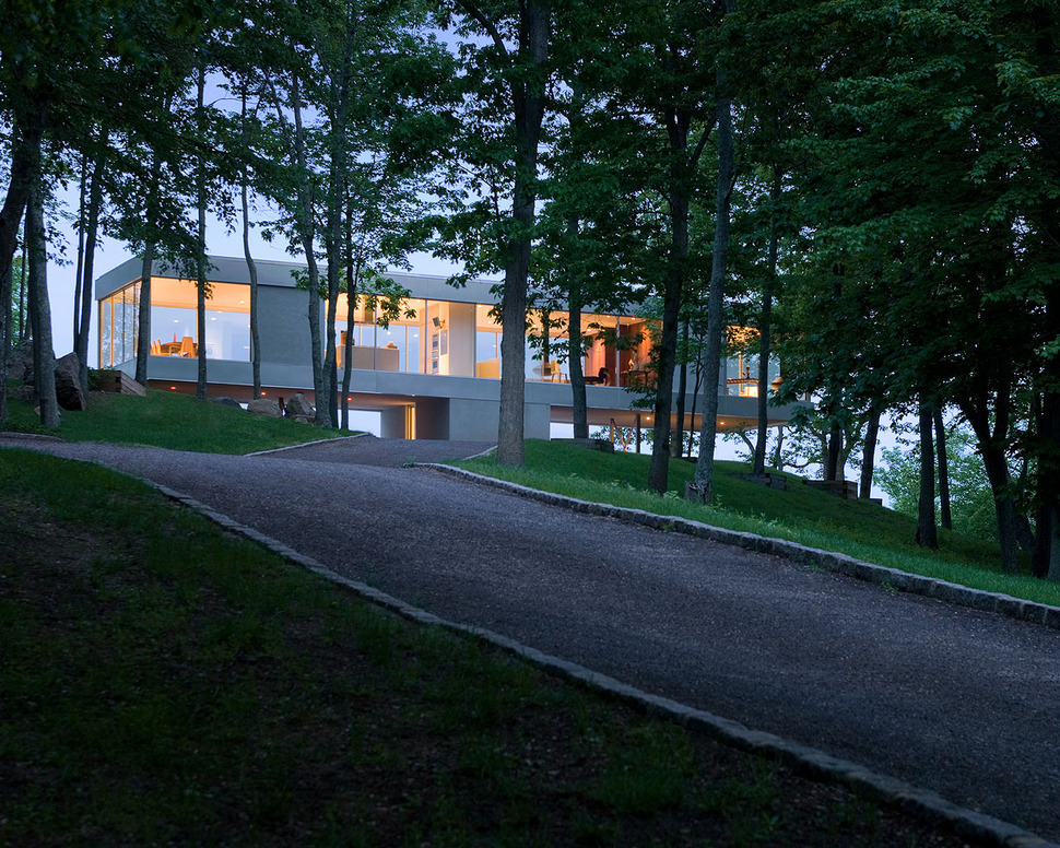
Even the drive up to the home is a picture perfect setting of heavily foliaged trees and softly rolling hill. The landscape is so beautiful that the home all but disappears in it thanks to the see through aspect of the glass exterior walls. And the soft tones of the concrete that blend harmoniously with the driveway and the hazy distant sky and ocean.
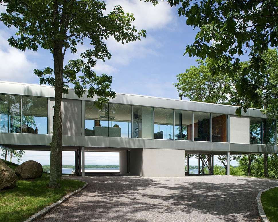
Even upon arrival, the show stopping aspects of Clearhouse does not overpower the various views, in fact the volume of the vista perspectives has been further enhanced by the strategic placement of large boulders next to the driveway.
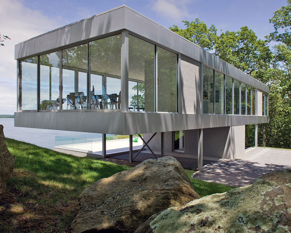
Not only do the boulders help define the perspective of the location but they also help tie the home into its surrounding landscape.
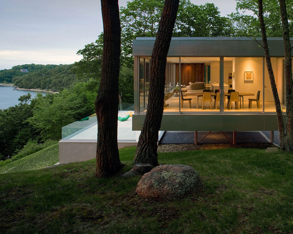
Additional boulders are placed in other strategic places and each has been sunk into the ground to give the appearance of always having been there. Adding to the natural aspect of the large rocks is the lichens and moss that have decided to make them their home.
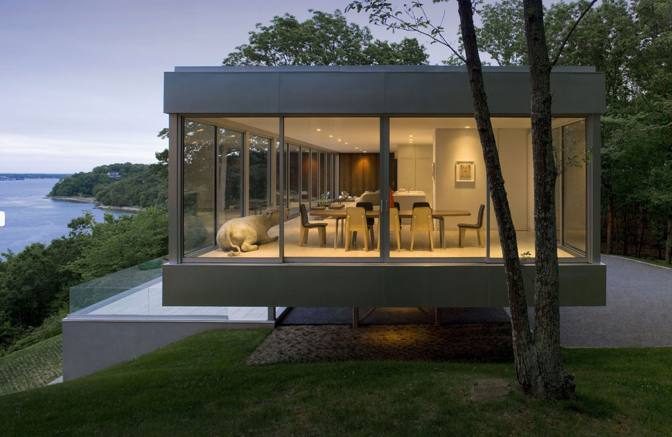
This left side of Clearhouse is the location of the dining room and with glass on three sides it is as though you are dining el fresco.
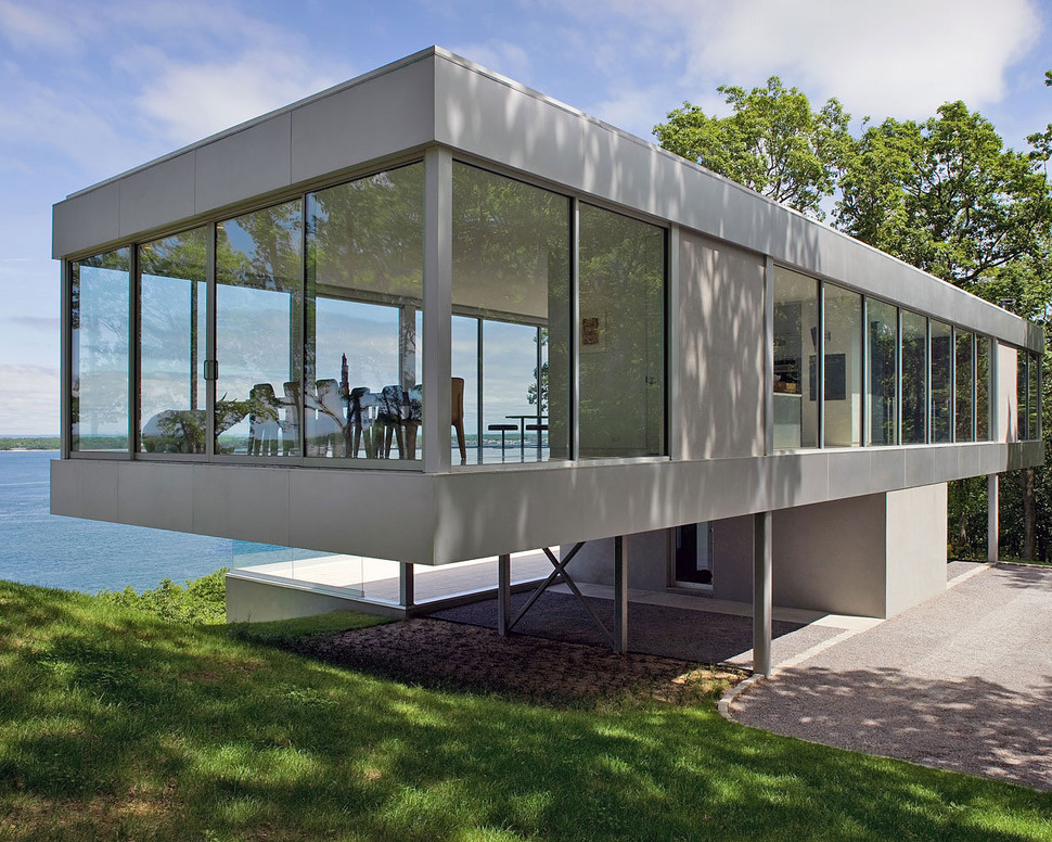
even from the outside looking in, the dining room appears to be an outdoor space with its own roof overhang.
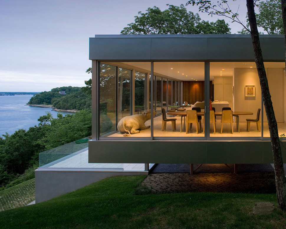
A life-sized sculpture of a bull sits just next to the dining arrangement, as though it has just wondered in for a rest. This touch of whimsical realism is a perfect sculptural moment in a minimalist setting – and perfectly suited to the forested location.
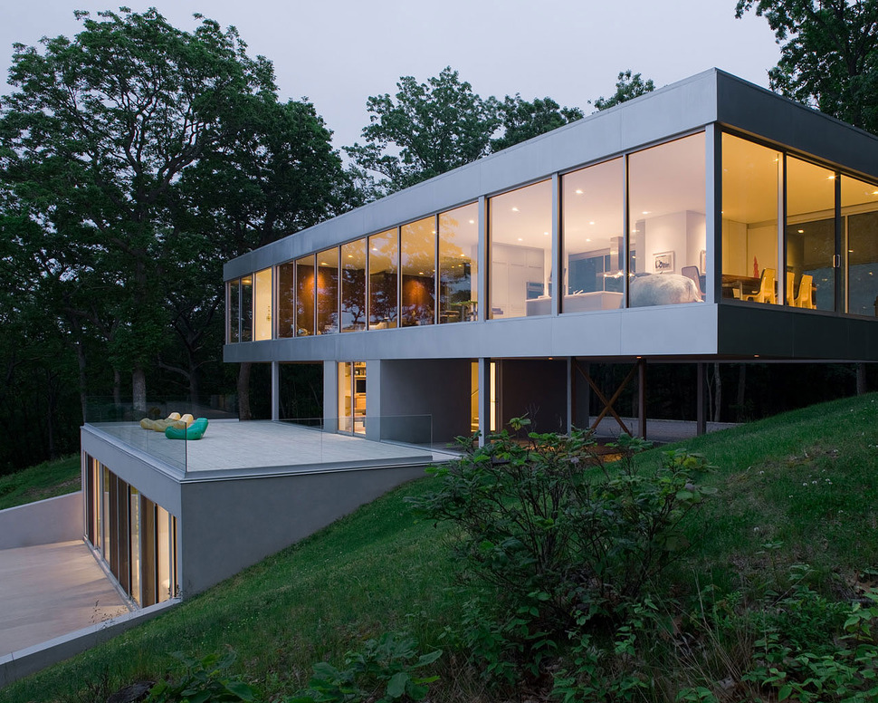
Around the back of the home, the lower level is revealed beneath the entry level terrace. This lower level is where the secondary bedrooms are located.
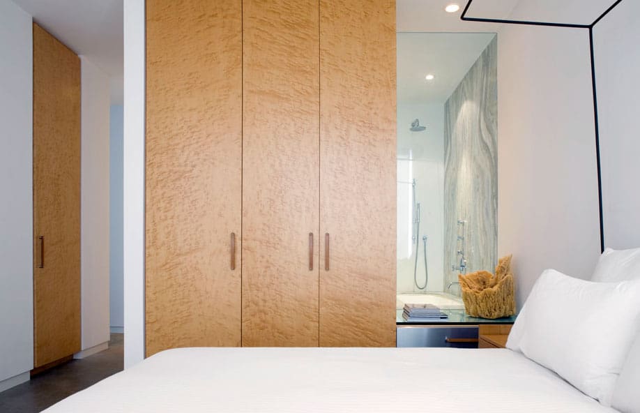
The bedrooms downstairs include their own ensuite and closets. Positioned to overlook the views, the interior wall is covered with a closet that creates a separation to the ensuite behind it – with the exception of the glass panel between the closet and the wall. This panel allows the views to permeate into the bathing zone.
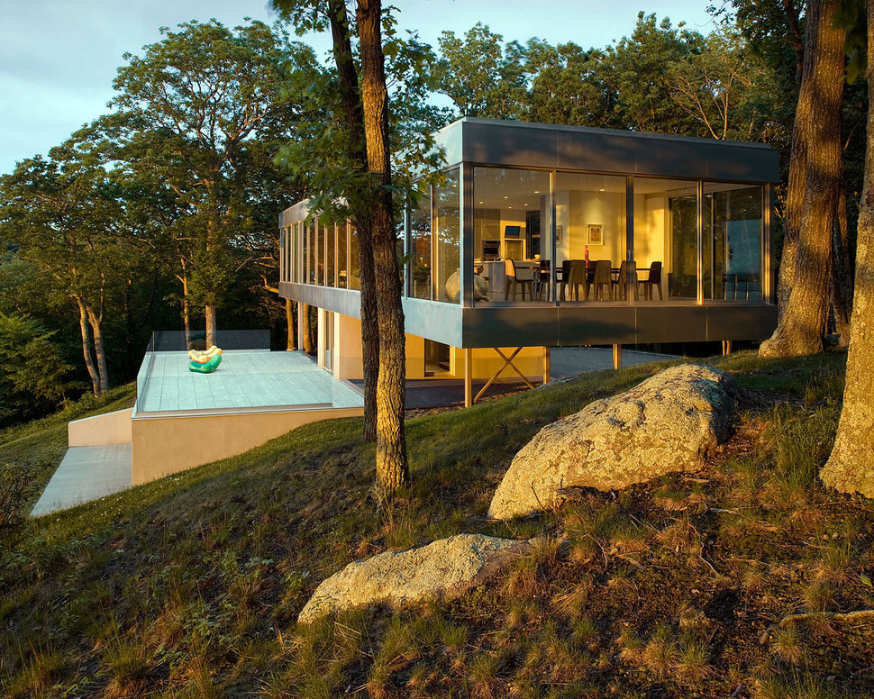
The two bedrooms have a level concrete pad in front of them for an easy access outdoor experience separate from the main outdoor zone above.
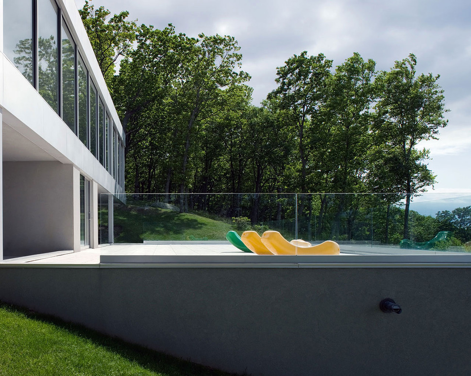
The terrace is accessed through the central access column which acts both as the main foyer, the back door and the stairwell connecting the upper and lower levels.
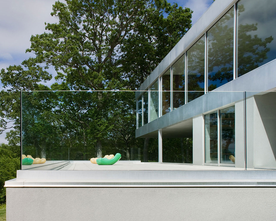
The terrace is wrapped in a safety rail of clear tempered glass so as not to obstruct the ocean views.
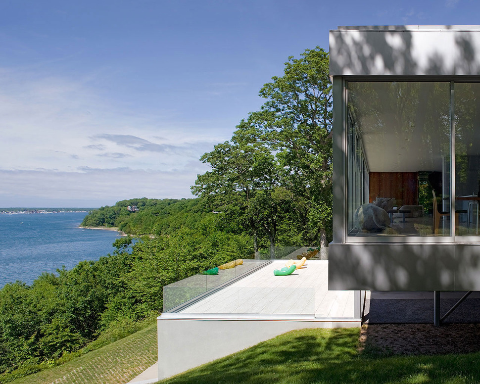
By wrapping the terrace in clear panels the view is also further exposed to the side yards, the covered parking, the front of the home and even the driveway
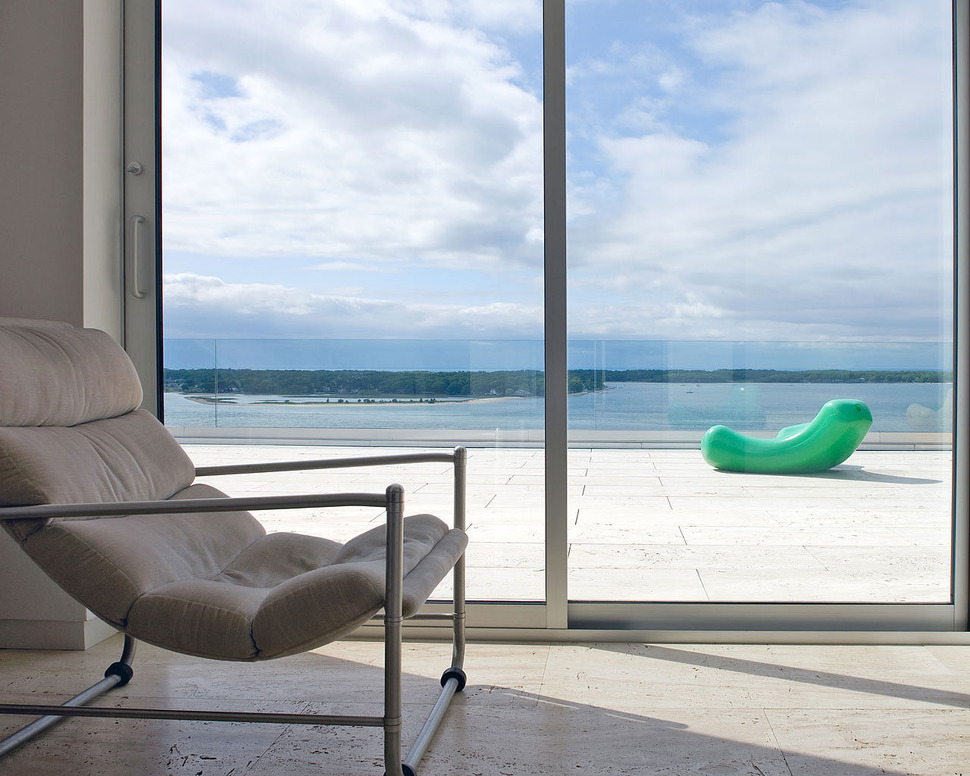
The access to the foyer from the central column is through a pair of sliding glass doors and those days when the weather isn’t at its best, a indoor chair creates the perfect private viewing spot.
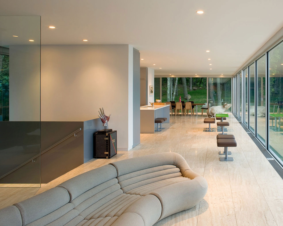
The foyer staircase leads up to the social volume arriving between the living room and the kitchen with the dining room located on the end wall just past the kitchen.
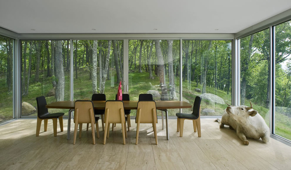
As stunning as the water views are, the forest is just as spectacular. What a setting! Even the bull looks content.
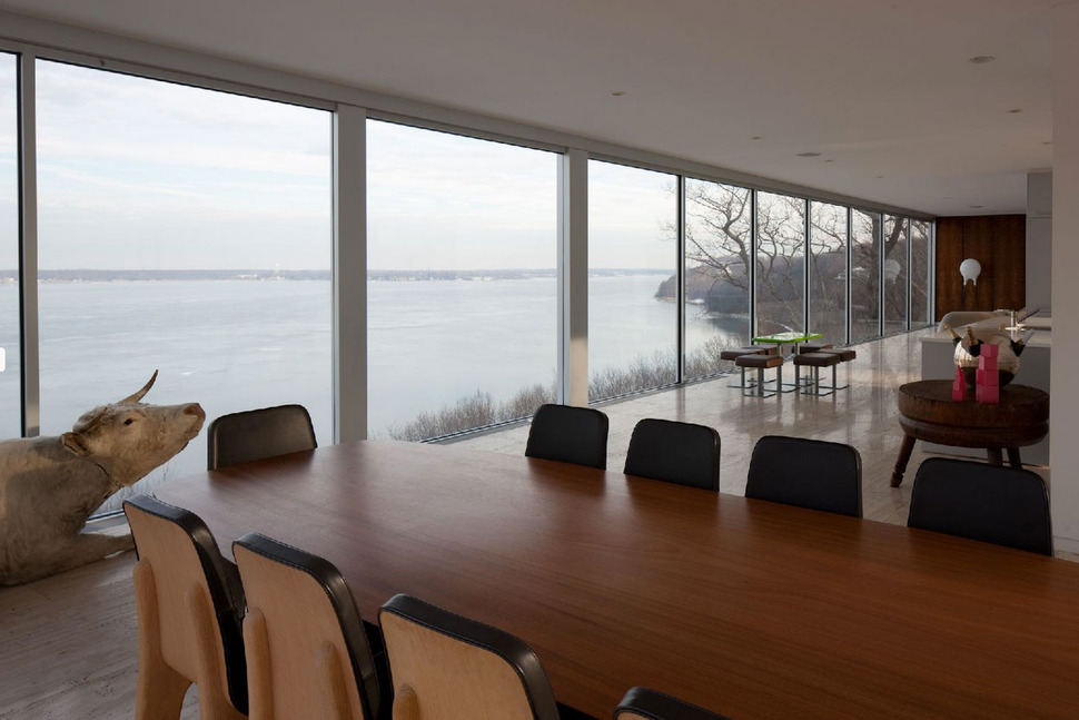
The decision to create a sculptural statement with the bull in the dining room was a smart one. Without the usual pendant over the table the room would otherwise have felt feel sparse and the choice not to have a pendant was dictated by the desire not to infringe on the view of the coastline in the distance.
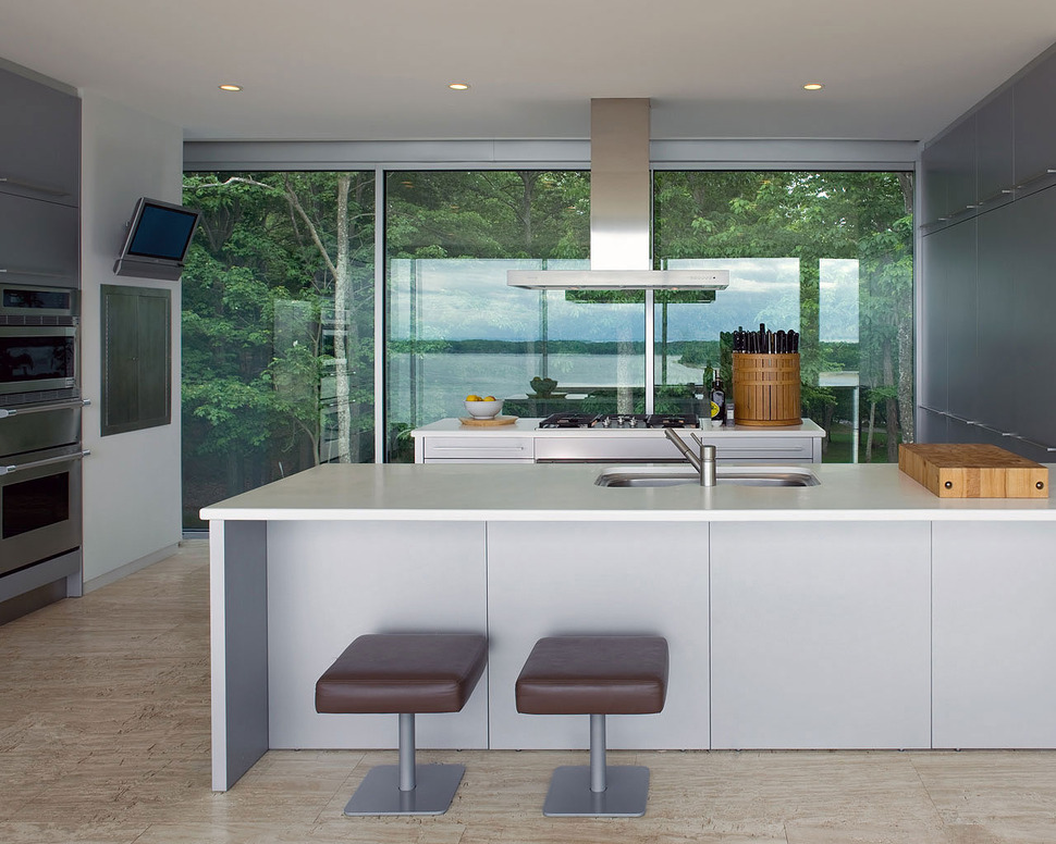
The kitchen is exposed front and back to the views with short sidewalls creating the space for the necessary wall cabinets, ovens and TV and even though the kitchen is open to the views on two sides, the designers still managed to create the perfect working triangle.
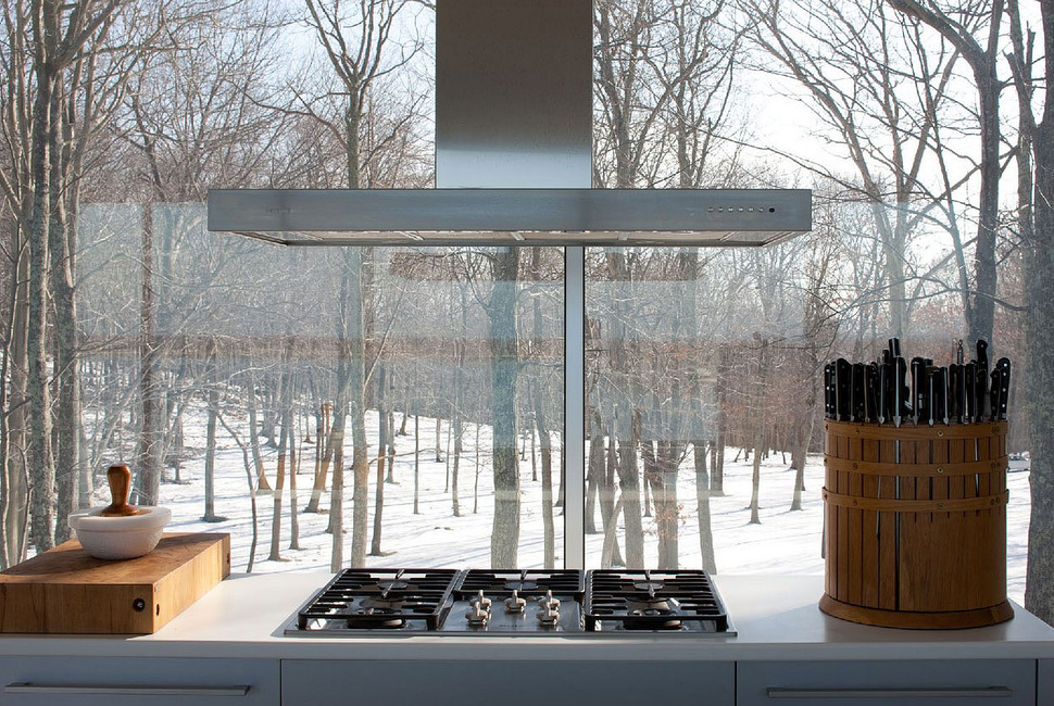
Seriously, who wouldn’t want these views while managing food on the gas cooktop?
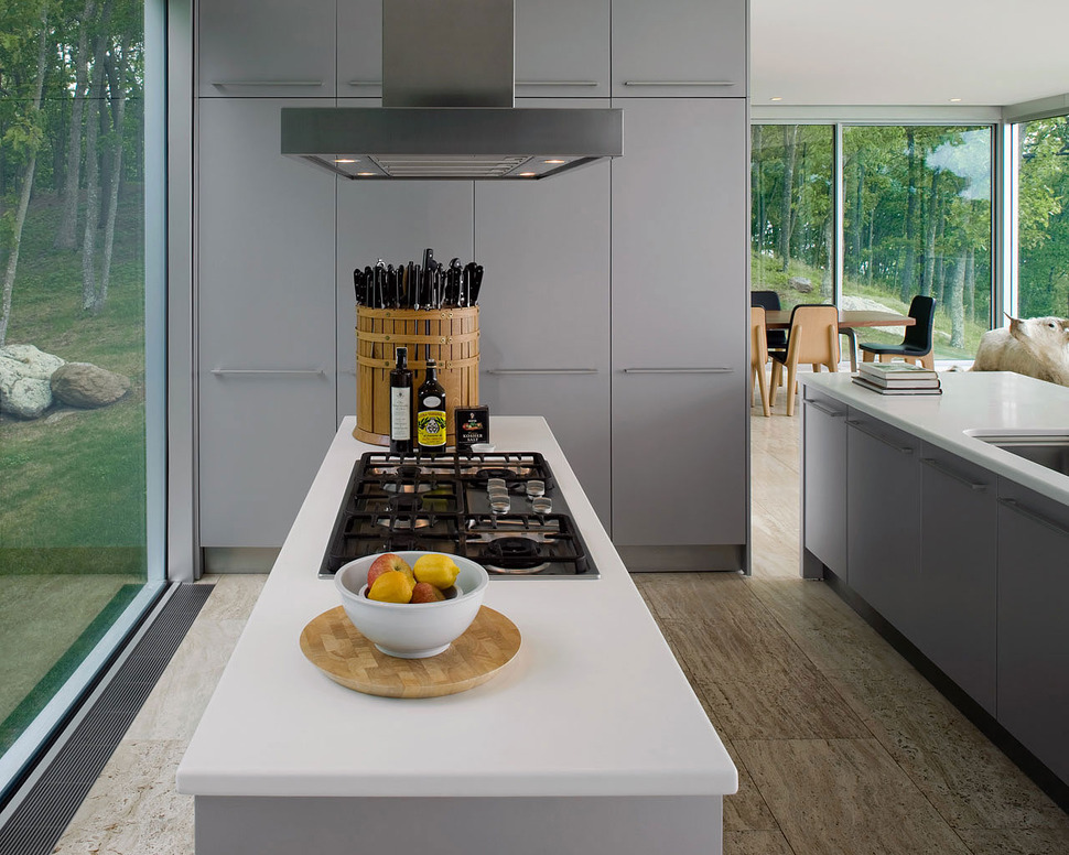
Both the sink and stove are within their own islands meaning both locations can be accessed from both sides making this the perfect two-person kitchen while still leaving plenty of room for others to help out, and check out that awesome knife block!
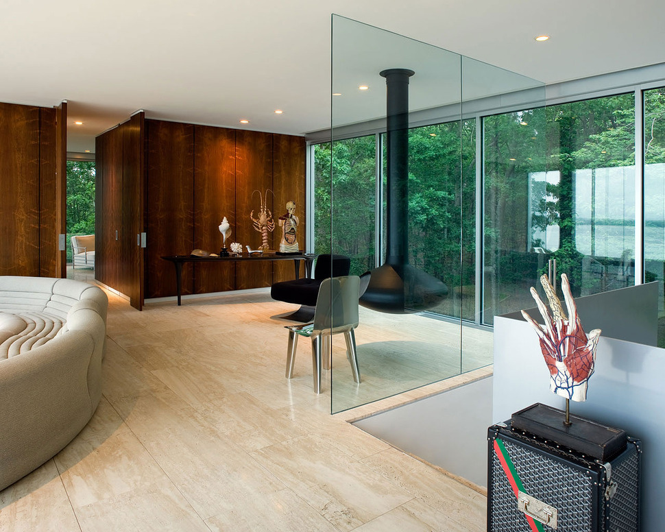
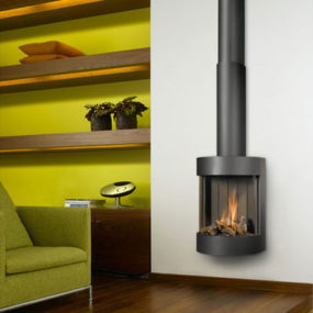
The kitchen flanks one side of the stairwell while the living room is on the other and just behind the living room, overlooking the front yard, is the office complete with its own hanging fireplace. I love how the designers chose to install glass panels rather then a safety rail around the stairwell, thereby keeping the view as exposed as possible. Here, like in the dining room, realism is portrayed in select table top sculptures – but rather then being whimsical, these pieces are hand-somely scientific.
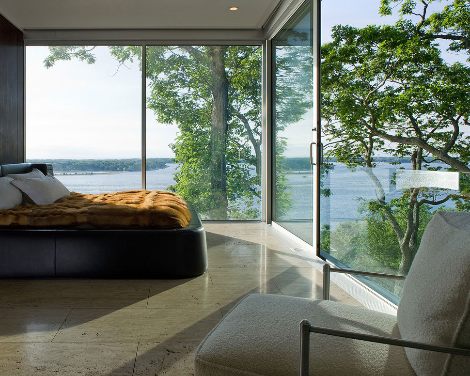
Just past the living room and office, with its entrance between the two zones is the Master Suite. Here, the homeowner can fall asleep to the night skies and wake up with the birds. It’s a serene and peaceful setting that seems so remote and is yet so close to the hustle and bustle of New York city.
22-ensuite
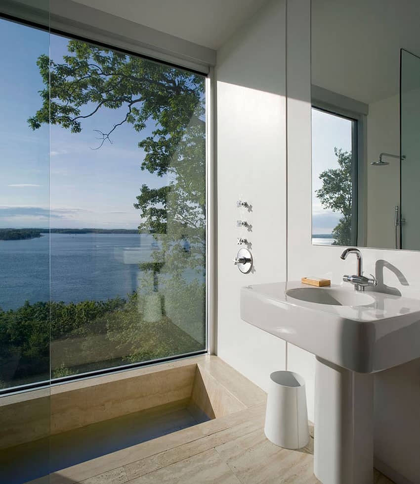
and the shower has the unique feature of being one step below the rest of the floor.
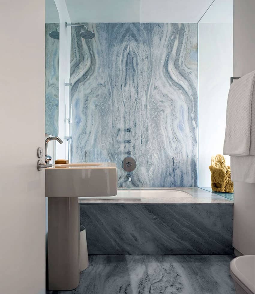
Opposite the shower is a beautiful tub surround of bookmatched marble – it really doesn’t get much better then that
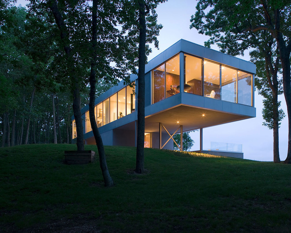
The bedroom even has its own lounging area located in the front corner of the room, meaning just like the dining room, this Master Suite is exposed to the views on three sides.
Michael P Johnson
Stuart Parr Design
Built by Atlantic Collaborative
Photography by Bill Timmerman
