Large warehouse style lofts can feel overwhelming due to their large size and overly high ceilings but by using innovative design details, MARTINarchitects was able to take Loft is Loft – located in Kiev, Ukraine – to task and cozied it up so that not only is it warm and inviting but it is also visually and viscerally exciting.
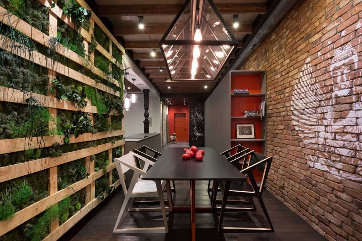
Loft is Loft still has its original exposed ceiling joists and brick walls but MARTINarchitects has modernized them with such simple tricks as drawing a Buddha on the dining room bricks with white, to imitate the white chalk on the chalkboard in the kitchen, and mimicking the exposed ceiling joists in the dining room with a rough construction green wall.

It doesn’t matter which direction you look at in the dining room, each is unique and each is wildly fun.
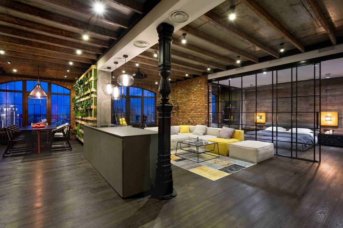
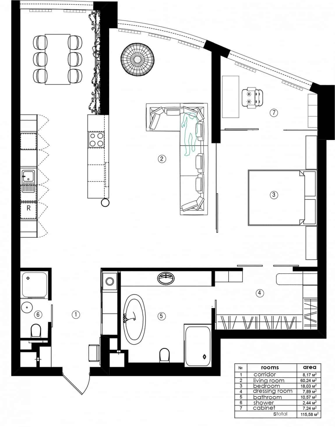
The living wall closes off the dining room from the living room while the kitchen stays connected to both zones.
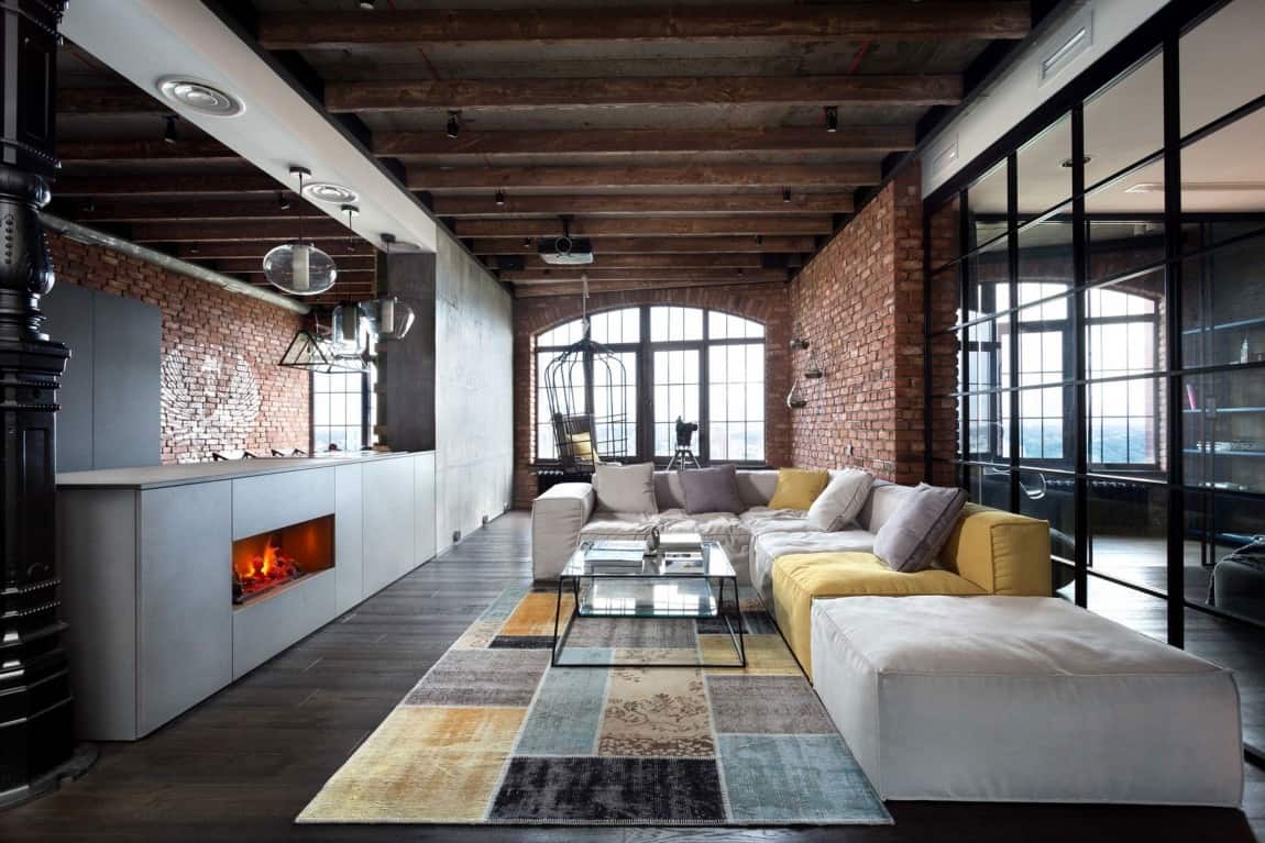
The kitchen peninsula has a cook top on one end with a long prep/serving counter extending out from it and the living room’s fireplace is positioned in this peninsula.
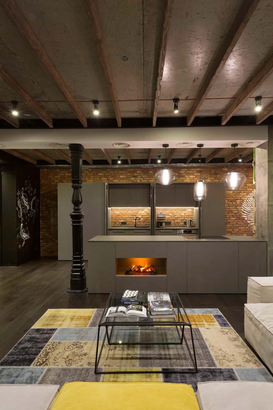
A dropped ceiling section over the kitchen peninsula is held up by a balustrade shaped column. The turning on the column is played up by painting it a contrasting black which, like the white Buddha, references the chalkboard at the gateway to the hallway.
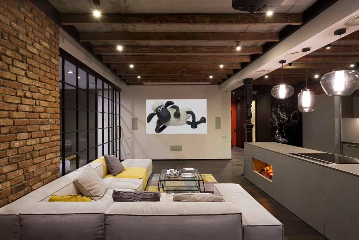
While most of the loft is filled with neutral tones, including black and white, pops of yellow and red are used sporadically to designate the different zones.
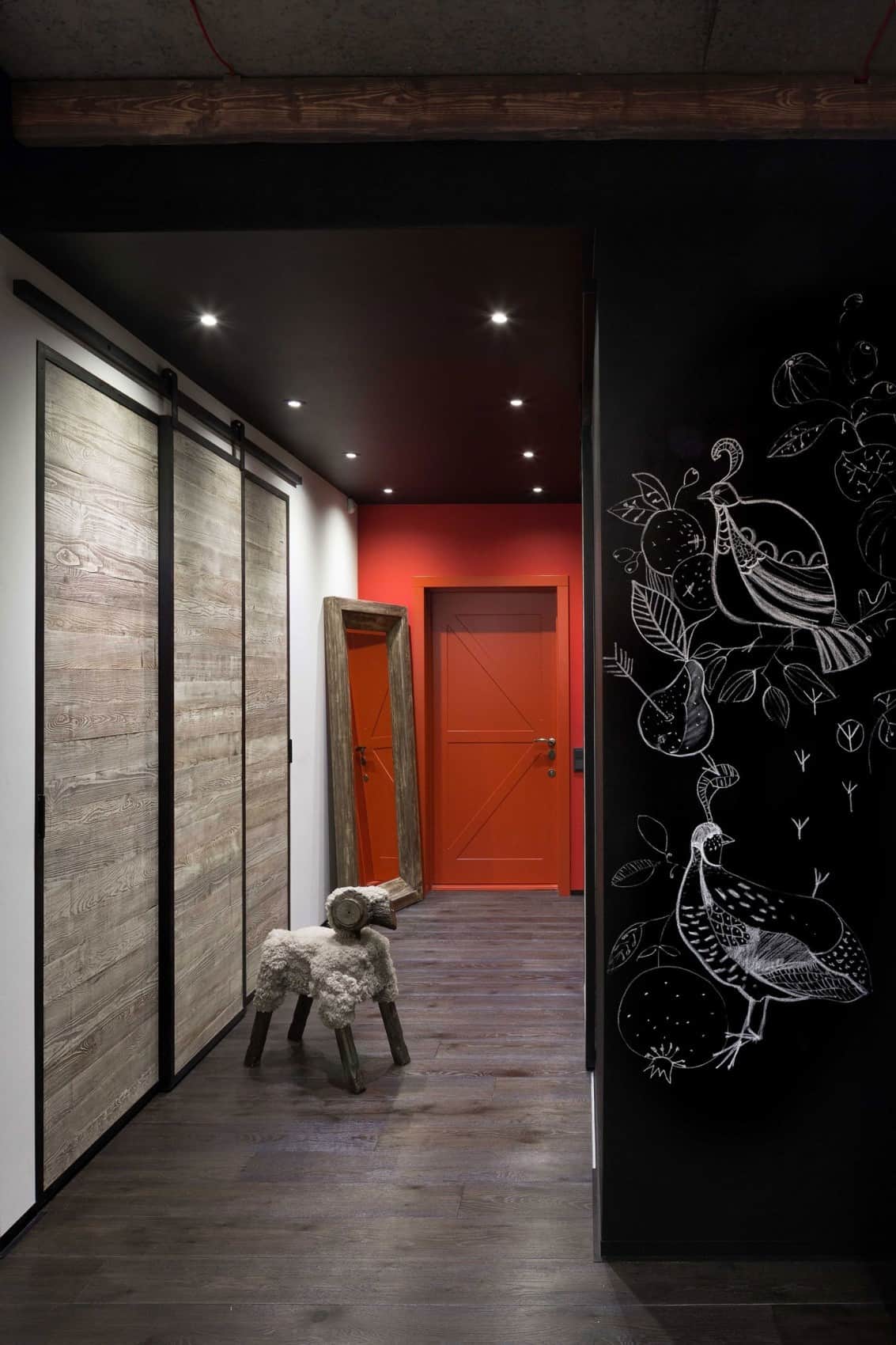
Red is the choice of color to mark the entryway. Aside from the bold use of red and chalkboard paint, I also love the hall closet’s weathered wood sliding doors with barn door hardware.
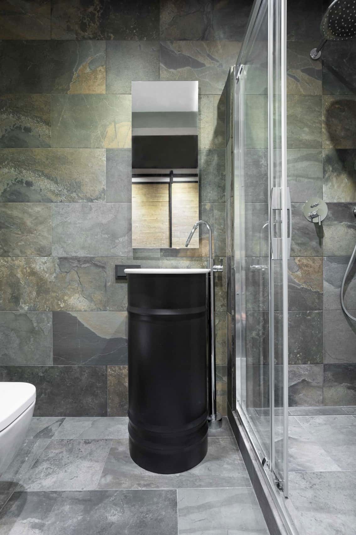
Across from the hall cupboard and next to the kitchen is a small bathroom featuring an oil drum sink and covered in natural slate tiles. Even though there is no window in this small bathroom, the organic texture and patterns of the slate stop it from feeling confined and that drum sink, that just funs up the space don’t you think?
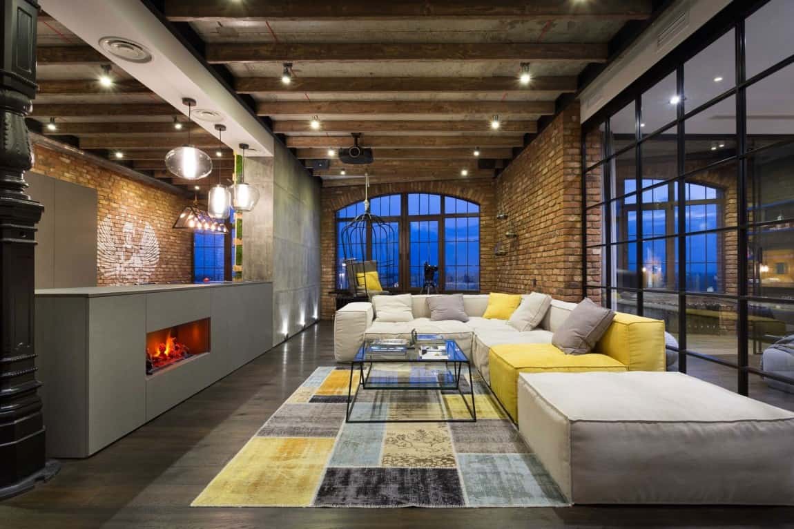
The living room is just a few feet away from the entrance and is positioned centrally with a small sitting area past it to enjoy the view, the kitchen on one side and the master suite on the other. A small office is accessed through the bedroom.
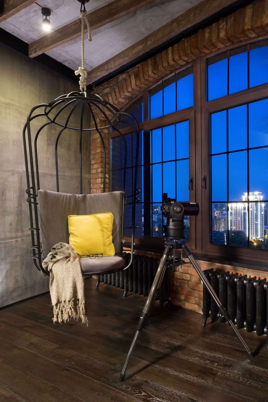
The sitting area in the window features the Cageling Chair suspended from the ceiling so that you can feel like a bird perched up high, swinging comfortably as you enjoy the view.
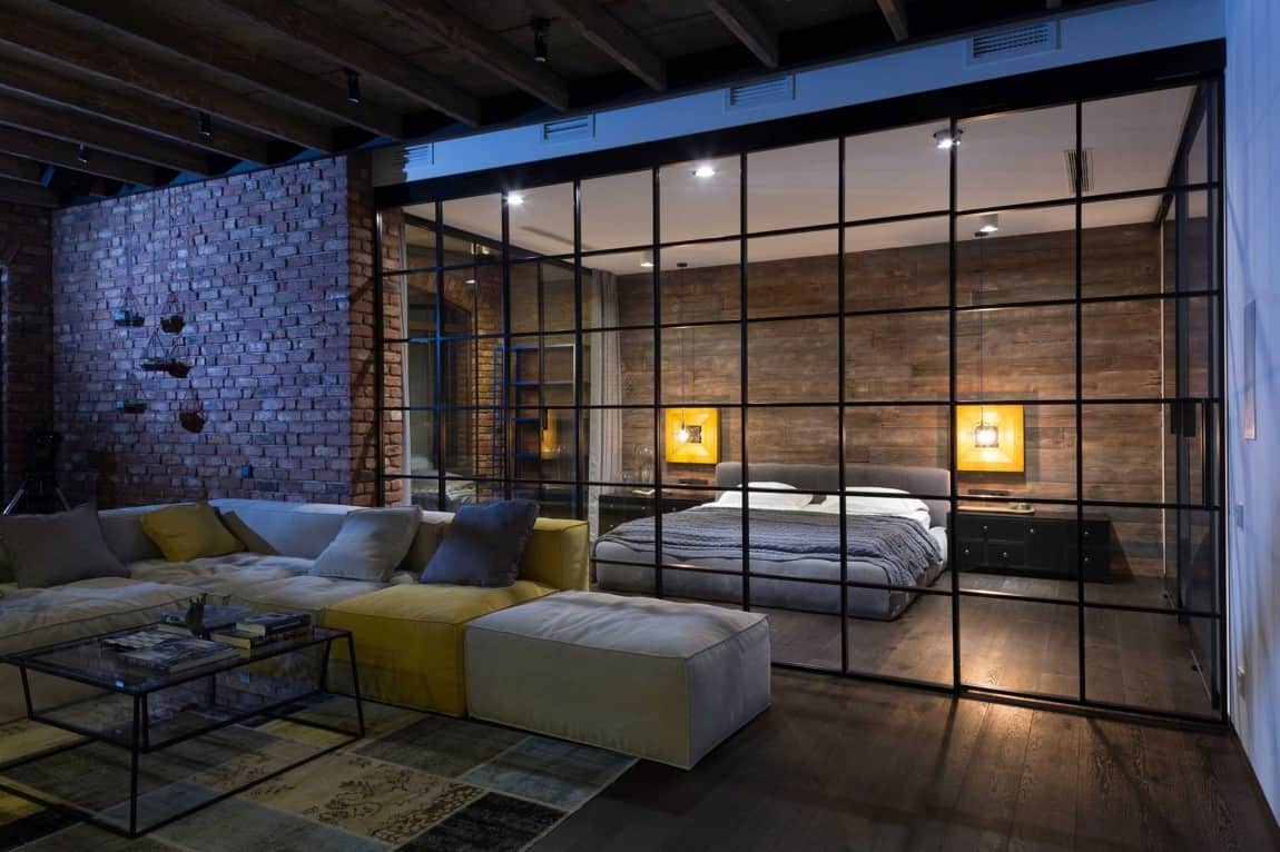
The sitting area is flanked on both sides with a short brick wall. On one side the brick wall is the back of the living wall in the dining room and on the other side the brick wall hides the office area next to the master suite.
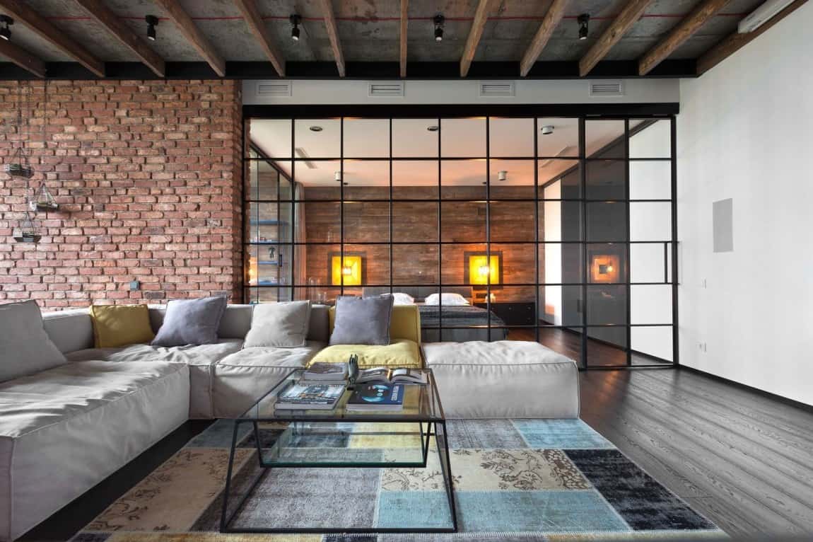
The master suite is flanked by the office and the ensuite, both hidden from the living room unlike the sleeping zone which is completely exposed.
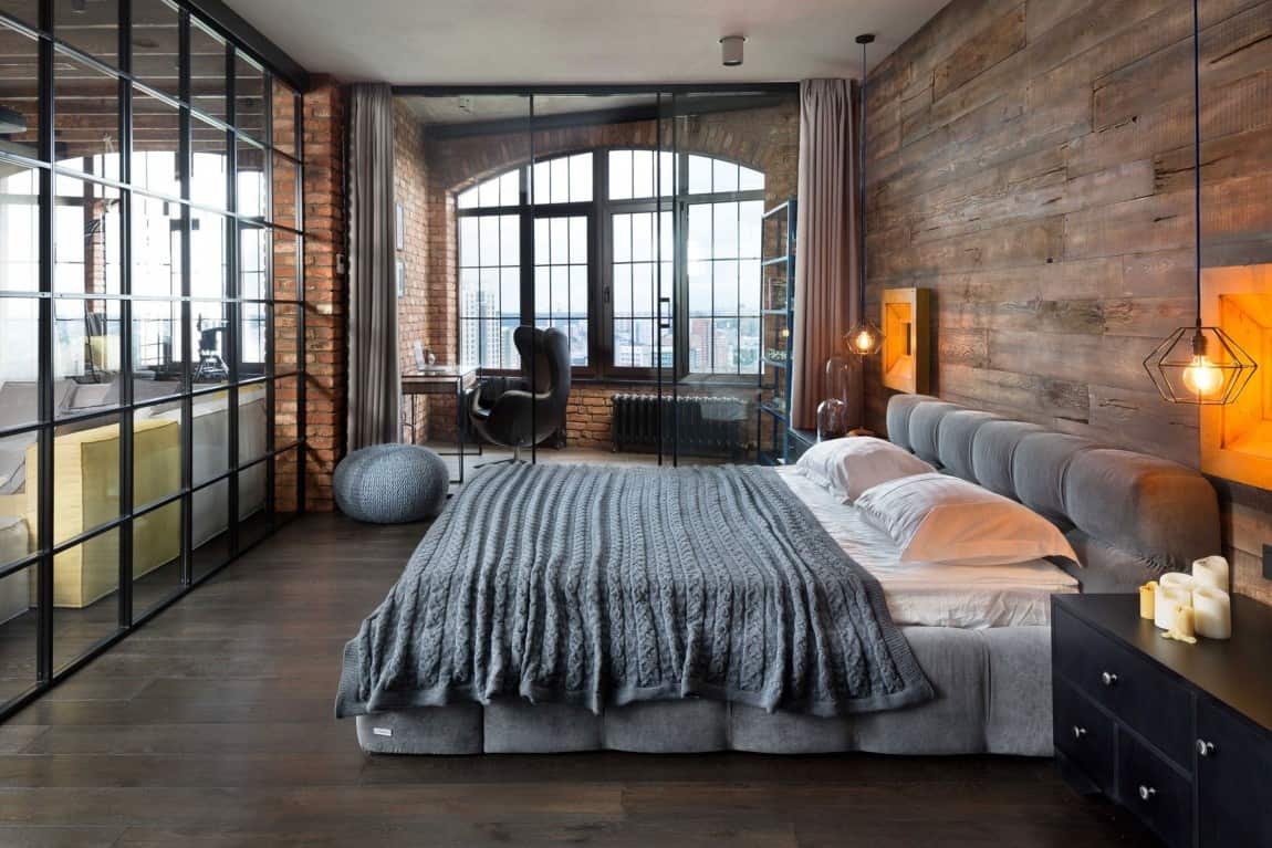
While no curtains shield the bed from the social zone, curtains are installed to create privacy for the office.
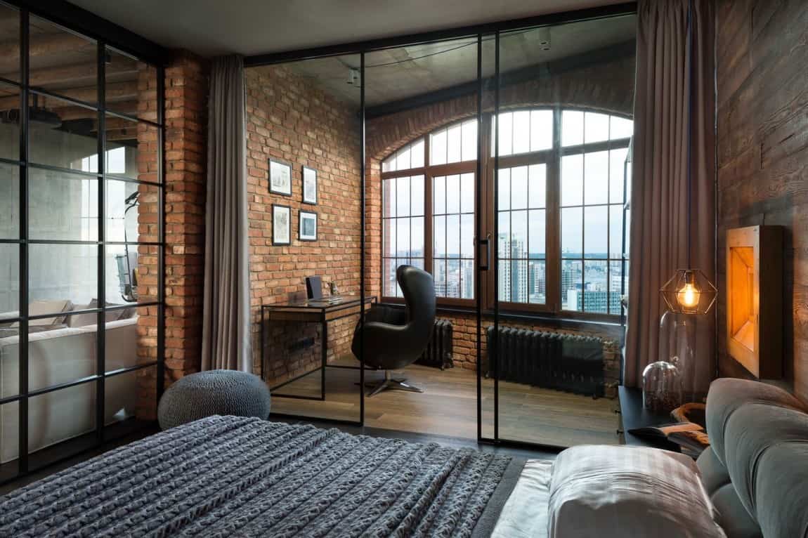
Aside from curtains, the office is also glassed off from the bedroom for audio privacy.
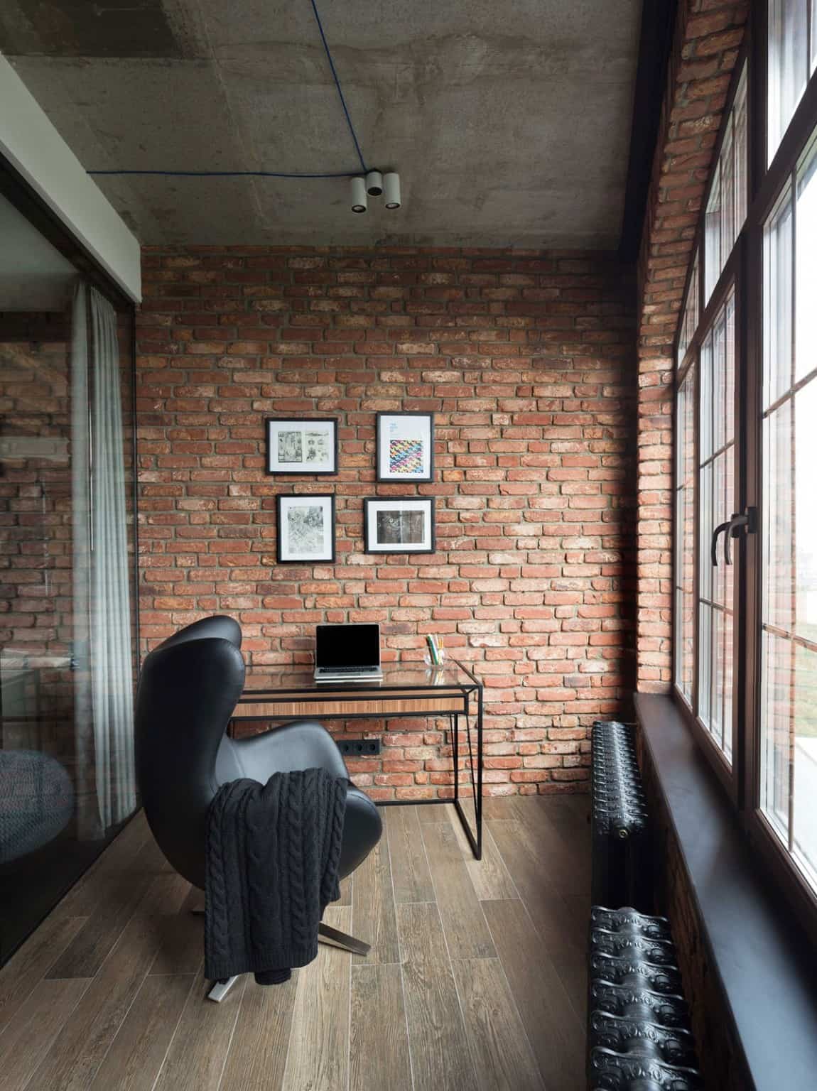
Unlike the living, dining and kitchen areas, the exposed wires on the ceiling are blue here rather than red.
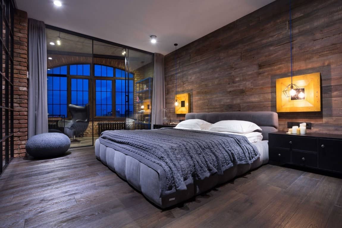
The master suite is the only area within the loft that does not have exposed ceiling joists.
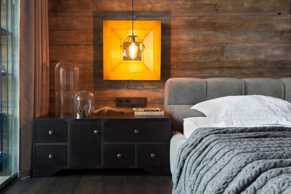
The ceiling may not bring in the rustic wood elements, but the headboard wall certainly does!
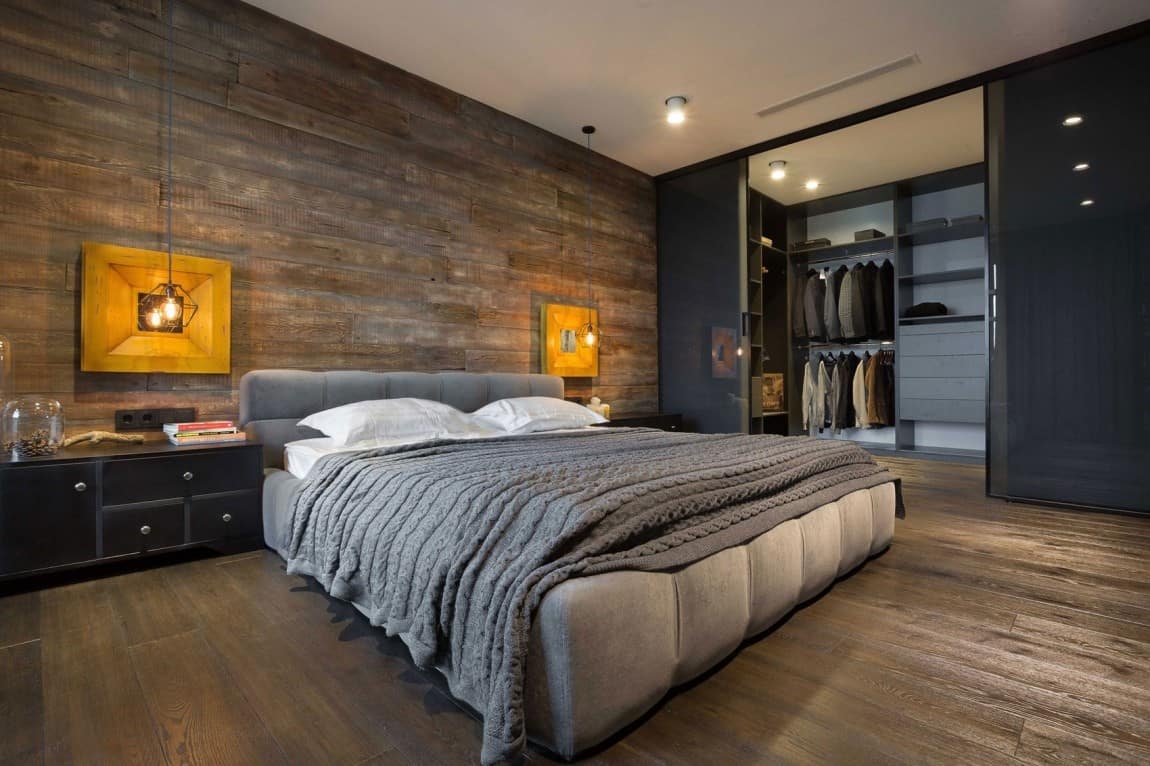
Access to the ensuite is through a walk in closet. This allows the closet to act as a noise barrier to the bathroom.
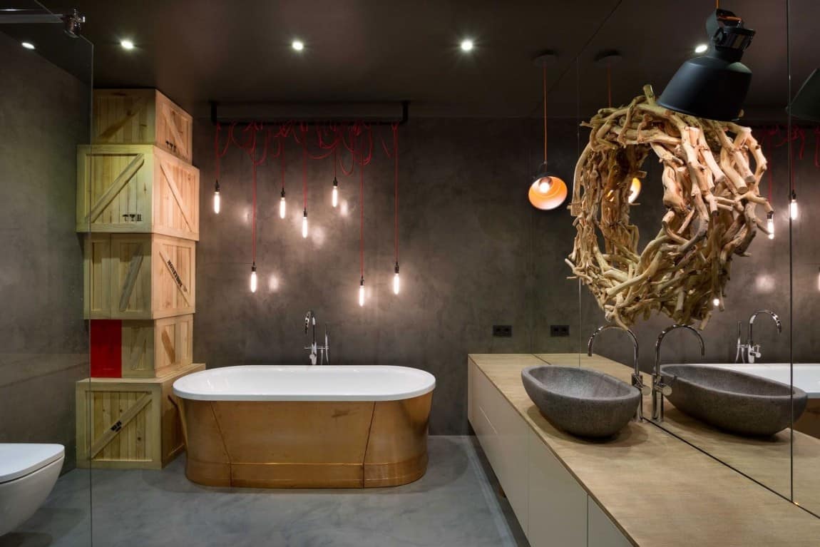
This is what you see when you first walk into the ensuite. If I could only use one word to describe this space it would be WOW!
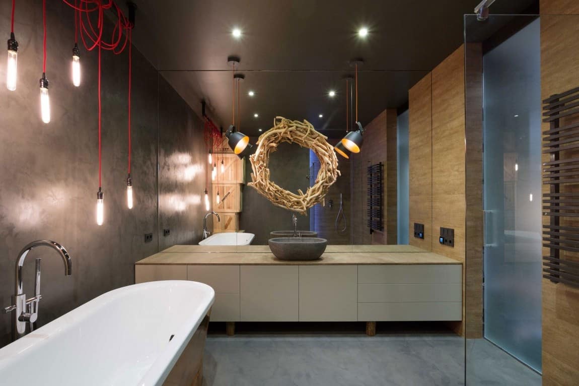
With a wall of mirrors above the vanity, MARTINarchitects still managed to create the effect of a small feature mirror by hanging a natural wood wreath above the sink – so creative.
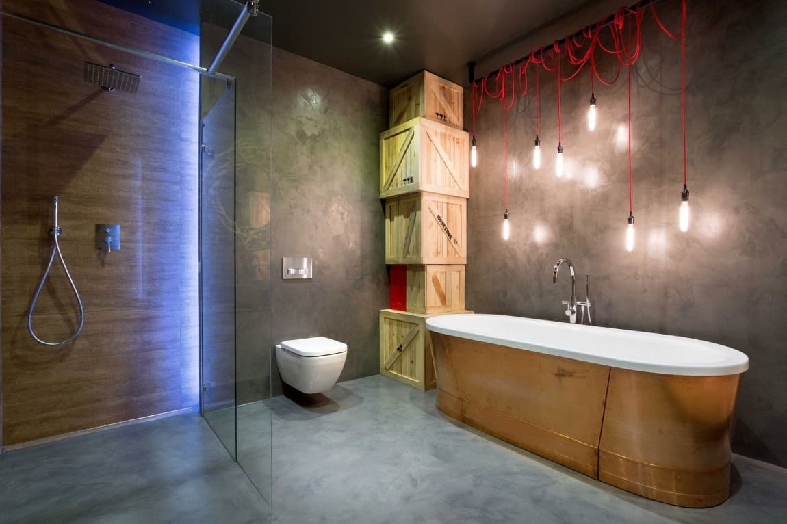
The carefully orchestrated mess of red electrical conduits for the light display above the tub and the seemingly random (but not) stack of crates next to the tub give so much presence to the room that you almost don’t even notice the stunning copper faced tub – almost.
Which of the innovative design ideas in this warehouse style loft do you like?
MARTINarchitects
Photography by Igor Karpenko
If you love the creativity used in this warehouse loft you will also like the innovation in the sleek, fashionable French loft with open interiors by Dum Dum Design.
